Datawrapper is an online tool that helps you make nice-looking charts for the web. No code is required. Instead, a focused interface lets you load data, pick your chart type, refine, and publish.
Datawrapper is an online tool that helps you make nice-looking charts for the web. No code is required. Instead, a focused interface lets you load data, pick your chart type, refine, and publish.

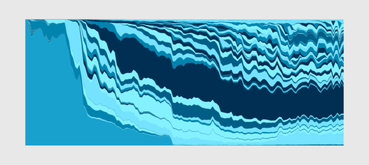
John Nelson turned the Grand Canyon inside out to understand the magnitude better:
Some of my earliest memories of the place had to do with the trippy feeling of my eyes and mind trying to make sense of the scale. I had seen many mountain ranges and vistas, including some on the way, but the vast negative space played havoc with my perception of magnitude. I’ve felt it a few times since, but never like that first Grand Canyon overlook.
Instructions included on how to do this in ArcGIS Pro.

Digital assistants offer convenience, but they also offer continuous surveillance, and it’s not always clear when the tech is listening. Alias by Bjørn Karmann is a device you put on top of the assistant the block any unwanted listening:
Alias acts as a middle-man device that is designed to appropriate any voice activated device. Equipped with speakers and a microphone, Alias is able to communicate and manipulate the home assistant when placed on top of it. The speakers of Alias are used to interrupt the assistance with a constant low noise/sound that feeds directly into the microphone of the assistant. First when Alias recognises the user created wake-word, it stops the noise and quietly activates the assistant with a sound recording of the original wake-word. From here the assistant can be used as normally.
Armed with a Raspberry Pi and a 3-D printer, follow the build guide to make your own.
Amanda Cox is the new data editor for The New York Times:
As data editor, Amanda will continue to provide direction for The Upshot, and she’ll add the expertise from Computer-Assisted Reporting journalists in New York and software developers here and in the Washington bureau. She’ll serve as the top adviser to the executive editor and managing editor on statistical questions like polling methodologies and election forecasting, and she’ll participate in conversations with desks as they discuss data-oriented reporting that may aid our economics, technology and investigative coverage.
In her time here, Amanda has helped bring together some of our best explanatory and statistical reporting efforts with our smartest visualization experts, and now she’ll do that on a bigger stage.
Great news for both Amanda and NYT.
There’s a space on the basketball court called “mid-range.” It’s actually not off-limits. In fact, people used to shoot these so-called “mid-range” shots.
Using color as the visual encoding, show changes over time in two dimensions.
People show up unannounced at John and his mother Ann’s home in South Africa, looking for stolen property, but John and Ann didn’t steal anything. For Gizmodo, Kashmir Hill investigates another case of IP address and geolocation mistaken for exactness:
John and Ann’s problems weren’t necessarily caused by one bad actor, but by the interaction of a bunch of careless decisions that cascaded through a series of databases. The NGA provides a free database with no regulations on its use. MaxMind takes some coordinates from that database and slaps IP addresses on them. Then IP mapping sites, as well as phone carriers offering “find my phone” services, display those coordinates on maps as distinct and exact locations, ignoring the “accuracy radius” that is supposed to accompany them.
The victims of theft, police officers, private investigators, the Hawks (South Africa’s FBI), and even foreign government investigators showed up mistakenly at John and Ann’s door, and none of them ever tried to figure out why.
Remember when we thought Kansas had unusually high porn views per capita?
Along the same lines as last week’s one-year wind time-lapse, Weather Decoded provides this one-year time-lapse of the weather over the United States:
Fun. [via kottke]
It feels like magic. I think there’s a magic trick percolating in there somewhere.
I’m not sure where this is from. It looks like it’s a recording from a camera pointed at a television screen, so if anyone knows where the original is, please let me know.

Compelling visualization doesn’t just conjure itself out of nowhere. The ideas come from somewhere, and oftentimes they build off previous ones.
Using the same National Weather Service data that powers his live-ish wind map of Earth, Cameron Beccario put together a time-lapse for all of 2018. Watch it on full-screen in its 4k glory.
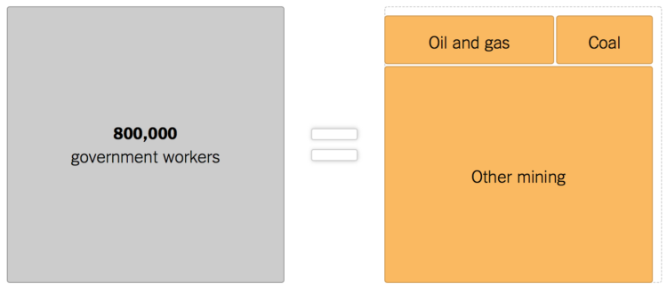
As the shutdown continues, 800,000 government workers wait for something to happen. The New York Times uses others industries for scale. Ugh.
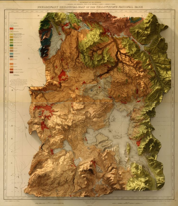
This vintage recreation by graphic designer Scott Reinhard fills all the right checkboxes for me.
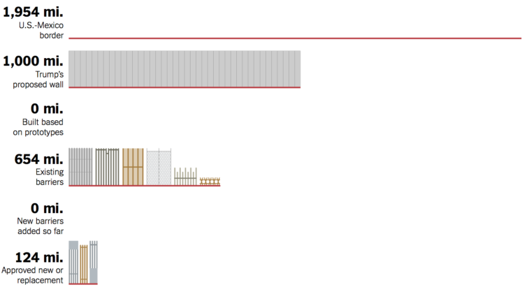
Denise Lu for The New York Times provides a quick overview of the proposed border wall and its progress. Scroll for zeros.
The end of a year is always a good time to look back at past work, because the day-to-day can sometimes feel like an endless churn. There’s also just no way to remember everything, and because of the volume, there’s really no way you can see everything that everyone made. Hence, lists. And Maarten Lambrechts compiled a list of all the visualization lists for 2018 for your perusal.
I am partial to the lists from The New York Times, The Washington Post (not listed), and FiveThirtyEight.
Nick Barrowman on the myth of raw data:
Assumptions inevitably find their way into the data and color the conclusions drawn from it. Moreover, they reflect the beliefs of those who collect the data. As economist Ronald Coase famously remarked, “If you torture the data enough, nature will always confess.” And journalist Lena Groeger, in a 2017 ProPublica story on the biases that visual designers inscribe into their work, soundly noted that “data doesn’t speak for itself — it echoes its collectors.”
So, when you work with data and make conclusions, you must consider everything that came before.

D3.js can be used for a lot of things, and for some people it’s too much to deal with.
Niklas Elmqvist provides a detailed guide for finding and a visualization PhD program:
Unless you have a specific reason to choose a specific university (such as a geographic one; maybe you can’t relocate), don’t start from the university you want to go to, but start with the faculty member you want to work with. This is where all that idle web surfing experience can come in useful: you need to become an expert in finding faculty members that have research interests that match your own, and the only way to do so is to trawl their websites and read their papers.
And then applying:
Now, having identified some possible advisors (and don’t just pick one; you never know whether you will be admitted and whether they have funding to hire new students), you should reach out to them. In other words, don’t just apply, but send them an email with plenty of time to spare before the application deadline. Attach your CV, outline your background, and provide some of the above-mentioned commentary on their work and why you are interested in it (i.e., the “hook”). If you have a portfolio or website, link to it. Remember, no form letters!
Useful information here. You might also want to get a sense of flexibility in the department. I was two years into my PhD in statistics until I decided I wanted to go the visualization direction, which was a big switch from my original intentions of statistics education. Focus and interests tend to shift after you learn more.
Once you get into a program, see also my survival guide for avoiding burnout and finishing.
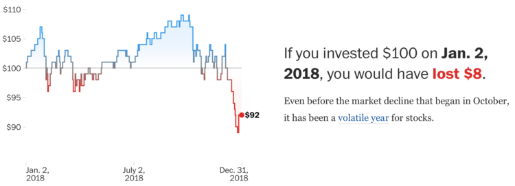
The stock market is in a state. So finicky the past few months. Kate Rabinowitz and Leslie Shapiro for The Washington Post provide a view further into the past for more context to the recent flux. The stretching time axis as you scroll makes for an easy-to-follow visual cue.
Max Read for New York Magazine describes the fake-ness of internet through the metrics, the people, and the content:
Can we still trust the metrics? After the Inversion, what’s the point? Even when we put our faith in their accuracy, there’s something not quite real about them: My favorite statistic this year was Facebook’s claim that 75 million people watched at least a minute of Facebook Watch videos every day — though, as Facebook admitted, the 60 seconds in that one minute didn’t need to be watched consecutively. Real videos, real people, fake minutes.
I wonder how the fake-ness level online compares to fraud IRL.
 Visualize This: The FlowingData Guide to Design, Visualization, and Statistics (2nd Edition)
New tools, refined process.


