Ask the Question, Visualize the Answer
While working through the recent animated pyramid chart tutorial, I came across a chart showing the shrinking surplus of women in Germany by Lisa Charlotte Rost. Taking the difference between men and women populations by age, she highlighted whether there were more men or more women for various age groups over time.
It’s the same dataset but focus shifted.
I of course had to see it for United States populations.
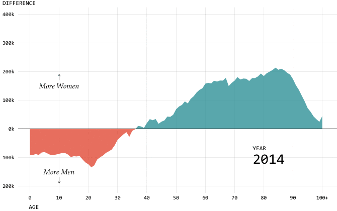
Then I grew curious about other views for the same dataset. Here’s the same data but shown with a difference chart:
While there’s still some focus on whether there are more men or women for a given age, the difference chart emphasizes the trend of total population across the range of ages.
Which chart is better?
It depends on what you want to see. If you only care about whether there are more men or women, then you go for the first chart. However, if you care about the total population too and less about the magnitude of the men-women difference, then you go for the second chart.
The questions you ask before visualizing data will help you figure out what charts to use. Otherwise, you end up with rambling, unfocused graphics, which is fine for analysis and exploration but not so much for data presentation.
Let’s keep poking at this population dataset to see how this works in practice.
First, here’s a sample of the data:
Year    Age   Gender    Projected.Population
2014      0   Female                 1939928
2014      0     Male                 2031919
2014      1   Female                 1933019
2014      1     Male                 2024845
2014      2   Female                 1941924
2014      2     Male                 2030157
...
I downloaded the dataset from the CDC WONDER database, but the estimates are supplied by the Census Bureau. We have year, age, gender, and projected population in each row. The data starts for 2014 and ends at 2060. Age ranges from 0 to 100+ years old, and population ranges from about 9,000 people to 2.7 million. Gender is either male or female.
With the dataset in mind, let’s ask some questions and visualize accordingly.
What is the general feel for this dataset?
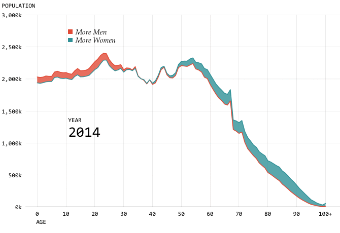
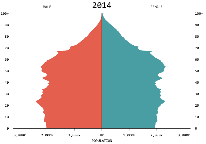
Coming back to the chart that started this, an animated pyramid chart provides an overall feel for this dataset. You can see the populations getting older as the distributions shift up. You see the total population increasing as the areas grow wider. It’s more of a challenge to compare the male and female distributions.
How will total population in 2060 compare to now?
Maybe you only care about total population and not about age or gender. A simple bar chart will suffice.
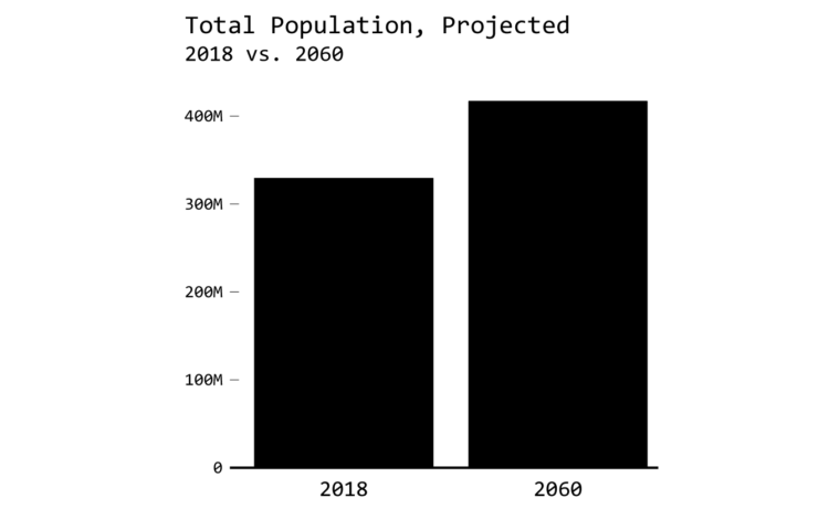
Or, here’s an even more straightforward solution: The population is projected to grow by 26.5% between 2018 and 2060. Boom goes the dynamite.
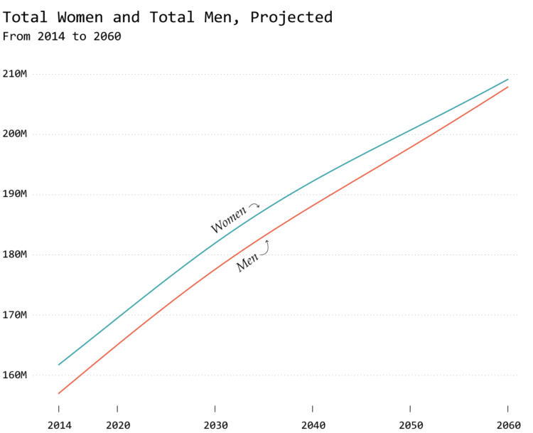
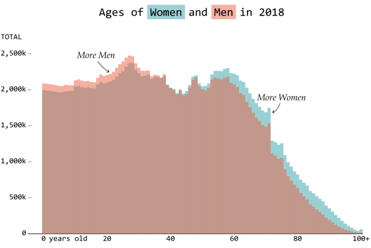
Are we trending towards more male or more female?
In the first charts, you could see a comparison of male and female populations by age. It’s tougher to gauge the totals though, because you have to estimate the area underneath curves or attempt to run totals in your head.
So for totals, you could instead simplify to totals over time using a line chart. One line represents the female population, and another line represents the male population. Clearly there are more females in the United States, and projections show it’s likely to be that way for a while.
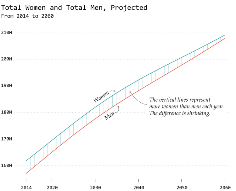
However, the gap between the male and female populations decreases over time. To focus more on the gap, segments in between the trend lines explicitly show the differences.
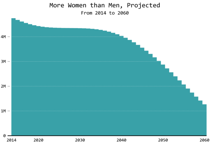
You can also do the math and only show the difference:
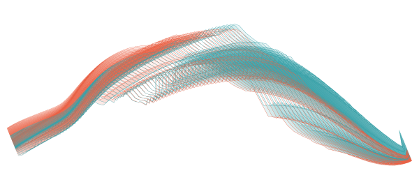
And yet another way to compare the male and female populations over time: a connected scatterplot.
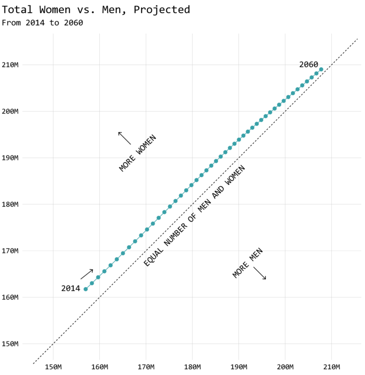
You can see the dots creeping towards the equal line in the middle, and the x-y layout suggests a connection between the populations. I’m not sure it’s necessary in this case to explicitly show that connection, but there you go.
How does the age distribution for males and females compare?
The population pyramid shows age distribution for males and females, but the mirrored layout makes it more challenging to compare the subtle differences. The animation makes it harder too, because the chart changes before you can check the values on each side.
Instead, you can orient static histograms in the same direction to make it easier to compare.
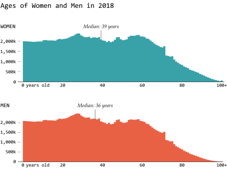
You could also overlap the histograms, which essentially forces a comparison. If it’s for a wider audience, you will probably need to consider what readers are ready to digest.
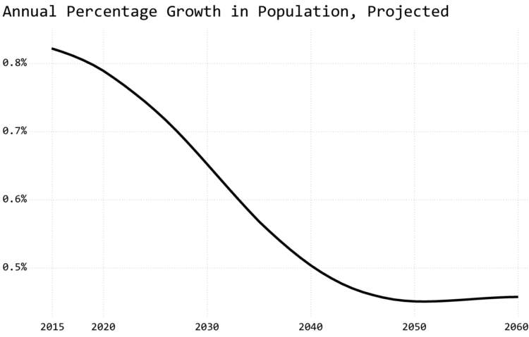
How much does population increase each year?
Surely, the rate that population increases goes down at some point, right? With some arithmetic, you can place focus on the relative annual change. The rate of increase appears to decline.
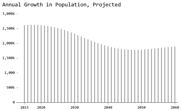
Maybe you’re more interested in the absolute increase each year instead of the rate:
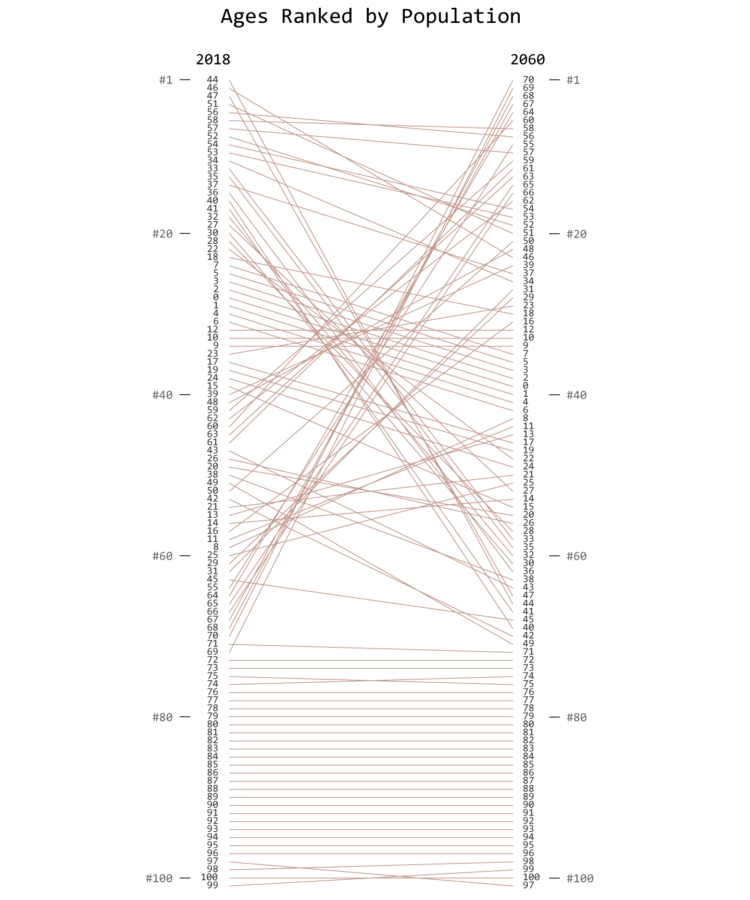
What is the projected change for each age?
Age seems to be an important factor though, so let’s bring that back into the mix. The chart below shows the range of change among different ages. Longer lines mean greater increases in population between 2014 and 2060.

You can also answer this question from a ranking perspective instead of population counts:
By now, it should be easy to see how different questions about your data can lead to different visualization types. This accomplishes a few things:
- A question can give you a place to start when presented with a dataset, which can lead to more questions.
- It provides focus, because a graphic is made to answer something specific.
- Filters out what you do not need to show.
A different route that people take is to simply ask the data type sans context and then pick a fitting chart type. Got a time series? Line chart. Categorical data? Bar chart. For smaller datasets with one or two variables, this route can be a quick fix. It’s more mechanical.
However, as seen in this example, a lot can come out of a single dataset. Your route should vary based on what you want to focus on.
Couple the available methods with the questions you want to answer, and then you’re getting somewhere.
Relevant Tutorials
I’ve written tutorials for most of the chart types in this guide. If there isn’t a tutorial for a specific chart type, it can be accomplished with a combination of tutorials.
- Animated Pyramid Chart in R
- Bivariate (Difference) Charts in R
- How to Make Animated Line Charts in R
- How to Make a Connected Scatter Plot
- How to Make Slopegraphs in R
Notes
- The data in this example comes from the CDC WONDER database. It’s actually Census data, but the data was more accessible via CDC. Go figure.
- I made all of the graphics in R and touched them up in Adobe Illustrator.
Chart Types Used


Become a member. Support an independent site. Get extra visualization goodness.
See What You Get