In visualization, there are tools, templates, and defaults, which are meant to be copied and reused. Then there are data graphics that are designed with a specific purpose and dataset, which are something more than a certain chart type.
In visualization, there are tools, templates, and defaults, which are meant to be copied and reused. Then there are data graphics that are designed with a specific purpose and dataset, which are something more than a certain chart type.
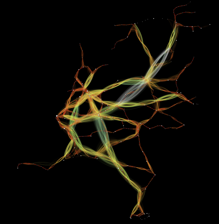
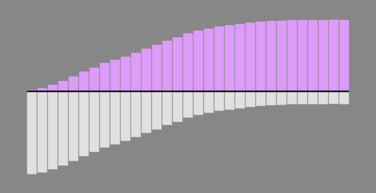
Jan Willem Tulp visualized train travel times using distance and color as an indicator. His reasoning:
When a train starts running from one station to the next station, conceptually, these two stations will temporarily be closer to each other. And that is exactly what this visualization shows: whenever a train moves to the next station — and only for as long as a train is moving — the origin station moves towards the destination station.
Be sure to watch the animation run with organic-looking behaviors.
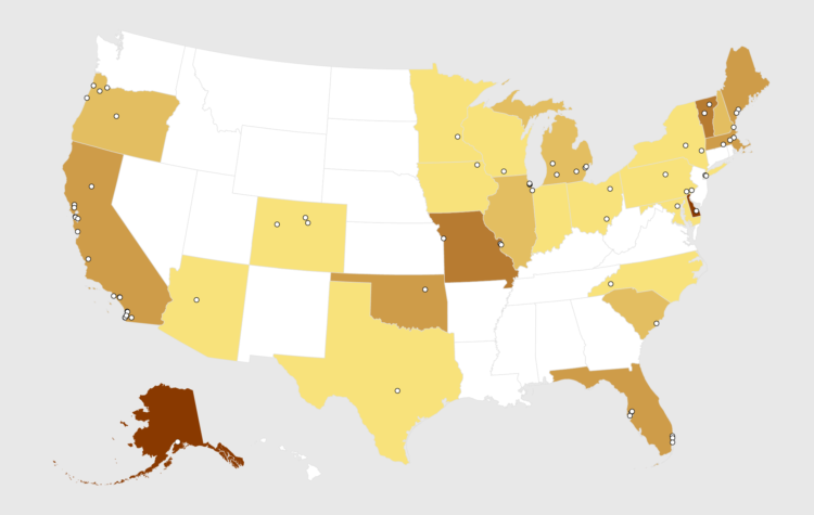
RateBeer puts out a list every year for top 100 breweries in the world. Here are the states that cracked the list.

It started with a mom holding her painting of a bird. Then someone painted that photo and took a picture of himself holding the painting. Then someone painted the photo of the man holding the painting of the picture of the mom holding the bird. The recursion continued. Luckily someone diagrammed all of the iterations:
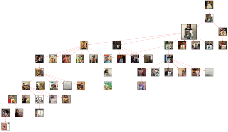
Just wow.
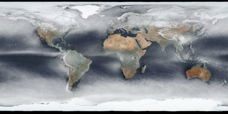
Using a year’s worth of daily images from NASA’s Visible Infrared Imaging Radiometer Suite (VIIRS), Johannes Kroeger constructed the average snapshot for 2018. Fun.
Many parents stop at two kids. Most are done by three. Still, everyone has their own timelines. Here are 1,000 of them.
Throughout the month I collect new tools for data and visualization and additional resources on designing data graphics. Here’s the new stuff for January.
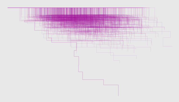
A wideout view of the news cycle can look like a series of rise and falls. Something captures the general public’s attention, and then it fades off. Thank you, next. This collaboration between Schema Design and Google Trends charts search volume for news stories and aligns them by their peaks, so that you can see these rise and falls.
Transparent areas overlaid on each other show an “average” trend, and the more irregular shapes are made obvious because they stand out from the rest.
See also the simpler view by Axios, who contributed stories to the project.
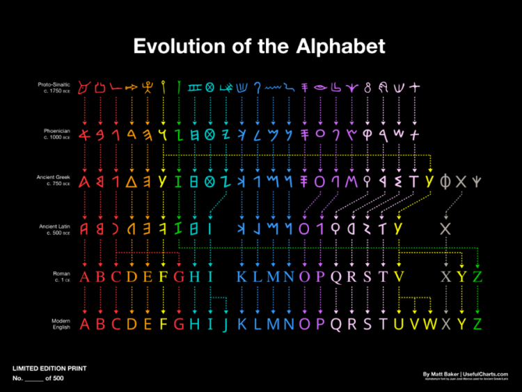
Matt Baker provides this nifty diagram on how the alphabet changed over the centuries, evolving to what it is now. Grab the print.
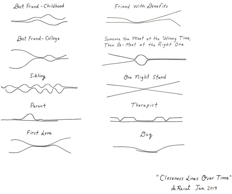
Cartoonist Olivia de Recat illustrated the closeness over time for various relationships. Charming. Unfortunately, the print is sold out. Sad trombone.
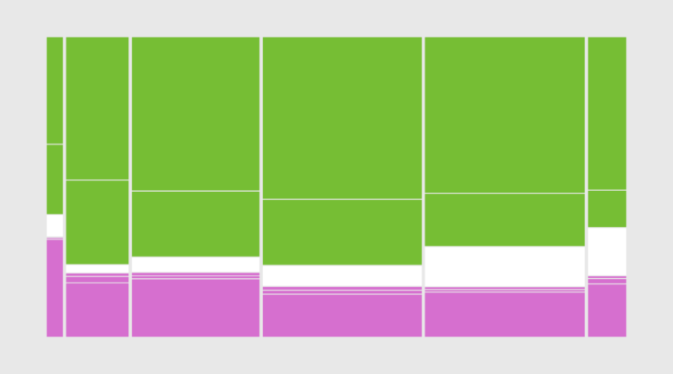
Also known as a Marimekko diagram, the mosaic plot lets you compare multiple qualitative variables at once. They can be useful, sometimes.

First comes love, then comes marriage, then comes baby in the baby carriage. Sometimes.
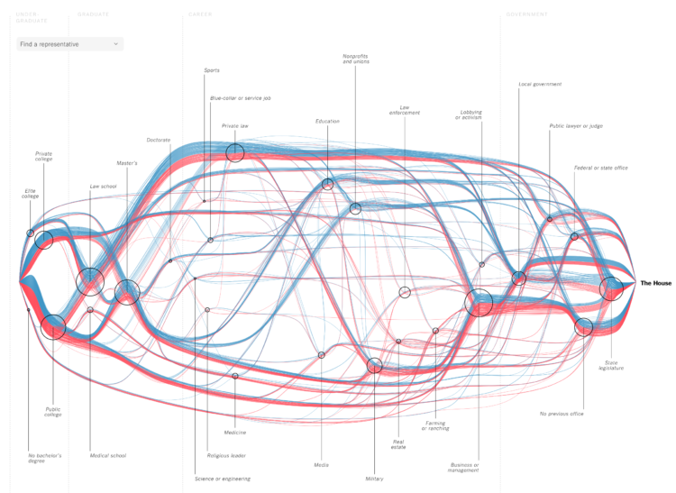
For The New York Times, Sahil Chinoy and Jessia Ma visualized the path to Congress for every member. See it all at once like above or search for specific members. The vertical scale represents previous categories of work and education and looks like it’s sorted by how common the categories were among Republicans and Democrats. The horizontal scale represents time, which starts at undergraduate and finishes at the House. Nice.
We looked at prime dating age and when people usually marry. Now it’s time for the next step in the circle of life.

Unfortunately, you can’t just conjure data out of thin air. Well, I guess you can, but it’d probably be sort of unreliable. Kind of. Maybe. So where do you find data? Here’s where I’m at in 2019.
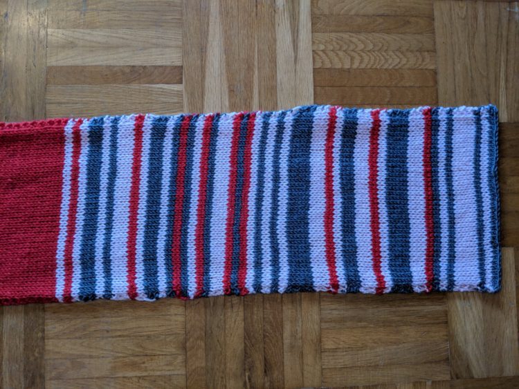
Sarah Weber posted a picture of a scarf that her mom knit to represent rail delays. Weber’s mom knitted two rows per day and used color to indicate the delay. Grey was under 5 minutes, pink was 5 to 30 minutes, and red was over 30 minutes.
After getting some attention on the Twitters, the mom opted to put it up on eBay to benefit charity Bahnofs Mission. It went for $7,550 euros. Nice.
I’m always up for some scaled perspective. From David Packer:
Anyone need a video demonstrating 1000s, 100s, 10s and 1s? You're in luck pic.twitter.com/sMGKlXKVy7
— Dave (@sheepfilms) January 21, 2019
DataKind, the organization known for helping others use data for social good, received a $20 million grant from The Rockefeller Foundation and the Mastercard Center for Inclusive Growth:
The grant will allow DataKind to transition from a project to a platform-based model, thereby, supporting more organizations on a set of high impact areas, such as community health and inclusive growth. We’re humbled and honored that these two groups are supporting our mission with $20M over five years to help us grow to support the needs of the sector.
Awesome.
Some words are harder to spell than others, and on the internet, sometimes people indicate the difficulty by following their uncertainty with “(sp?)”. Colin Morris collected all the words in reddit threads with this uncertainty. Download the data on GitHub.
 Visualize This: The FlowingData Guide to Design, Visualization, and Statistics (2nd Edition)
New tools, refined process.