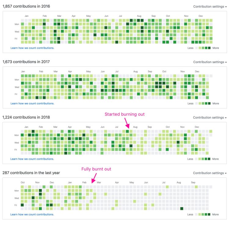
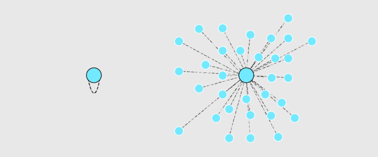
A quick annotation by Jonnie Hallman on Twitter: “GitHub is really good at visualizing burnout.”
A quick annotation by Jonnie Hallman on Twitter: “GitHub is really good at visualizing burnout.”
As discussed previously, the “impeach this” map has some issues. Mainly, it equates land area to votes, which makes for a lot of visual attention to counties that are big even though not many people live in them. So, Karim Douïeb used a clever transition to change the bivariate map to a cartogram. Now you can have a dual view.
Using the library command-line gets you more flexibility to highlight the important parts of the data.
Kelly Martin died of cancer on September 30. She was able to enjoy her final days at home, and as she knew the end was near, she kept track of her drug doses in a dashboard:
Brain tumors are unpredictable. I don’t want my last days with a personality that isn’t mine. I wanted to laugh, to enjoy the days, and fart around in the garden as much as possible. We added in a variety of medications to use as needed to manage symptoms and tracked what worked and what didn’t in a Tableau dashboard. It was the only way to see the patterns and to get more good days.
From Bridget Cogley, Martin’s friend who took over the writing as Martin grew too ill:
63% of Canadians with a terminal illness want to die at home. Only about 15% do. Kelly Martin died on September 30, 2019 in her home with her son and me (Bridget) at her side and her mother on the phone. A true honor she gifted us knowingly. We used this dashboard to provide care and communicate with providers. It was crafted in a couple of hours, edited with Kelly’s feedback, and used to provide a better death. Seeing the data can truly be life-changing.
I… just. Wow.
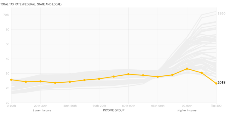
David Leonhardt, for The New York Times, discusses the relatively low tax rates for the country’s 400 wealthiest households. The accompanying animated line chart by Stuart A. Thompson shows how the rates have been dropping over the years, which are now “below the rates for almost everyone else.” Oh.
 Visualization is a relatively new field. Sort of. The increased availability of data has pushed visualization forward in more recent years, but its roots go back centuries. Michael Friendly and Howard Wainer rewind back to the second half of the 1800s, looking at the rise of visual thinking.
On the first construction of the periodic table of elements:
On February 17, 1869, right after breakfast, and with a train to catch later that morning, Mendeleev set to work organizing the elements with his cards. He carried on for three days and nights, forgetting the train and continually arranging and rearranging the cards in various sequences until he noticed some gaps in the order of atomic mass. He later recalled, “I saw in a dream, a table, where all the elements fell into place as required. Awakening, I immediately wrote it down on a piece of paper.” (Strathern, 2000) He named his discovery the “periodic table of the elements.”
I sometimes wonder what they will say about current visualization work a couple of centuries from now. At what point will the historians say, “This is when visualization crashed and burned, never to be seen again.” Or, maybe it’ll go the other way: “This is when everyone understood and communicated with data, and visualization was the vehicle to do it.”
Toph Tucker used to make graphics for Bloomberg Businessweek. Now he does enterprise visualization for finance. He wrote about the major differences between the two jobs. On the iconic Bloomberg Terminal:
There are more things in Bloomberg than are dreamt of in your meetings. This was not the consensus when I worked at Bloomberg, but I now believe the Terminal is incredibly well-designed. Folks reply, “I get that it’s useful, but I don’t think that means it’s well-designed,” and I rejoin: No! It is well-designed in every way that matters, even visually! (Such nice high-contrast easy-to-spot color-coded inputs and affordances! So nice that it stretches rather than reflow critical content off the screen!) I want people to look, and recoil, and then remind themselves that Bloomberg is wiser than that disgust. If you haven’t been in the position it’s built for, it’s a deep-set Chesterton’s fence; only after you’ve understood it can you disagree with it.
On Excel:
One large hedge fund shows every new young software engineer a particular Excel spreadsheet that makes hundreds of millions of dollars a year as part of their orientation, to beat the programmer’s “Excel isn’t serious” hubris out of them upon arrival. At this level, Excel is not interchangeable with Google Sheets or Apple Numbers or even Excel for Mac.
I love how there are these clusters of visualization that exist in the world, all making charts, but with completely different approaches and usage.
The visualizations are used and read differently, which requires that you approach their design differently.
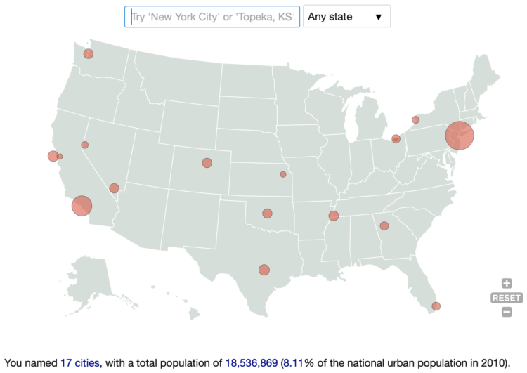
How many US cities can you name? Here’s a quick and fun game by Ian Fisher to find out. Simply start entering as many as you can think of and rack up population counts as a sort of point system.
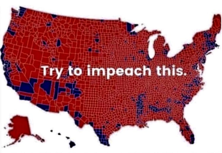
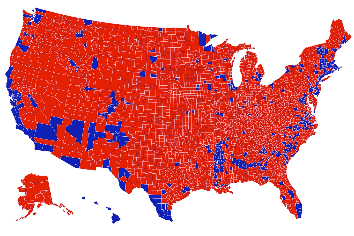
Philip Bump explains why the “impeach this” map is a bit dubious:
By now, this criticism of electoral maps is taught in elementary schools. Or, at least, it should be. Those red counties in Montana, North Dakota, South Dakota and Wyoming, for example, are home to 1.6 million 2016 voters — fewer than half of the number of voters in Los Angeles County. Trump won 1 million votes in those states, beating Hillary Clinton by a 580,000-vote margin. In Los Angeles, Clinton beat Trump by 1.7 million votes.
As Alberto Cairo already went into, it’s not so much that the map itself is incorrect. It’s a bivariate map. It shows which counties voted more for one person versus another. It’s more about the context of how the map is used. It’s the visualization equivalent of pulling a quote out of context and people seeing what they want to see.
A couple of weeks ago, The Washington Post visualized 13,000 school districts using moving bubbles. Post graphics reporter Armand Emamdjomeh describes how they did it.
Saving this for later.
This is perfect. Willikin Wolf made characters out of two dots moving along their paths of productivity and wages.
Something’s wrong pic.twitter.com/tMhNPk85pH
— Willikin Wolf (@WillikinWolf) September 23, 2019
More data+comics, please.
In 2008, the World Wildlife Fund ran a campaign that used pixelation to represent the number of animals left for endangered species. One pixel represents an animal, so an image appears more pixelated when there are fewer animals left. Imgur user JJSmooth44 recently used more recent numbers to show the images for 22 species (sourced from the Animal Planet endangered species list).
Read More

Thomas Lin Pedersen has been sharing his generative art pieces as of late:
All my systems and visualisations are programmed in R, an open source programming language for statistics and data analysis. I’ve developed and released many tools that are central to my work, and help maintain others.
Beautiful work. It really gets the imagination going for what else R can do. Check out Pedersen’s Instagram for more, and you can also grab a print from him directly.
Every month I collect the latest visualization tools and resources on how to make the most of your data. Here’s the good stuff for September.
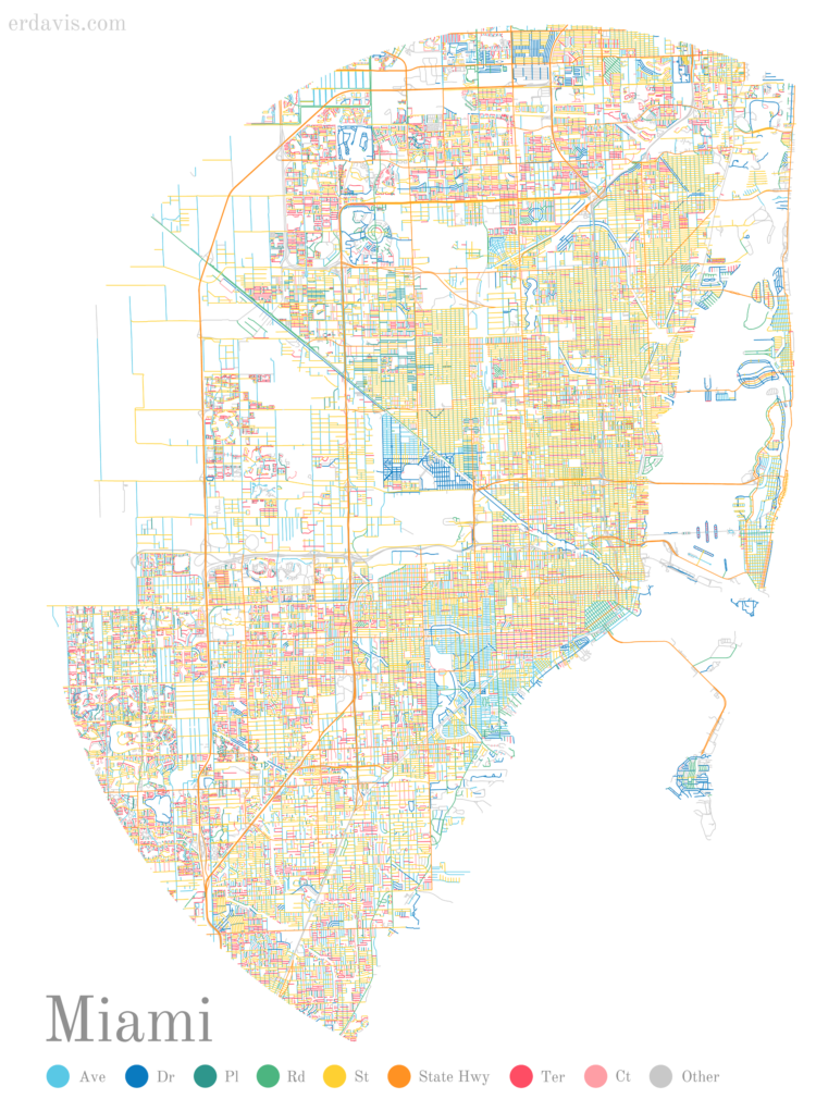
The suffixes on street names can say a lot about a neighborhood. A Boulevard elicits a business-centric area whereas a Road or Court might mean a more residential area. So, Erin Davis mapped the suffixes of all the streets in some major cities. [via @NadiehBremer]
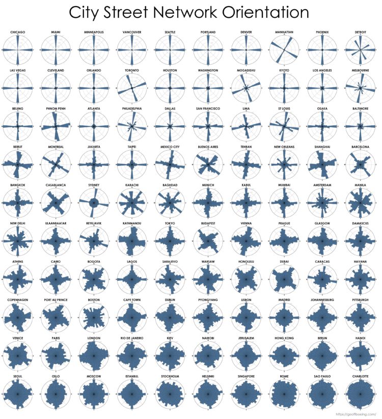
Continuing his analysis of street grid-iness in cities around the world, Geoff Boeing sorted cities by the amount of order in their street networks:
Across these study sites, US/Canadian cities have an average orientation-order nearly thirteen-times greater than that of European cities, alongside nearly double the average proportion of four-way intersections. Meanwhile, these European cities’ streets on average are 42% more circuitous than those of the US/Canadian cities. North American cities are far more grid-like than cities in the rest of the world and exhibit far less orientation entropy and street circuity.
Chicago is all grid. Charlotte not so much.
See the detailed study that Boeing published in Applied Network Science.
For UnHerd, Tom Chivers, talks about David Spiegelhalter’s new book and why every statistical headline deserves a grain of salt. One way to make sure things check out:
As a non-mathematician, I have a few shortcuts for working out whether a statistic is worth believing, which seem to have done all right for me so far. One, which Spiegelhalter stresses, is that often the best statistical analysis you can do is simply visualising the data. There was a bit of a recent kerfuffle about suicides among girls and young women going up 83% since 2012; but simply looking at the ONS chart showed that the numbers were small, the data was noisy, and the only way you got the 83% figure was by choosing the lowest year on record. (It’s an old trick.)
See also: common statistical fallacies.

GPX Jewelry by Rachel Binx lets you turn your GPS traces into jewelry. Just upload a GPX file from, say, your fitness app or Apple Watch, choose your finish, and you’ve got yourself a personalized pendant. Nice.

The Generated Photos project is a work in progress to provide realistic AI-generated faces for use in things like presentations or user interface design. “Copyrights, distribution rights, and infringement claims will soon be things of the past.”
An API is in the works so that you can generate the kind of faces that you want, but for now, a set of 100k images are available.
Cool? Slightly creepy?
 Visualize This: The FlowingData Guide to Design, Visualization, and Statistics (2nd Edition)
New tools, refined process.


