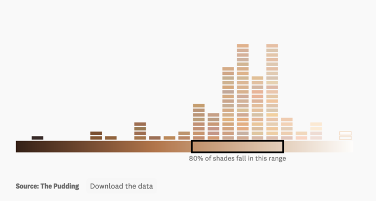
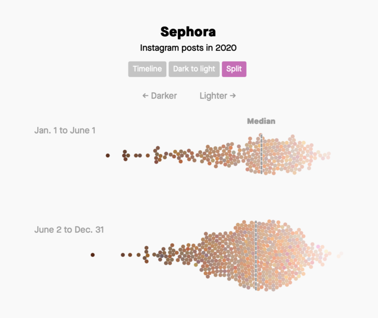
For The Pudding, Ofunne Amaka and Amber Thomas looked at shades, words, and numbers used to describe foundation makeup:
A 2020 study investigating the connotations of foundation shade names in 20 products found that dark shades were largely named after “the least valuable substances and objects” while lighter shades were labeled after “decorative, valuable, and precious objects.” Our analysis revealed similar results, and the more you study the data, the more patterns of microaggressions specifically targeting Black and Brown consumers begin to materialize.
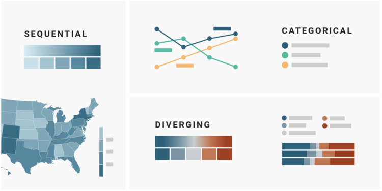
 Visualize This: The FlowingData Guide to Design, Visualization, and Statistics (2nd Edition)


