• Membership
  • Newsletter
  • Projects
  • Learning
  • About
  • Member Login
  • Cycling and mapping all the streets in London

    March 4, 2020

    Topic

    Self-surveillance  /  cycling, Davis Vilums, London

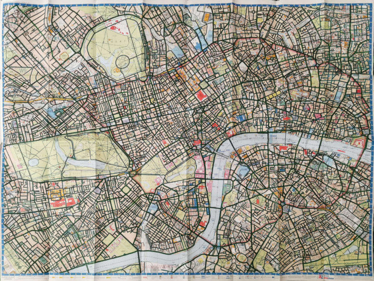
    Davis Vilums set a goal to cycle every street in London on his way to work (without being late). After four years, he accomplished his goal:

    I am a passionate cyclist, and I love the streets of London. Most of my travels are daily 25-minute rides to work. Over time my route became boring. I decided to make it a little bit more interesting by taking the parallel streets on my way there. I bought a map of central London and started to colour in the streets to mark the routes that I have taken. And then I got obsessed with it.

  • R turned 20 years old

    March 3, 2020

    Topic

    Software  /  birthday, R

    R turned 20 last week. The first public release of R was on February 29, 2000. Jozef Hajnala with the look back:

    The power of R comes by no small part from the fact that it is easily extensible and the extensions are easily accessible using The Comprehensive R Archive Network, known to most simply as CRAN.

    My initial reaction was, “Wow, 20 years. R is old.” And then I realized, “So R was only… three when I started using it… wait a minute.”

  • SVG and CSS animations, without JavaScript

    March 3, 2020

    Topic

    Coding  /  animation, CSS, SVG

    Andrew Wang-Hoyer built over 200 animations on and off over two years. They are satisfyingly hypnotic. They also only use SVG, CSS, and HTML, and you can get the code on GitHub.

    I feel like sans-JavaScript is becoming a thing. Is this becoming a thing?

  • Super Tuesday simulator

    March 2, 2020

    Topic

    Statistical Visualization  /  election, FiveThirtyEight, simulation, Super Tuesday, uncertainty

    With Super Tuesday on the way, there’s still a lot of uncertainty for what’s going to happen. FiveThirtyEight has their forecast, but even with results expressed as odds and probabilities, the outcome almost seems static and concrete. So FiveThirtyEight has a different way of poking at their forecast. Pick the winners in each state, note how the conditional probabilities change as you go, and see what might happen in the rest of the primary given your picks.

  • Small multiples pizza baby

    March 2, 2020

    Topic

    Infographics  /  Amanda Makulec, baby, pizza

    For each month in her child’s first year, Amanda Makulec took a picture of her baby and a pizza. Each slice represents a month. Hence, pizza baby.

  • How to Make a Dynamic Multi-population Pyramid in Excel

    Create better population pyramids that allow for improved comparisons between sexes and populations.

  • Testing Gmail’s tab choices on presidential candidates’ emails

    February 28, 2020

    Topic

    Statistics  /  election, Gmail, Google, Guardian, The Markup

    For many, Gmail automatically categorizes incoming emails to the primary inbox, promotions, and spam. The Markup and The Guardian tested the categorization on presidential candidate emails:

    Their results:

    I don’t use Gmail, and I don’t get any of these emails, but I’m curious how these candidate emails differ. Does Buttigieg write more personal messages whereas Sanders’ is more like an advertisement?

  • Face mask respirator and its usefulness with different beard styles

    February 27, 2020

    Topic

    Infographics  /  beards, CDC, coronavirus, mask

    The Centers for Disease Control and Prevention made this graphic to show what beard styles work and do not work with a respirator. If there is hair in the way, the seal breaks. The CDC made it a couple of years ago for No-shave November, hence the playful tone, but with coronavirus concerns, it’s once again made relevant.

    It reminds me of the trustworthiness of beards.

    Also, wash your fingers.

  • Members Only

    Visualization Tools, Datasets, and Resources — February 2020 Roundup (The Process #78)

    February 27, 2020

    Topic

    The Process  /  roundup

    Every month I collect useful tools and resources for visualization. Here’s the good stuff for February 2020.

  • Living room corner pie chart

    February 27, 2020

    Topic

    Miscellaneous  /  corner, humor, pie chart

    From reddit user shoru_lannister, here is a pie chart of their living room corner.

    Do we have another contender for best pie chart? I think the pyramid pie chart still has an edge.

  • BellTopo Sans is is a free typeface based on maps from 1800s

    February 26, 2020

    Topic

    Design  /  cartography, Sarah Bell, USGS

    While working on maps inspired by USGS maps from the 1800s, Sarah Bell made a typeface to match:

    While making my own USGS-inspired maps, my search never returned the exact type of font I was looking for. The fruitless search was serendipitous however, because it provided the push to make my own. It was designed for map labels that are no larger than 80-100pt, but usually much smaller. I decided to name it BellTopo Sans with the plan to create a serif version.

    She made it available here.

  • Map shows how NASA satellites collect global rain data

    February 25, 2020

    Topic

    Maps  /  collection, NASA, precipitation, satellites

    [arve url=”https://www.youtube.com/watch?v=bO9-dyYK3qQ” loop=”no” muted=”no” /]

    We can download data as a single snapshot in a single file, but oftentimes that data is generated piece-by-piece. In the map above, NASA shows how they piece together rain data with a network of satellites:

    The ten currently-flying satellites in the Global Precipitation Measurement Constellation provide unprecedented information about the rain and snow across the entire Earth. This visualization shows the constellation in action, taking precipitation measurements underneath the satellite orbits. As time progresses and the Earth’s surface is covered with measurements, the structure of the Earth’s preciptation becomes clearer, from the constant rainfall patterns along the Equator to the storm fronts in the mid-latitudes.

    [via kottke]

  • Grandpa Chad distribution

    February 23, 2020

    Topic

    Infographics  /  age, humor, names, xkcd

    xkcd crossed a rough age distribution of people becoming grandparents with people named “Chad” and “Jason” to highlight the dawn of a new era. The time is now.

  • Canceled flights due to coronavirus

    February 21, 2020

    Topic

    Maps  /  China, coronavirus, flights, New York Times

    With an animated side-by-side map, The New York Times shows canceled flights in efforts to slow down the spread of the coronavirus. The left map represents 12,814 flights within China on January 23. The right map shows 1,662 on February 13. Keep scrolling to see changes for flights leaving China to other countries.

  • Map of mathematics

    February 21, 2020

    Topic

    Infographics  /  math, Quanta

    The Map of Mathematics from Quanta Magazine explains key concepts with animated visualizations:

    From simple starting points — Numbers, Shapes, Change — the map branches out into interwoven tendrils of thought. Follow it, and you’ll understand how prime numbers connect to geometry, how symmetries give a handle on questions of infinity.

    And although the map is necessarily incomplete — mathematics is too grand to fit into any single map — we hope to give you a flavor for the major questions and controversies that animate the field, as well as the conceptual tools needed to dive in.

  • Scale of Bloomberg net worth

    February 20, 2020

    Topic

    Infographics  /  Bloomberg, Mother Jones, net worth, scale

    While we’re on the topic of Mike Bloomberg’s money, here’s another view from Mother Jones:

    I guess he’s rich.

  • Members Only

    A Better Chart, Limitations Considered: Exit Poll Results (The Process #77)

    February 20, 2020

    Topic

    The Process  /  poll results, remake, television

    Welcome to a new segment where I try to put myself in the shoes of someone who made a bad chart and try to make it better.

  • Bloomberg ad spending, relative to other candidates’

    February 20, 2020

    Topic

    Infographics  /  ads, Bloomberg, election, spending, Washington Post

    Mike Bloomberg’s ad spending might not be that much relative to his own net worth, but compared to other candidates’ spending, it’s a whole lot of money. The Washington Post puts the spending into perspective with a long scroller. Each rectangle represents $100k, and there are “mile markers” along the way to keep you anchored on the scale.

  • Forgotten map types

    February 19, 2020

    Topic

    Maps  /  Tim Wallace, vintage

    Geographer Tim Wallace likes to look at old maps, and is particularly fond of the weird and forgotten types:

    So, I slowly amassed a more complete list. And here it is. Most of these map types are silly or unusual, not forgotten. Many of them are even deliberately taken out of context to highlight their wackiness and how easily maps can be misread (I sure misread them all the time!).

    It’s fun poking around the Internet Archive and HathiTrust, blowing the digital dust off of a volume with 0 views and having a look. You never know what you’ll find. Maybe a forgotten map type?

    The above is the long forgotten but everlasting Gobstopper zone map.

  • Datylon Graph is a visualization extension for Illustrator

    February 18, 2020

    Topic

    Software  /  Datylon, Illustrator

    Adobe Illustrator has charting functions that can be useful if you’re on a deadline. Make a quick chart, design, and publish. However, if you want to reuse the chart with new data or need to use a more complex chart type, it’s usually been better to use different software and then come back to Illustrator to adjust.

    Datylon Graph is an extension that aims to make it easier to stay in Illustrator for your full workflow. It promises reusable charts, collaborative tools, and a growing visualization library.

    It currently starts at €7.50 per month with a 14-day free trial. I’m skeptical about working completely in Illustrator, but I’ll have to kick the tires on this soon.

  • Page 110 of 392
  • <
  • 1
  • ...
  • 107
  • 108
  • 109
  • 110
  • 111
  • 112
  • ...
  • 392
  • >

Analyze, visualize, and communicate data usefully, beyond the defaults.

Become a member →

Recently for Members

May 15, 2025
Step Chart, Enhanced

May 8, 2025
When the data is not what it seems

May 1, 2025
Finding the Right Charts

April 24, 2025
Visualization Tools, Datasets, and Resources – April 2025 Roundup

April 17, 2025
Breaking Out of Chart Software Defaults

Browse by Chart Type See All →

Barcode Chart Heatmap Sankey Diagram Spiral Chart Pie Chart Line Chart Surface Plot Ternary Plot Bubble Chart

Browse By Topic

  • Visualization

    Seeing data

  • Maps

    Seeing geographic data

  • Infographics

    Explaining data

  • Networks

    Connecting data

  • Statistics

    Analyzing data

  • Software

    Working with data

  • Sources

    Getting data

  • Design

    Making data readable

Get the Book

Visualize This: The FlowingData Guide to Design, Visualization, and Statistics

Available now.

Order: Amazon / Bookshop

Made by FlowingData

  • The Process

  • Data Underload

  • Chart Everything

  • Guides

  • Books

  • Shop

  • About
  • Contact
  • Newsletter
  • LinkedIn
  • Instagram
  • Bluesky
  • RSS
Copyright © 2007-Present FlowingData. All rights reserved.