Game of Distraction

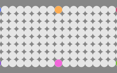
They say a watched pot never boils. So here’s a game where you try to make a pot boil by looking somewhere else. More distraction leads to more points.


This is a toy, but as you might expect, there’s plenty of research that suggests we perceive time to move slower when we stare at that metaphorical pot.

Going the other direction, and maybe more important for these current days, time seems to move faster when we’re occupied by a goal. Philip Gable and Bryan Poole published research in 2012 about how time flies when you’re having approach-motivated fun. They showed hungry psychology students a series of pictures, and the subjects appeared to perceive time to move faster when they saw pictures of food versus neutral pictures like geometric shapes.

On top of that, in 1997, Angrilli, et al. studied how emotion plays a role in time perception. Subjects appeared to estimate time moving slower when shown pictures of anger or scowling than when shown happy pictures.

So, I think I’m going to read less news, which tends to be a not so happy place. I’ll just keep on cooking quarantine recipes and maybe learn to make better games.


Become a member. Support an independent site. Make great charts.

See What You Get
Learn to Visualize Data See All →

How to Make Interactive Frequency Trails with D3.js

Layering time series data or distributions with this method can change the feel and aesthetic versus a multi-line chart or small multiples. In some cases, frequency trails let you show more in less space.

How to Make Chord Diagrams in R

Show connections in the circular layout for a more compact presentation.

How to Flatten the Curve, a Social Distancing Simulation and Tutorial

Using R, we look at how your decreased interaction with others can help slow the spread of infectious diseases.

How to Make Baseline Charts in R

By shifting the baseline to a reference point, you can focus a line chart on relative change, which can improve the visibility of smaller categories.

Favorites

Finding the New Age, for Your Age

You’ve probably heard the lines about how “40 is the new 30” or “30 is the new 20.” What is this based on? I tried to solve the problem using life expectancy data. Your age is the new age.

A Day in the Life of Americans

I wanted to see how daily patterns emerge at the individual level and how a person’s entire day plays out. So I simulated 1,000 of them.

Divorce Rates for Different Groups

We know when people usually get married. We know who never marries. Finally, it’s time to look at the other side: divorce and remarriage.

Causes of Death

There are many ways to die. Cancer. Infection. Mental. External. This is how different groups of people died over the past 10 years, visualized by age.