xkcd continues to answer the important questions.…
Nathan Yau
-
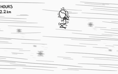
What if you floated upwards one foot every second
-
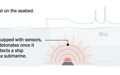
Naval mine mechanics illustrated
Iran is starting to deploy mines in the Strait of Hormuz. For the…
-
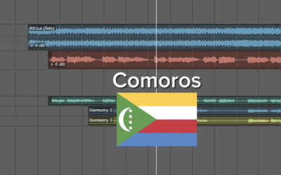
Africa by Toto with the lyrics switched out for the countries
You’re probably familiar with the song “Africa” by Toto. This version, by There…
-

Shades of a lunar eclipse
There was a total lunar eclipse on March 3, 2026. From Michala Garrison…
-
Members Only
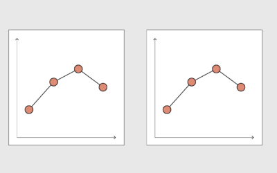
Faking real charts
This week is about fake charts and keeping ourselves in the feedback loop.
-
Class action lawsuit for Grammarly
After backlash over their tool that pretends to provide expert editing advice, Grammarly…
-
Grammarly pretends to provide expert reviews
Upon finding out that Grammarly uses AI-generated editing, supposedly driven by real authors,…
-

Outdated data used in U.S. strike on elementary school in Iran
School children were killed in the poorly informed attack. The New York Times…
-

Choose the real music vs. generated
Shri Khalpada, as a technologist and musician, thinks through his mixed feelings for…
-
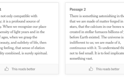
AI or human: writing passages
We are approaching a point (or we’re here already) where generated output is…
-
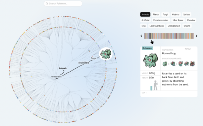
Pokemon tree of life
Pokemon is in its 30th year of existence. The Straits Times visualized the…
-
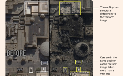
Satellite images that are AI fakes
To everyone’s surprise, that people definitely did not see coming, fake satellite images…
-

Bird search patterns
By Nadieh Bremer with Emily Barone, this is a charming piece on the…
-
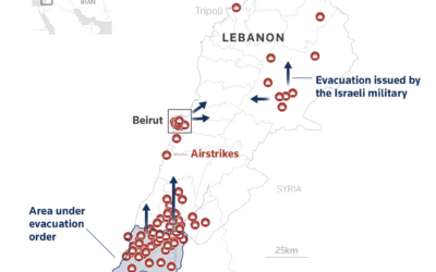
Maps and charts for what is happening in Iran
Reuters Graphics has a feed of maps and charts for updates on Iran.…
-
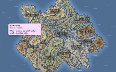
Mapping what makes us happy
In 2017, researchers asked study participants via MTurk to list three happy moments…
-
Database to explore conflicts of interest through financial disclosures
ProPublica has been collecting thousands of disclosure documents, and they made a searchable…
-
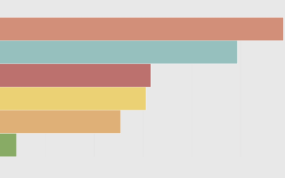
Unemployment reasons, by age and education
Why Americans are unemployed varies across groups.
-
Members Only
Animating data for fun and interest
This week is about animating data to better show insights and to keep randos engaged on the internets.
-
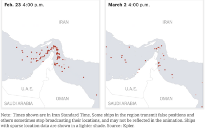
Oil supply chain slowdown
The New York Times mapped the traffic difference at the Strait of Hormuz,…
-
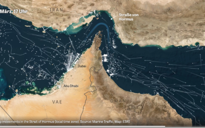
Marine traffic through the Strait of Hormus
Normally there is a steady flow of ships through the strait, but when…
Recently for Members
Second Edition
 Visualize This: The FlowingData Guide to Design, Visualization, and Statistics (2nd Edition)
 Visualize This: The FlowingData Guide to Design, Visualization, and Statistics (2nd Edition)
New tools, refined process.
Browse by Chart Type See All →


