From Rod Bogart, a Voronoi diagram of people sitting in Bryant Park. It’s…
Nathan Yau
-

Voronoi diagram of people in the park
-

Working on Tips, by State
What percentage of a waiter and waitress’s income comes from tips and what comes from salary? The calculation isn’t straightforward but we can try.
-
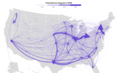
Flow of goods between states
Using data from the Freight Analysis Framework, Chris Canipe for Axios mapped the…
-
Google Trends eclipse interest
I feel like the large-volume coverage of the upcoming eclipse doesn’t quite match…
-
Roomba selling maps of home interiors
Newer Roomba vacuums form a map of your house to more efficiently clean…
-
Office Hours
If you’re a FlowingData member, you can now access the new forum where…
-
Link
How Many Users Resize Their Browser? →
I’ve been slow to get into making things that are responsive. But maybe I should hurry up.
-
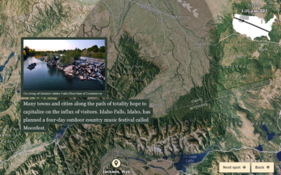
Satellite view of the upcoming eclipse’s path
In case you didn’t hear, a solar eclipse is on the way that…
-
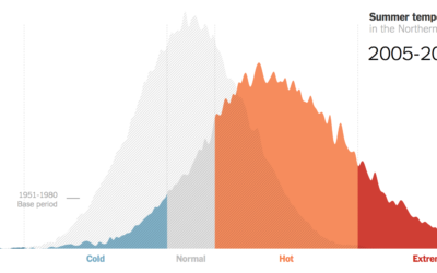
Hotter and hotter summers, extremely hot
Climate scientist James Hansen and team looked at summer temperatures over several decades.…
-

Why automation is different this time
Since forever, we’ve tried to make jobs easier. More automated. In many cases,…
-
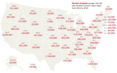
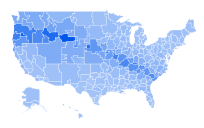
How many people might lose health insurance
The Urban Institute estimated how many people in each state gained health insurance…
-

Explaining the evolution of trust with game theory
Nicky Case, who has a knack for making complex topics playfully fun, delves…
-
Ten
FlowingData turned a decade last month. June 25 to be exact. Woo woo.
-

Divorce and Occupation, in 2015
Some jobs tend towards higher divorce rates. Some towards lower. Salary also probably plays a role.
-
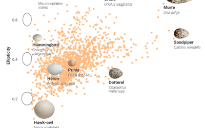
Charting bird egg shapes, and why so many varieties
Bird eggs come in all shapes and sizes, and people didn’t really know…
-
An interactive to explain histograms, for normal people
Histograms require some statistical knowledge to grasp, and without the tidbits, the distribution…
-

Shazam music recognition maps
Shazam is a service with an app that lets you point your phone…
-
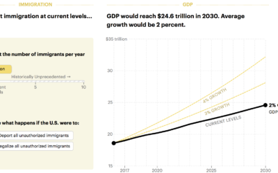
Boost economy with immigration
Want to increase the GDP? Easy. Let more immigrants in. Lena Groeger for…
-
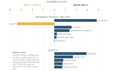
Gender representation in comic books
Amanda Shendruk for The Pudding analyzed how genders are represented differently in comic…
-
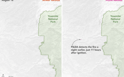
Algorithm to detect wildfires earlier
Traditional detection algorithms use infrared heat as the main signal of a wildfire.…
Recently for Members
Second Edition
 Visualize This: The FlowingData Guide to Design, Visualization, and Statistics (2nd Edition)
 Visualize This: The FlowingData Guide to Design, Visualization, and Statistics (2nd Edition)
New tools, refined process.
Browse by Chart Type See All →


