Firearms Dealers vs. Burgers, Pizza, and Coffee
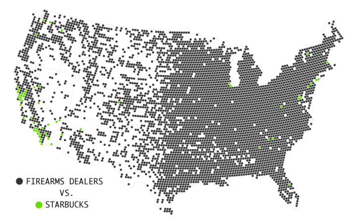
Earlier this year, 1 Point 21 mapped firearms dealers against Starbucks locations. Based on listings from the Bureau of Alcohol, Tobacco, Firearms and Explosives, the graphic drew attention to the large number of firearms dealers and pawnbrokers — about 6 for every Starbucks.
With the horrible Orlando shooting, the topic inevitably bubbled up again. There are an awful lot of places to buy a gun. As of May 2016, there were 64,432 licensed firearms dealers and pawnbrokers, according to the ATF, which got me wondering how that compares to other businesses.
I’ve made similar comparisons already, so I pulled up the old code and looked.
First though, here’s how Starbucks compares.
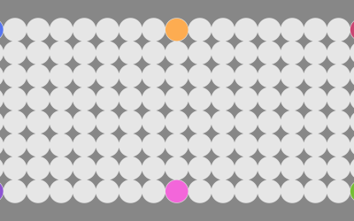
Each circle represents an area with a 10-mile radius. If there are more dealers than Starbucks locations, the area is colored black. If there are more Starbucks locations, the area is green.
While for many, it seems like Starbucks is ubiquitous nationwide, the coffee shop tends to concentrate in densely populated areas. So I thought, maybe if I compared dealers against all the major coffee chains in the United States, the former wouldn’t dominate the map so much.
I was wrong.
In fact, I tried the same count-to-count comparison with McDonald’s, which has more locations than Starbucks, but that didn’t change the patterns much. So I tried all the major burger chains. And then all the pizza.
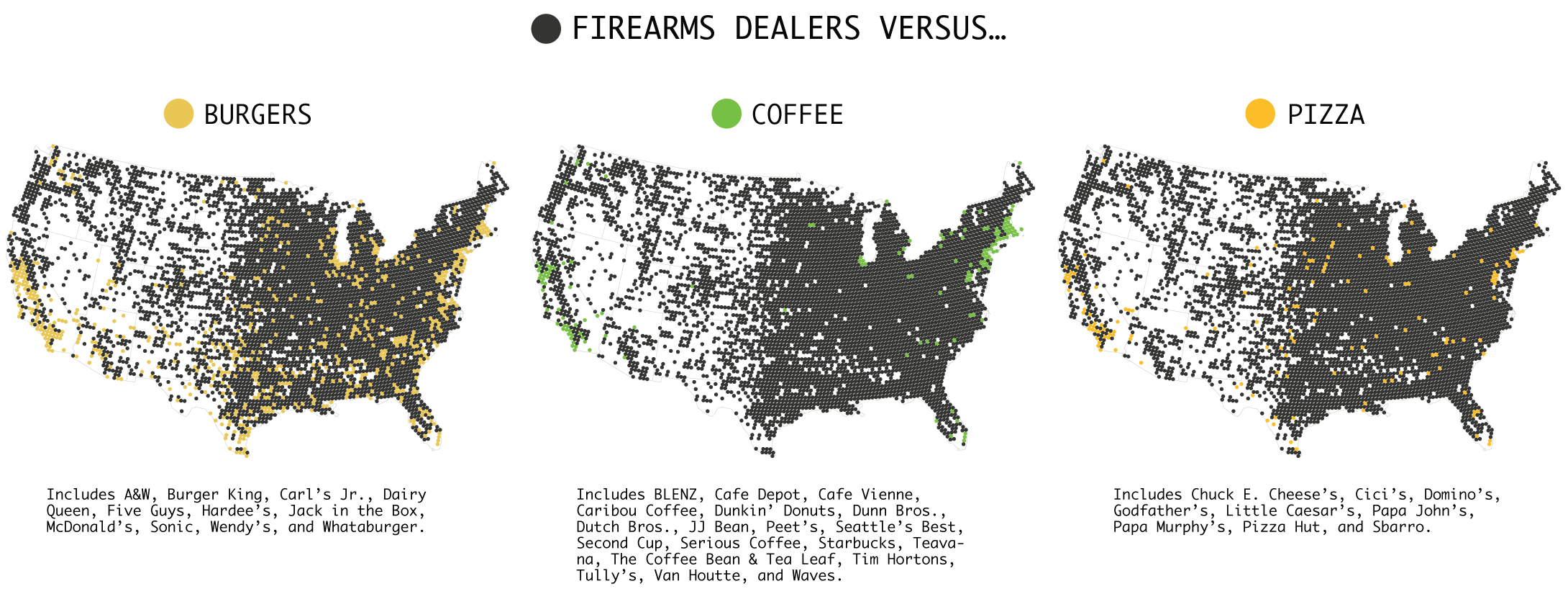
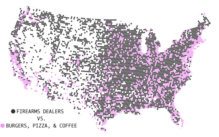
Like I said, there are a lot of dealers. It’s hard to say how many of these licensees actively sell firearms, but still. It isn’t until I sum all the burger, pizza, and coffee chains together against firearms dealers that there’s a noticeable change.
Business location data from AggData and list of firearms licensees from the Bureau of Alcohol, Tobacco, Firearms and Explosives.
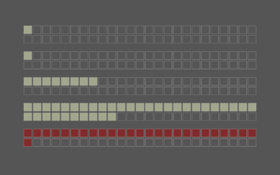
Chart Type Used

Become a member. Support an independent site. Get extra visualization goodness.
See What You Get