Who Still Smokes?
It’s been a couple of decades since California banned smoking in all enclosed workplaces. It’s long enough for it to seem like a long time ago but short enough to remember the smell of smoke in most restaurants. Heck, people used to smoke on airplanes.
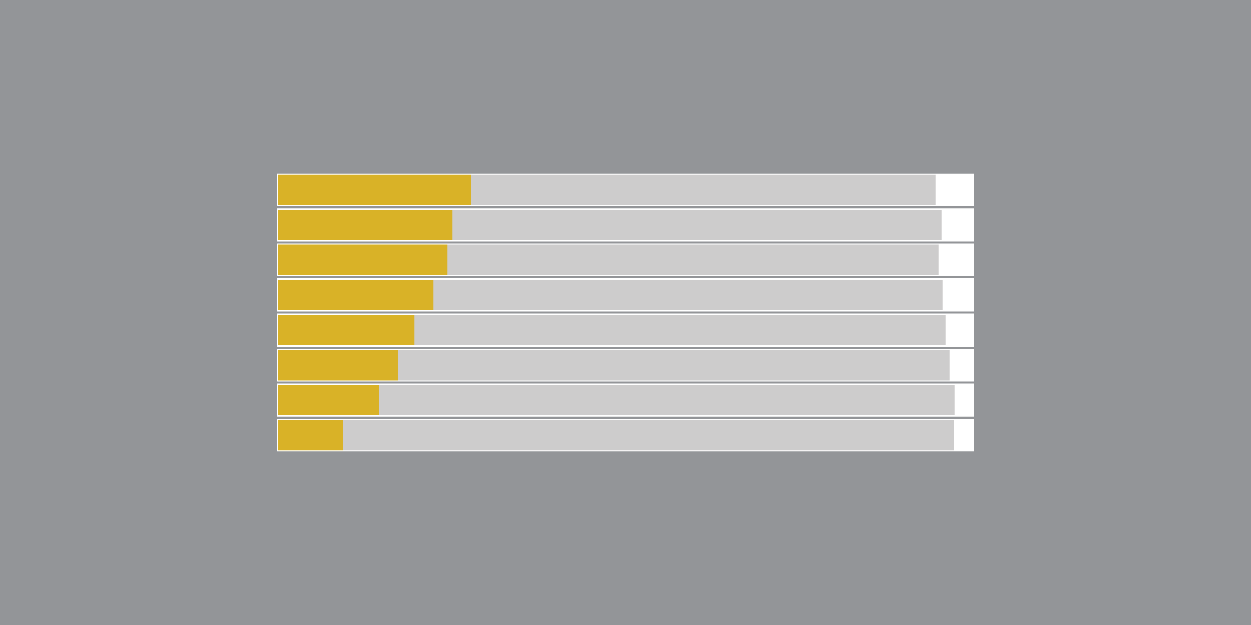
Two decades out from the 1995 law in California, along with the known impact of smoking on one’s health, you’d think smoking rates would be way down. And you’d be right for many demographic groups, but for some, smoking is still the same as it ever was.
See the differences and changes in the the charts below. They show estimated percentage of adult smokers among different groups, for 1994 and 2014. Estimates are based on survey data from the Behavioral Risk Factor Surveillance System.
Nerd Notes
- Data comes from the Behavioral Risk Factor Surveillance System, run by the Centers for Disease Control and Prevention. In 2014 there were 464,664 interviews, and in 1994 there were 105,853 interviews. Records are weighted to reflect the national population at the time.
- Household income was not adjusted for inflation. The income groups have stayed the same in the BRFSS survey, I’m guessing for comparability over years.
- I analyzed and prepared the data in R. I used d3.js to make stacked bar charts.
Become a member. Support an independent site. Make great charts.
See What You Get

