Joshua Rosenberg describes his one-day experience teaching R to 7th graders:
[T]he activity…
Nathan Yau
-
Teaching R to 7th graders
-
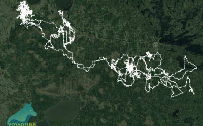
2,774 miles traveled by a lone wolf
From the Voyageurs Wolf Project, a map shows the travels of a lone…
-
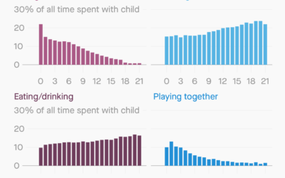
How parents spend time with their kids
For Quartz, Dan Kopf and Jenny Anderson on how time spent with kids…
-

Hours of daylight mapped as a function of latitude and time of year
Reddit user harpalss animated hours of day light by latitude and day of…
-
Members Only
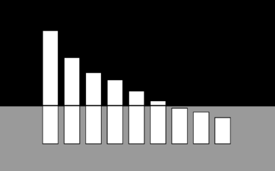
Bar Chart Baselines Don’t Have to Start at Zero? (The Process #66)
False.
-
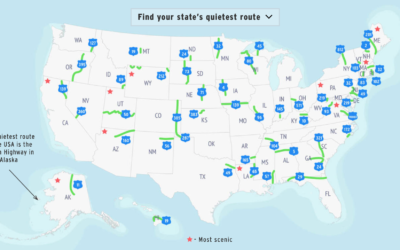
Quietest highway route in each state
Geotab made a rough estimate of the quietest route in each state, based…
-
Data life cycle
Summarizing a talk by Xaquín G.V., Natalie Gerhardstein for Delano:
Among González’ takeaways… -
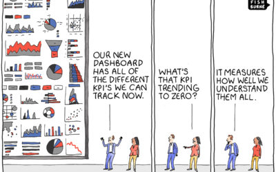
KPI overload
From Tom Fishburne, the Marketoonist. Maybe a dashboard isn’t the answer you’re looking…
-

Salary and Occupation, in 2018
Salaries vary across occupations. Here are some charts that show by how much for 800 of them.
-
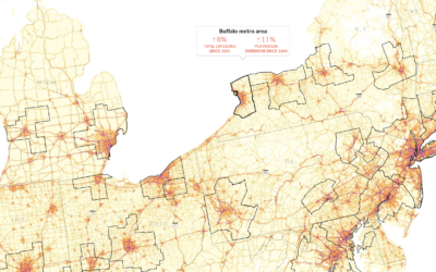
Making the most detailed map of auto emissions in America
Using estimates from the Database of Road Transportation Emissions, Nadja Popovich and Denise…
-
Members Only
The Best Visualization Course I Ever Took; Membership Update with New Points of View (The Process #65)
This week I reminisce back to when I didn’t know anything about visualization, and all I wanted to do was solve analysis problems. Also, some fun updates on the way, exclusively for members.
-
Why scientists need to be better at visualization
For Knowable Magazine, Betsy Mason looks at the state of (not so good)…
-

Growing Your Visualization Toolset (and Mine), a FlowingData Membership Update
It’s time to kick the tires on some new tools.
-
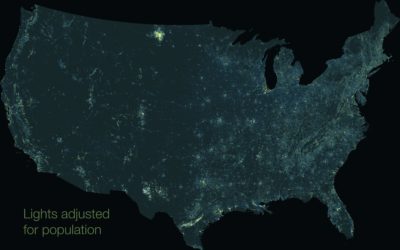
Map of nighttime lights normalized by population
You’ve probably seen the composite map of lights at night from NASA. It…
-
How Much You Should Be Saving for Retirement
There are a lot of variables to consider, but for people of middle income, here’s a suggestion, based on when you start saving and when you want to retire.
-
xkcd-style charts in JavaScript
For xkcd fans, here’s a JavaScript library by Tim Qian that lets you…
-
Saving for Retirement and Age
People tend to have more money saved up over time, but range and variation also grow, and often it’s not enough.
-
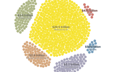
Paying for Elizabeth Warren’s proposed policies
Elizabeth Warren has big plans, and they would cost a lot with a…
-
Members Only

Cleaning and Formatting Data, What I Use (The Process #64)
There are many tools to clean up your data, and they can be helpful with the right dataset and situation. I tend to stick to a small handful. Here’s what works for me.
-
Randall Munroe of xkcd on Data Stories
Randall Munroe of xkcd was on the Data Stories podcast. He talks about…
Recently for Members
Second Edition
 Visualize This: The FlowingData Guide to Design, Visualization, and Statistics (2nd Edition)
 Visualize This: The FlowingData Guide to Design, Visualization, and Statistics (2nd Edition)
New tools, refined process.
Browse by Chart Type See All →


