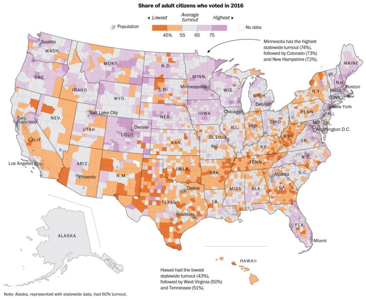
Based on data from Dave Leip’s Atlas of U.S. Presidential Elections, The Washington Post mapped voter turnout on a diverging color scale. Orange represents lower than average turnout in 2016 and purple represents higher than average.
Not to diminish the meaning of the map, but the most shocking part might be the placement of Hawaii.
 Visualize This: The FlowingData Guide to Design, Visualization, and Statistics (2nd Edition)