Tree of Life
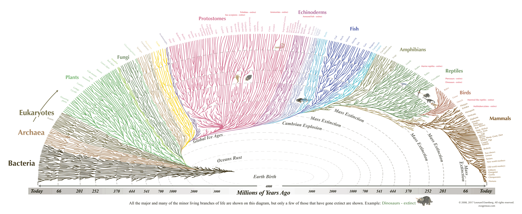
This Tree of Life diagram is based primarily on the evolutionary relationships so wonderfully related in Dr. Richard Dawkins’ The Ancestor’s Tale, and timetree.org. The smallest branches are purely illustrative. They are intended to suggest the effect of mass extinctions on diversity, and changes in diversity through time. This diagram is NOT intended to be a scholarly reference tool! It is intended to be an easy-to-understand illustration of the core evolution principle; we are related not only to every living thing, but also to everything that has ever lived on Earth.
Design-wise, there are many things that could’ve made the graphic more readable, but something about it makes me like it just the way it is.
Become a member. Support an independent site. Get extra visualization goodness.
See What You Get