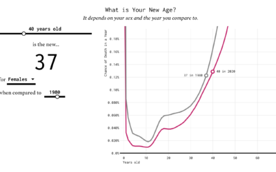
You’ve probably heard the lines about how “40 is the new 30” or “30 is the new 20.” What is this based on? I tried to solve the problem using life expectancy data. Your age is the new age.
Nathan Yau
-
Finding the New Age, for Your Age
-

Illustrated color catalog of minerals
Between 1802 and 1817, James Sowerby cataloged and illustrated 718 minerals across seven…
-
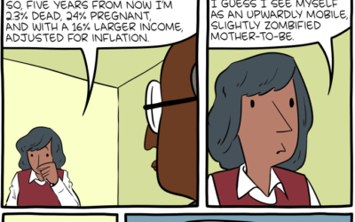
Five years from now
Saturday Morning Breakfast Cereal can see the future.…
-
Members Only

Visualization Tools, Datasets, and Resources – July 2020 Roundup
Here’s the good stuff for July.
-

What schools might look like if students go back
Dana Goldstein, with illustrations by Yuliya Parshina-Kottas, imagines what school might look like…
-
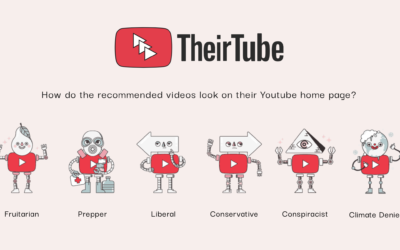
What YouTube recommendations look like for others
Watch enough YouTube, and you end up in a bubble of videos catered…
-
Tracking what happens to police after use of force on protestors
You’ve probably seen the videos. ProPublica is tracking to see what happens after:…
-
Tic-Tac-Toe the Hard Way is a podcast about the human decisions in building a machine learning system
From Google’s People + AI Research team, David Weinberger and Yannick Assogba build…
-

Spacecraft orbits
For The New York Times, Jonathan Corum illustrated the dozens of spacecraft orbiting…
-
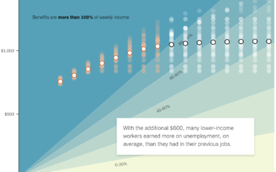
If the unemployed lose $600 per week
A $600 per week benefit expires for the unemployed at the end of…
-
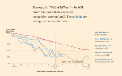
Defining ’90s music, based on song recognition
In search of songs that define music in the 1990s, Matt Daniels and…
-
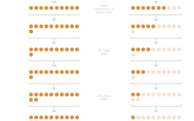
Wearing masks and infection rate
Studies suggest that wide adoption of masks can reduce the spread of the…
-
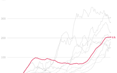
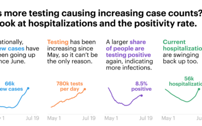
Comparing U.S. coronavirus case rates to other hot spots
The numbers are high here in the United States, and at this point,…
-
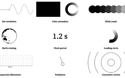
Visualizing periodicity with animations
Pierre Ripoll provides several ways to visualize periodicity using animation. Moving dots, rotating…
-
Members Only
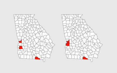
Maybe They’re Just Not Good at Charts Yet (The Process 099)
This week, people were taking a closer look at the Georgia Department of Public Health’s Covid-19 status page (again), which led to an unnecessary pile-on.
-

Park sounds before and during the pandemic
With lockdown orders arounds the world, places that we’re allowed to go sound…
-
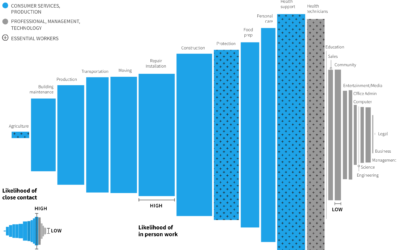
Remote work and industry
Some industries are more compatible with remote work than others. Jonathan I. Dingel…
-
Understanding Covid-19 statistics
For ProPublica, Caroline Chen, with graphics by Ash Ngu, provides a guide on…
-
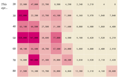
This Age is the New Age
30 is the new 20. Wait. 40 is the new 20. No, scratch…
-
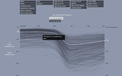
Unemployment for different groups
Unemployment has hit the United States hard over the past several months, for…
Recently for Members
Second Edition
 Visualize This: The FlowingData Guide to Design, Visualization, and Statistics (2nd Edition)
 Visualize This: The FlowingData Guide to Design, Visualization, and Statistics (2nd Edition)
New tools, refined process.
Browse by Chart Type See All →


