Household Types, Then and Now

We saw the most common household types in America. It starts with the one-person household, then to the married couple, the married couple with a kid, and so on.
But there were a couple of things I didn’t get to show: how common each household type is and how the makeup compares to a few decades ago.
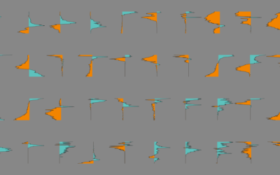
The interactive below shows the top 25 household types, based on estimates from the 2014 American Community Survey. Select the 1970 button to see how this compares to a time when it was much more common to live in a house with a married couple and a bunch of kids.
Each circle represents a member of the household, roughly sized by how common a type was in 2014. The gray circle represents a head of household, and colors represent the relationship of others to the head.
The main thing you notice when you switch between 1970 and 2014 is how common it was to have multiple kids and how rare it was to see unmarried couples during the former. The distribution kind of flips when you move closer to the present.
Although it’s also worth noting that the top 10 household types from 2014 account for 85 percent of the total, and those same 10 account for 83 percent in 1970. So while certain household types grow more common, as a whole, the main types still make up most of the country over the years. But now there’s more variation in the remainder.
Nerd Notes
- Data was from the one-year American Community Survey from 2014, made more accessible by the Integrated Public Use Microdata Series.
- I analyzed and processed the data in R. The final visualization was made with d3.js.
Become a member. Support an independent site. Make great charts.
See What You Get