A few years ago I downloaded speed dating data from experiments conducted by…
-
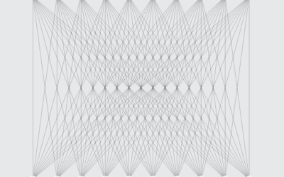
What the Sexes Want, in Speed Dating
-
Price of Damien Hirst spot paintings →
Damien Hirst is an artist known for a number of works, one of…
-

Other than advertisers
The Onion tackles data privacy:
“As a law-abiding resident of this nation, I… -
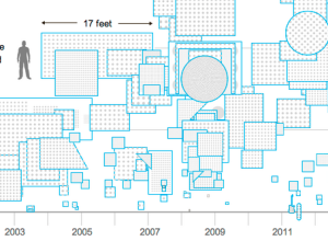
Easy mapping with Map Stack
It seems like the technical side of map-making, the part that requires code…
-
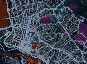
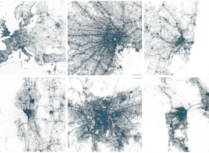
State of the OpenStreetMap
OpenStreetMap, the free wiki world map that offers up high quality geographic data,…
-
Link
NlpTools
NlpTools is a PHP library for natural language processing.
-
Link
Polychart
Polychart just launched its open beta. “Lightweight visual analytics and business intelligence on the web.” Mainly, a drag-and-drop interface for quick charts.
-
Nothing to hide
With all the stuff going on with surveillance and data privacy — especially…
-
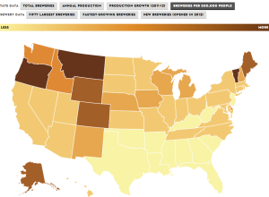
Rise of craft beer
The Brewers Association just released data for 2012 on craft beer production and…
-
Hans Rosling explains population growth and climate change
Because every day is a good day to listen to Hans Rosling talk…
-
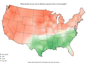
Map: Vernacular across America
When you talk to different people across the United States, you notice small…
-

Stupid calculations
Josh Orter takes back-of-the-napkin math to the next level with Stupid Calculations, which…
-

Map of London fire engine callouts
Using data from the London Fire Brigade, James Cheshire mapped 144,000 incidents in…
-
Myths of big data
Microsoft researcher Kate Crawford describes several myths of big data. Myth #4: It…
-
Comment to win a signed copy of Data Points
It seems like ages since we ran one of these.
It’s hard to… -
Link
Visualising data with ggplot2
Hadley Wickham gives a two-hour video tutorial on how to use his ggplot2 package in R. I have limited experience with it, but a lot of people really like it and use the package exclusively for their visual analysis needs.
-
Members Only
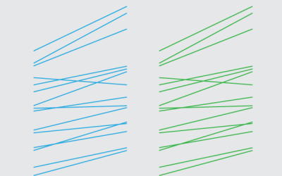
How to Make Slopegraphs in R
Also known as specialized or custom line charts. Figure out how to draw lines with the right spacing and pointed in the right direction, and you’ve got your slopegraphs.
-
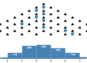
Central limit theorem animation
The central limit theorem:
In probability theory, the central limit theorem (CLT) states… -
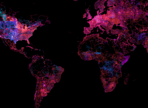
Geography of tweets
Twitter mapped all the geotagged tweets since 2009. There’s billions of them, so…
-
Link
Colour schemes
A bunch of color schemes and their corresponding hex codes.
Recently for Members
Second Edition
 Visualize This: The FlowingData Guide to Design, Visualization, and Statistics (2nd Edition)
 Visualize This: The FlowingData Guide to Design, Visualization, and Statistics (2nd Edition)
New tools, refined process.
Browse by Chart Type See All →


