This is a guest post by Joan DiMicco, who heads the IBM Visual…
-
Telling Stories with Data, A VisWeek 2010 Workshop
-
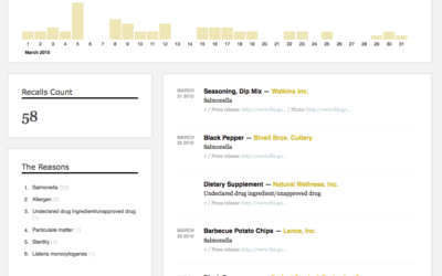
Making recalls and market withdrawals more accessible
Last week I found out that the FDA has a feed for all…
-
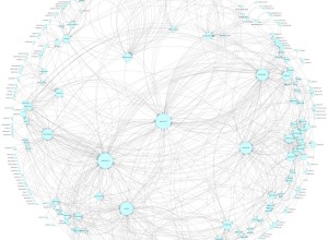
Mexican drug cartel network map
I’m not entirely sure what we’re looking at here, other than relationships between…
-
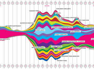
What New Yorkers complain about
Wired, in collaboration with Pitch Interactive, has a look at complaints called in…
-

Find the names in your data with Mr. People
Inspired by Shan Carter’s simple data converter, appropriately named Mr. Data Converter, Matthew…
-
Best of FlowingData – October 2010
Here are the most popular posts of October, according to combination of views…
-
Simple analysis makes Expedia extra $12m
There was a problem on Expedia where a lot of people were choosing…
-
Open thread: How do you start working on a data graphic?
People approach data in different ways, especially across different fields. When you’re presented…
-
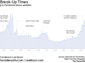
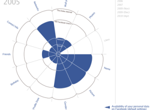
When people break up, according to Facebook updates
For his book The Visual Miscellaneum, David McCandless, along with Lee Byron, had…
-
Review: Atlas of Science, Visualizing What We Know
Katy Börner, professor of information science, catalogs visualization and science in Atlas of…
-
FlowingData is brought to you by…
My many thanks to the FlowingData sponsors. They help me keep the servers…
-
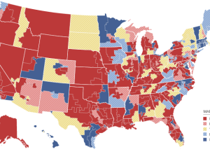
Keeping an eye on election results
All eyes here in the states will be on election results tonight, and…
-
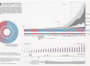
Past century of government and economy
John Palmer has a look at the past 100 years of government and…
-
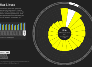
Issues Americans care about
Every year the Pew Research Center asks Americans what their top political priority…
-
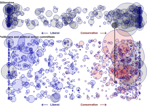
Billionaires’ favorite politicians
Jon Bruner for Forbes reports on billionaire contributions to politicians over the past…
-
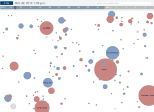
The Election on Twitter
In what seems to have become an expectation during all major events, a…
-
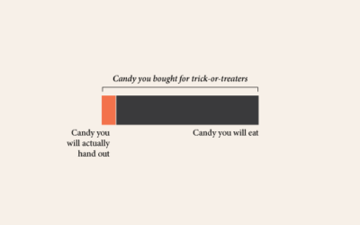
Data Underload #24 – My Candy
One pound for them. Nine pounds for you. Happy Halloween. Watch out for…
-
Stat concepts to the tune of Gershwin
Stat people will probably find this amusing. For the rest, this might make…
-

Famous logos and brands simplified
How well do you know your logos and brands? Or more importantly, how…
-

Why everyone should learn programming
Daniel Shiffman, assistant professor at the NYU Interactive Telecommunications Program, talks programming, computation,…
Recently for Members
Second Edition
 Visualize This: The FlowingData Guide to Design, Visualization, and Statistics (2nd Edition)
 Visualize This: The FlowingData Guide to Design, Visualization, and Statistics (2nd Edition)
New tools, refined process.
Browse by Chart Type See All →


