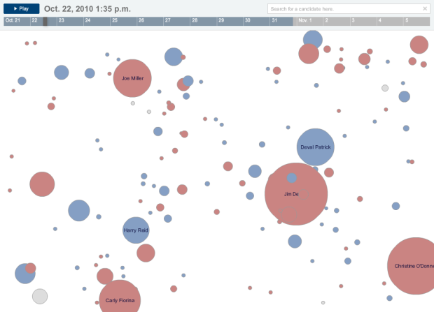
In what seems to have become an expectation during all major events, a Twitter tracker from the New York Times shows you what candidates are getting the most and least buzz. Each circle represents tweets from a candidate, retweets, and tweets direct at, colored appropriately by party. Press play and they grow and shrink over time. Select a specific candidate(s) to see the specific breakdowns.
The Election on Twitter
4 Comments
Second Edition
 Visualize This: The FlowingData Guide to Design, Visualization, and Statistics (2nd Edition)
 Visualize This: The FlowingData Guide to Design, Visualization, and Statistics (2nd Edition)
New tools, refined process.
So what does the dot x- and y-position mean? Is is an attempt at crude geographical mapping? Ideology mapping across two parameters? Something else?
Remember, though, that Twitter users skew to an older population, which tends to vote more often. It “might” be interesting to do a post-election correlation to see if Twitter is a good predictive metric.
I’m not sure if I get this exactly – just because someone is tweeted about doesn’t mean that is good or bad or that someone will be voting for the person – they might be getting a lot of flack or ridicule via Twitter – or conversely they might be getting positive feedback or mentions – this isn’t tracking that from what I can tell. So great big circles may not be a good thing – of course there is that sentiment that any publicity is good publicity – but well, that remains to be seen- I think a few candidates have proven that to be a fallacy.
@Pam – Right, and good point. I think that’s how it’s meant to be read. it’s a way to see who’s being talked about on twitter, and from there you can look deeper through the links to google news.