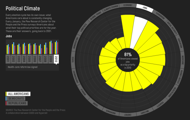
Every year the Pew Research Center asks Americans what their top political priority is for the year. It should come as no surprise that the economy, jobs, and terrorism top the list.
Good and Hyperakt have a look at how these priorities have changed over the past decade. Select the year of interest at the left, and the polar area diagram, where each wedge represents the amount of interest for an issue, updates accordingly. You can also switch to the interest amongst only Democrats or Republicans.
Grab the data from the Pew archives to take a look for yourself.
[Thanks, Deroy]
 Visualize This: The FlowingData Guide to Design, Visualization, and Statistics (2nd Edition)
Is the bar height or the bar surface area representative of the data relative size? Boring as it would be, a simple square bar graph would probably represent this better.
blame florence nightingale.