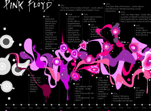
The National Science Foundation announced the 2009 winners of their annual visualization challenge.…
-
NSF Announces 2009 Visualization Contest Winners
-
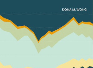
Review: The Wall Street Journal Guide to Information Graphics
Add another book to the growing library of guides on how to make information graphics the right way. Dona M. Wong provides the dos and don’ts of data presentation.
-
Open thread: What visualization tutorials do you want to see?
After the county map tutorial a few months ago, I decided to write…
-
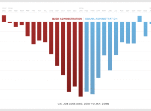
Road to Recovery – Is the Recovery Act working?
The Obama administration just posted a graph showing monthly job loss from December…
-

Build Online Visualization for Free with Tableau Public
Tableau Software, popular for making data more accessible, mainly in the business sector,…
-
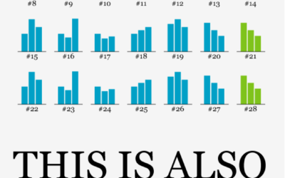
Data Underload #9 – Big Graphic Blueprint
Go big or go home.
-
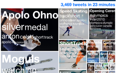
Watching the Pulse of the Olympics on Twitter
The Olympics are in full swing, so of course Twitter is abuzz with…
-
Weekend Fodder: Valentine’s Geekery
Tales around the Web for everyone’s favorite holiday.
Obligatory Valentine’s Day map –… -
Math Functions in the Real World
RIT student Nikki Graziano photographs math functions in the real world. Some are…
-
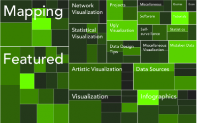
An Easy Way to Make a Treemap
If your data is a hierarchy, a treemap is a good way to show all the values at once and keep the structure in the visual. This is a quick way to make a treemap in R.
-
Get a Date With Your Online Profile Pic – Myths Debunked
The online dating world can be a confusing place. How do you interact…
-
Track Mouse Activity On Your Computer
Anatoly Zenkov provides this nifty tool (Mac and PC) to track your mouse…
-
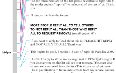
Data Underload #8 – Unsolicited
A few months back, the Caltrans Performance Measurement System (PeMS) opened up a…
-
Weekend Fodder
Here are some links and stuff to chew on as you wait for…
-
Undergraduate Summer Program for Statistics
If you’re an undergraduate with an interest in data and statistics, you should…
-
Excessively Labeled Airplane Tells You Where the Big Cheese Sits
In case the in-flight pamphlet isn’t enough for you, everything on this Kulula…
-
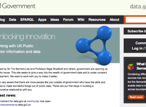
Data.gov.uk versus Data.gov – Which wins?
Back in May last year, the US government launched Data.gov as a statement…
-
Status Update for the World Progress Report
Just a quick update for those who ordered the World Progress Report. It’s…
-
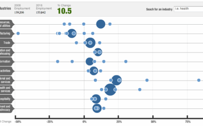
Future of Employment in the Decade Ahead
NPR shows projected employment changes from 2008 to 2018. Large circles represent major…
-
The Most Efficient Way to Type
Are you using the most efficient typing technique or are your fingers jumping…
Recently for Members
Second Edition
 Visualize This: The FlowingData Guide to Design, Visualization, and Statistics (2nd Edition)
 Visualize This: The FlowingData Guide to Design, Visualization, and Statistics (2nd Edition)
New tools, refined process.
Browse by Chart Type See All →


