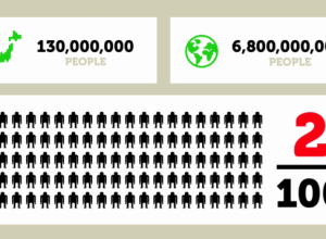
March 22 was World Water Day, and TreeHugger posted this graphic on drinking…
-
Discuss: Flowchart on drinkable water in the world
-
Mapping GitHub – a network of collaborative coders
GitHub is a large community where coders can collaborate on software development projects.…
-
Japan, the strange country, in motion graphics
Design student Kenichi Tanaka animates the history of Japan for his final thesis…
-
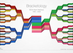
March Madness Bracketology
The Final Four is just about here. Who’s going to win it all?…
-
Design for America – Win $5,000
In a follow up to Apps for America, Sunlight Labs just introduced their…
-
How to: make a scatterplot with a smooth fitted line
Oftentimes, you’ll want to fit a line to a bunch of data points. This tutorial will show you how to do that quickly and easily using open-source software, R.
-
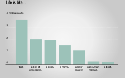
Data Underload #15 – Life Simile
You never know what you gonna get. Life is also known to be…
-
The periodic table to end all periodic table ridiculousness
A few centuries ago, scientists designed the periodic table to organize the elements…
-
IBM data propaganda – babies and old guys with glasses
IBM has been spreading the whole “smarter planet” spiel for a while now,…
-
Wear the weather as a bracelet
We all know that data is the new sexy, so it’s only natural…
-
Comment to win free copies of ‘Beginning Python Visualization’ – Winners announced
You know when you’re going through old junk and find something really awesome…
-
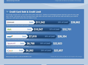
What your email says about your finances
This graphic shows average debt categorized by email provider. Average age for Gmail…
-
The Growing Plague that is Spam
Spam sucks. We all hate it, but no matter how good the filter,…
-
Poll: What do you mostly use visualization for?
We use visualization for a lot of different things, and its purpose varies…
-
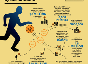
March Madness by the numbers
I didn’t fill out my bracket this year, so it’s not nearly as…
-

Buy and sell data at Data Marketplace
Add another site to the list of places to find the data you…
-
Data Underload #14 – Popeil Pitch
As corny as the Ronco infomercials are, you can’t help but stop and…
-

Weekend Fodder
The strange science of Francis Galton – Inspired by his cousin Charles Darwin’s…
-
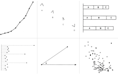
Graphical perception – learn the fundamentals first
Before you dive into the advanced stuff – like just about everything in your life – you have to learn the fundamentals before you know when you can break the rules.
-
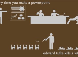
Powerpoint and dying kittens
I’m 96% sure this isn’t true. I have no evidence to backup nor deny these claims.
Recently for Members
Second Edition
 Visualize This: The FlowingData Guide to Design, Visualization, and Statistics (2nd Edition)
 Visualize This: The FlowingData Guide to Design, Visualization, and Statistics (2nd Edition)
New tools, refined process.
Browse by Chart Type See All →


