Simple yet effective. Any questions? [via 9gag | Thanks, Barry]…
-

How Genetics Works
-

Think Like a Statistician – Without the Math
I call myself a statistician, because, well, I’m a statistics graduate student. However, the most important things I’ve learned are less formal, but have proven extremely useful when working/playing with data.
-

Visualize your Last.fm listening patterns with LastHistory
Frederik Seiffert provides this nifty tool, LastHistory, to visualize your Last.fm listening history.…
-
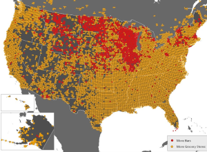
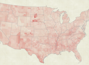
Where Bars Trump Grocery Stores
FloatingSheep, a fun geography blog, looks at the beer belly of America. One…
-
The State of the Internet
From JESS3 is this video on the state of the internet. It’s essentially…
-
Data Underload #11 – American Hockey
American interest in hockey went from practically zero to near Canadian status.
-
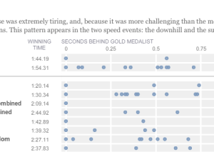
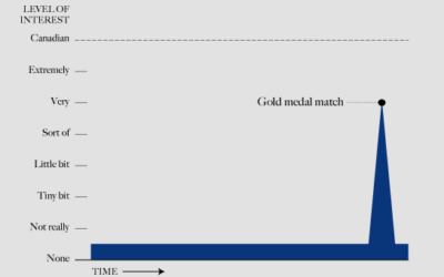
Olympic musical – how fractions of second make all the difference
Like everyone, I’ve been watching the Olympics, and it continues to amaze me…
-
Weekend Fodder
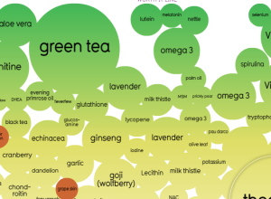
Snake oil? Scientific evidence for health supplements – Some work as advertised. Others…
-
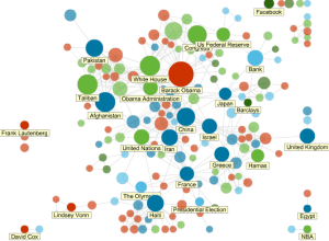
News Topics as Social Network
All news is connected in some way or another. News Dots from Slate…
-

Evolution of Olympic Pictograms
Every Olympics since 1936 has had a series of pictograms (i.e. icons that look like restroom signs) that represents the events.
-
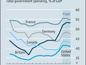
Challenge: make this graph easier to read
The Economist discusses the return of big government and includes this graph showing total government spending as a percentage of Gross Domestic Product. Is there a better way to represent the time series?
-
An Exploration of Biological Records
The Natural Science Museum of Barcelona has a growing database of 50,000 records…
-

Spirit of graph and dance is alive
A good portion of my time in high school was spent trying to…
-
Cleaning house.
I’m transitioning to a new server right now, and let me tell you.…
-

Man as Industrial Palace, Animated
In 1926, Fritz Kahn illustrated man as a working factory in his famous…
-
Sunlight Labs releases mapping framework, ClearMaps
Open data is great, but it’s useless if you don’t know what to…
-
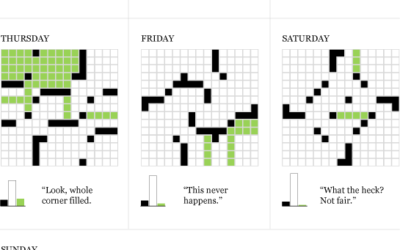
Data Underload #10 – Daily Crossword
Working towards the ultimate Sunday crossword.
-
Thank you, FlowingData sponsors
A big thank you to FlowingData sponsors. They help keep the blog running…
-
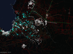
OpenStreetMap Edits Towards Haiti Relief
ITO world, who you might remember from a year of OpenStreetMap edits, come…
-
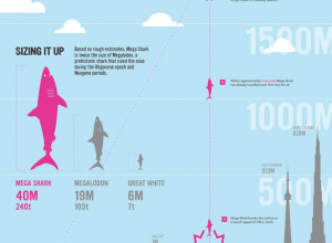
How a Giant Shark Took Down an Airplane
This graphic from designer Stephen Taubman is entertaining in so many ways. It…
Recently for Members
Second Edition
 Visualize This: The FlowingData Guide to Design, Visualization, and Statistics (2nd Edition)
 Visualize This: The FlowingData Guide to Design, Visualization, and Statistics (2nd Edition)
New tools, refined process.
Browse by Chart Type See All →


