A big thank you to FlowingData sponsors. They keep the virtual lights on…
-
Thanks, FlowingData Sponsors
-
Christopher Walken and Census
You should have received your Census survey by now. Did you fill it…
-

A Defense of the Unknown in Infographics
“We’re inventors – we’re creators. And that’s the most important thing about what we do.”
-

The everyday in Google Maps
With his usual cleverness, Christoph Niemann illustrates the everyday as Google maps. My…
-
Notes from Interactive Infographics #interinfo #sxsw
Yesterday was the Interactive Infographics panel at South by Southwest, and if Twitter…
-

Use your skills to help others
Designer Christopher Harrell talks about, with a dose of various embedded graphics, pointing…
-
Statistical Atlas from the ninth Census in 1870
In 1870, Francis Walker oversaw publication of the United States’ very first Statistical Atlas, based on data from the ninth Census.
-
Tim Berners-Lee with an update on open data
If people put data on the Web – government data, scientific data, community…
-
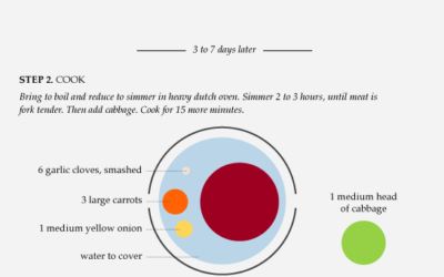
Data Underload #13 – Corned Beef Recipe
For as far back as I can remember, I’ve always had corned beef and cabbage on St. Patrick’s Day, or at least on the week of.
-
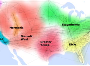
Weekend Fodder
How to split up the US – Geographic clusters based on social network…
-
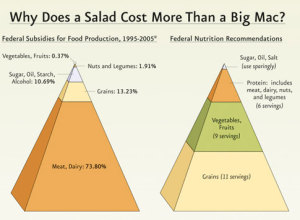
Challenge: Let’s do something with these 3-D pyramids
The government recommends a diet for healthy living, but there are billions of dollars of lopsided subsidies. Interesting point. Funky presentation.
-

Review: We Feel Fine (the book) by Kamvar and Harris
We Feel Fine, by Sep Kamvar and Jonathan Harris, is a selection of some of the best entries from the database of 12 million emotions, along with some insights into the growing dataset.
-
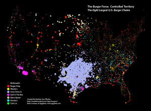
What burger chain reigns supreme?
In a follow up to his McDonald’s map, Stephen Von Worley of Weather…
-
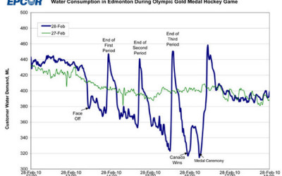
Canada: the country that pees together stays together
EPCOR, the water utility company that runs the fountains up in Edmonton, Canada…
-
Looking Inside a Bus Routing Algorithm
In an effort to put transit data from the Toronto Transit Committee to…
-
Edward Tufte will serve on Recovery Independent Advisory Panel
Big news for all you Edward Tufte fanboys and girls. He will be…
-
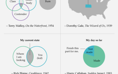
Data Underload #12 – Famous Movie Quotes
Here’s looking at you, data point.
-

Weekend Fodder
Footprints – Every building footprint, and nothing else, in Montgomery County, Ohio. It’s…
-
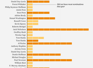
Is Jeff Bridges most likely to win best actor?
There’s this article on CNN, from The Frisky, that has this little theory…
-
Best of FlowingData – February 2010
It was a good month for FlowingData. We passed the 30k-reader mark, and…
Recently for Members
Second Edition
 Visualize This: The FlowingData Guide to Design, Visualization, and Statistics (2nd Edition)
 Visualize This: The FlowingData Guide to Design, Visualization, and Statistics (2nd Edition)
New tools, refined process.
Browse by Chart Type See All →


