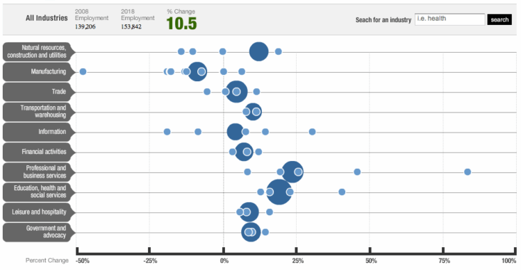
NPR shows projected employment changes from 2008 to 2018. Large circles represent major employment sectors and are sized by current employment numbers. Smaller circles are areas in the respective category.
Oddities
Maybe my eyes are playing tricks on me, but the sizes of the large sectors look funky. For example, is the bubble for Education, health, and social services really ten times the size of the bubble for Information? I don’t think so (and it should be).
It’d probably aslo be worth distinguishing between negative and positive growth. You know something simple like making the 0% line solid or color-coding the declining sectors.
What do you think?
[via The Big Picture | Thanks, Barry]
 Visualize This: The FlowingData Guide to Design, Visualization, and Statistics (2nd Edition)
I can’t figure out how they grouped them. From the January employment release (http://www.bls.gov/news.release/empsit.t14.htm), Information employed 2.8 million and education and health services employed 19.5 million. The graph also includes social services with education/health services, did that really employ 11 million?
hmm, yeah, something isn’t sitting right with this graphic.
Pingback: Weekly Roundup: Design Related Links #8 « Discovery Session… by Gerard Dolan