There have actually been some subtle changes in the Coca-Cola logo but not…
-
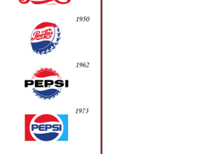
Pepsi and Coca-Cola Logo Design Over the Past Hundred Years
-
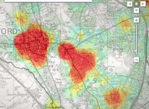
Mapping Crime in Oxford Over Time
Mentorn Media and Cimex Media, on behalf of BBC, explore crime patterns in…
-
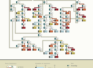
Choose Your Own Adventure – Most Likely You’ll Die
Remember those choose your own adventure books that you used to read as…
-
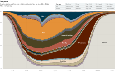
How People in America Spend Their Day
From Shan Carter, Amanda Cox, Kevin Quealy, and Amy Schoenfeld of The New…
-

Data is the New Hot, Drop-dead Gorgeous Field
We all know this already, but it’s nice to get some backing from…
-
your.flowingdata Update: Share Data and Set Reminders
It’s been about three weeks since I announced the new version of your.flowingdata…
-
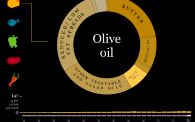
What Britain Has Eaten the Past Three Decades
The Department for Environment, Food and Rural Affairs (DEFRA) keeps an archive of…
-
Track Presidential Approval Ratings and Compare to Past
From William Couch, Kristen Novak, Michelle Price and Joshua Hatch of USA Today,…
-

Step-by-Step Guide On How to Get Shot by the Sartorialist
The Sartorialist is a unique fashion blog that highlights people’s hot styles on…
-
Watch the Ebb and Flow of Melbourne Trains
Similar to other visualizations showing location (e.g. Cabspotting, Britain From Above), this one…
-

Compare What Your Senators and Reps are Talking About With Congress Speaks
There’s a lot of talking in congressional meetings, but what are your state…
-
Friday Freebies: Beautiful Data is Now Available
Beautiful Data from O’Reilly is now available! The book is a collection of…
-
Animated Infographics for the Eat Local, Eat Real Campaign
I love food. I love infographics. Put them together, and this is what…
-
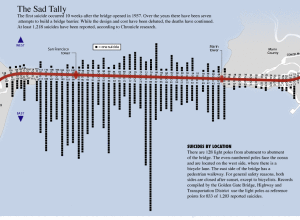
Suicides by Location on the Golden Gate Bridge
This graphic from SF Gate is a good four years old, well before…
-

Gauge Your Distraction While You Text and Drive in the Distracted Driving Game
From Gabriel Dance, Tom Jackson, and Aaron Pilhofer of the New York Times…
-
Friday Freebies: 5 E-book Copies of Beginning Python Visualization
It’s Friday! I don’t know about you, but I’m ready for the weekend,…
-
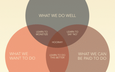
Three Ingredients to Make the Perfect Business
Thanks to Jessica Hagy and her Indexed project, we’ve seen lots of graphs…
-
Death and Taxes Poster 2010 – 50% Off for FlowingData Readers
Jess Bachman of WallStats just released his annual Death and Taxes Poster for…
-

IT Dashboard and Data from USAspending.gov
Taking another step towards data transparency, the US government provides the IT dashboard…
-

Comparing the Human and Chimpanzee Genomes
As part of the Explore Evolution exhibit at the University of Nebraska State…
Recently for Members
Second Edition
 Visualize This: The FlowingData Guide to Design, Visualization, and Statistics (2nd Edition)
 Visualize This: The FlowingData Guide to Design, Visualization, and Statistics (2nd Edition)
New tools, refined process.
Browse by Chart Type See All →


