Photo by nyki_m
Data visualization and infographics come in many forms. Some are…

Photo by nyki_m
Data visualization and infographics come in many forms. Some are…
A big thank you to our FlowingData sponsors who help keep the servers…
Visualize This: Obesity Rates by State
This segment of Visualize This is all…
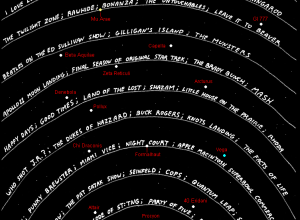
In a different take on a timeline of television, Abstruse Goose, a web…
While we’re on the subject of flight, ever since that plane landed in…
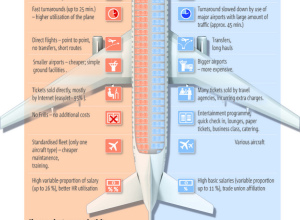
5W Graphics, whose work you’ve seen by now, compares lower-cost airlines to “regular”…
your.flowingdata (YFD), a Twitter application that lets you collect data about yourself, is…
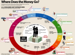
Add another graphic to the list of ways to show consumer spending. Visual…
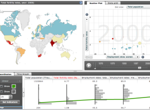
The Organization for Economic Co-operation and Development (OECD) makes a lot of world…
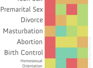
This graphic on religious teachings and sex is making the social media rounds.…
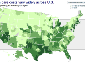
No, this isn’t a bad fungus spreading northwest towards Washington. This map from…
The brand new version of your.flowingdata (YFD) is coming soon, and of course,…
These ads for Hospital Alemán from Saatchi & Saatchi color code physical items…
Is the economy going to turn around any time soon? How does this…
Zum Kuckuck, a design group in Germany, visualizes data interchange and network traffic…
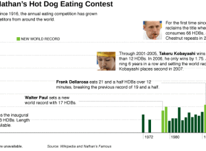
It’s July 4 this weekend. You know what that means, right? It’s Independence…

Contrary to what a lot people might think they know from the movies,…
Manolith, in collaboration with InfoShots, tells the story of Twitter. The graphic starts…
Visualization on the Web is growing, but a lot of the really good…
This is a guest review by Peter Robinet of Bubble Foundry, a web…
 Visualize This: The FlowingData Guide to Design, Visualization, and Statistics (2nd Edition)
New tools, refined process.


