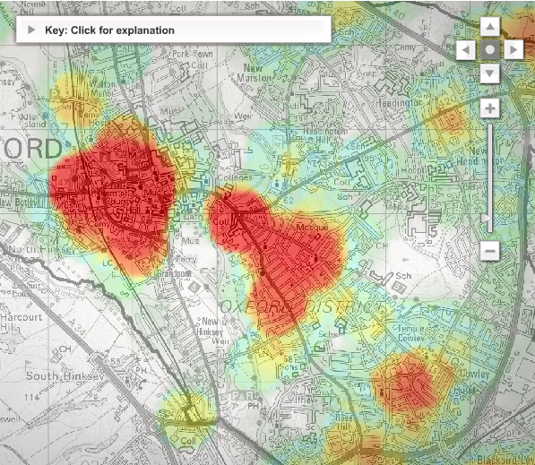
Mentorn Media and Cimex Media, on behalf of BBC, explore crime patterns in Oxford over time. In a map, that I am happy to see is not a Google mashup, select different kinds of crime (e.g. violent crime, burglary & theft), or if you live in the area, compare different neighborhoods by postcode. The interactive also provides three animations for a week in crime – street violence, street robbery, and rowdy behavior – complemented by narration and explanation.
One thing I’m not so sure about is the color scale. I think I would have gone with a yellow to red progression and left out the green since green usually means something positive. I’m also not sure what ‘high’ and ‘low’ levels of crime actually means in numbers. What do you think?
[Thanks, Jack]
 Visualize This: The FlowingData Guide to Design, Visualization, and Statistics (2nd Edition)
I’ve gotten maps like this from my local police force. The problem is that they tend to actually be maps of population density. With a comparable crime rate a higher density area – with apartment buildings – always looks like a it has a greater crime problem.
The trouble is there is so much crime there that the whole map is covered. Lol! Must remember that when I go there next.
I don’t know how heat maps are generally constructed, but suspect it is based on kernel density techniques. This technique would require geocoding all the crimes, and choosing a bandwidth that would determine how many of those points would influence the resulting density value. The bandwidth can really toy with how the overall density surface looks. As has been explained to me, data like this would probably benefit more from a variable bandwidth technique which might help with the underlying population density (as mentioned by srboisvert).
This book explains it better than I could: http://www.spatialanalysisonline.com/output/html/Pointdensity.html
As with so much of the current NeoGeography we are seeing these days this is an example of people who don’t know what they are doing not bothering to read the literature and use existing techniques that the PaleoGeographers solved in the early 1990’s.
Check out http://books.google.com/books?id=nlAcbe9GRnoC&dq=GAM+crime+mapping&printsec=frontcover&source=bl&ots=O1Kltbm1fF&sig=GBMLRY8KBfOJykV_H33H4oHEZjc&hl=en&ei=9lmESr7ePKCJtgfQ7NWvCg&sa=X&oi=book_result&ct=result&resnum=7#v=onepage&q=GAM%20crime%20mapping&f=false for example.
Ian
Thanks for the interest in the crime map – I led the project at Cimex. Re: “this is an example of people who don’t know what they are doing not bothering to read the literature”:
We worked closely with Spencer Chainey on this project (Chapter 5 of the book you recommend – Director of Geographical Information Science at the Jill Dando Institute of Crime Science, University College London) and the various local services in Oxford. All our data processing and map based presentation techniques (using geocoded source data) were approved by University College. The important thing here was to make the content accessible to broader public audience and to compliment the stories on the associated TV show and the feedback we received form user testing was this did succeed.
So did you allow for the background population or not? unless you link to your methods it looks like a pretty coloured map with no scientific value like all the other crime maps out there. Have a look at chapter 2 (the one I wrote with Stan Openshaw) and then decide if your map mean anything.