People have fallen in love with word clouds that make pictures. Zoom in…
-
Fun With Words that Collectively Make Pictures
-
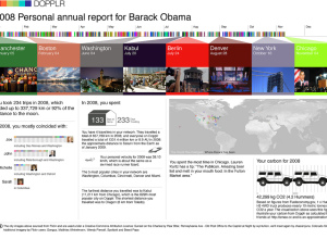
Dopplr Presents Personal Travel Report to All Users
Dopplr is a service that lets you share your travel schedule with friends…
-
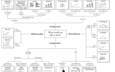
Flow Chart Shows You What Chart to Use
Amit Agarwal, of Digital Inspiration, posts this Andrew Abela creates this flow chart…
-
Visualize This: Poverty Rate By Age in America
I’m going to try something new here at FlowingData in a section called…
-
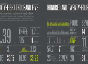
2008 Feltron Annual Report Now Available
After Nicholas Felton’s ever popular 2005, 2006 and 2007 annual report on himself,…
-

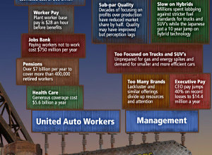
Ford Turns to Design and Data Visualization to Boost Sales
Ford sales are suffering. In an attempt to improve, they’re going green with…
-
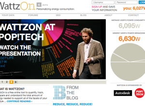
Tools You Need to Track Energy Consumption – WattzOn
“Climate change is a global problem. But it’s individuals who will create the…
-
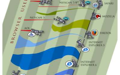
Browser Wars – A New Take on Streamgraphs
Because it’s Friday – PixelLabs puts a cartoon-ish spin on streamgraphs. Who will…
-
One Death is a Tragedy; a Million is a Statistic
Photograph by *Your Guide
I posted a comic from xkcd last week that…
-
Are You a Freelance Data Visualization Designer/Consultant?
I frequently get requests or propositions for data visualization projects, but I almost…
-
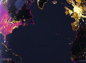
Animated Map Shows One Year of Edits to OpenStreetMap
I admit it. I’m a sucker for animated maps – especially when there’s…
-
Using Visualization to Optimize Adwords: Time Series Visuals vs the Pivot Table
This is a guest post from Elad Israeli and Roni Floman of SiSense,…
-
Discover Your Future for 2009 – CookieSays Fortunes
First off, happy new year! I’m back from my short hiatus from blogging…
-
Visual Guide to General Motors’ Financial Woes
As you’ve probably heard, General Motors has come on some financial troubles and…
-
Thank You, FlowingData Sponsors
December was a good month for FlowingData with some big waves of traffic…
-
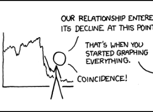
Graphs Lead to Decline in Love
Coincidence. Absolutely. Lisa Simpson agrees. Have a good weekend all.
[via xkcd |… -
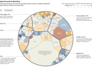
9 Ways to Visualize Consumer Spending
GOOD Magazine’s most recent infographic (above and below) on consumer spending got me…
Recently for Members
Second Edition
 Visualize This: The FlowingData Guide to Design, Visualization, and Statistics (2nd Edition)
 Visualize This: The FlowingData Guide to Design, Visualization, and Statistics (2nd Edition)
New tools, refined process.
Browse by Chart Type See All →


