Downloading survey microdata from public resources can be tricky. Sometimes the documentation is…
R
-
Survey microdata for free
-
Members Only
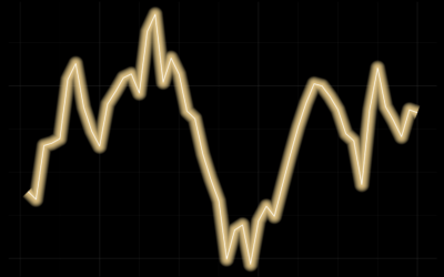
Line Chart with Decorative Neon Accents
We do it because things that glow in the dark are awesome, including line charts.
-
Members Only
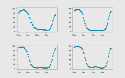
Aggregating Time Use Microdata
Being able to work with microdata from the American Time Use Survey, via IPUMS, means you can subset, filter, and categorize how you want. This makes it easier to explore questions.
-
Members Only
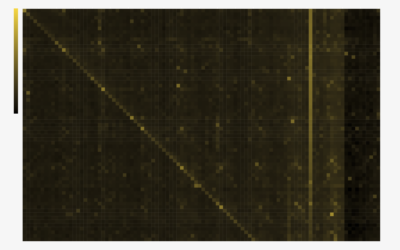
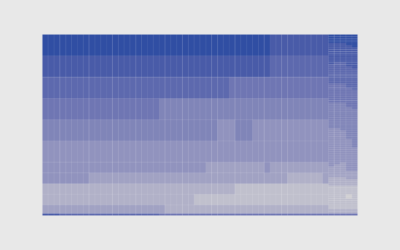
Heatmaps and Defining Color Scales
With color as the visual encoding, choose the scales that allow you to see actual patterns.
-
Members Only
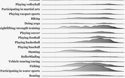
Ridgeline Chart with Color Gradients
Ridgeline charts are nice to look at, and that is enough reason to make them. Use a gradient fill for extra sauce.
-
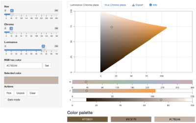
Color picker with R
As we have learned over the years, there can never be enough color-picking…
-
Members Only
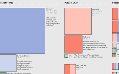
Make the Chart: Scaled Squares with Color Bands
Areas represent total counts and the colors indicate categories. Together, the symbols show the distributions in a population.
-
Members Only
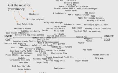
Make the Chart: Scatterplot Using Text Instead of Dots
I made a chart about Halloween candy. Even dumb charts need attention and require that choices are made.
-
Members Only
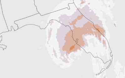
Make the Chart: Precipitation Map as Animated GIF
Weather. Data. Map. Animation. They go well together to show sudden changes over time.
-
Members Only
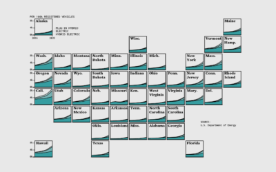
Make the Chart: Grid Map with Stacked Areas
Breaking it down to the small steps and choices with data, code, and editing that lead to a finished chart.
-
Members Only
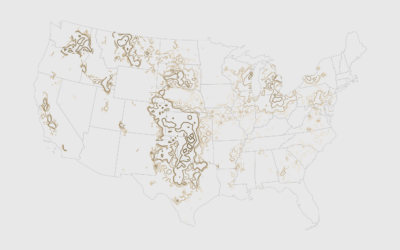
How to Map with Contour Lines and GeoTIFF in R
GeoTIFF data can provide high granularity but make it hard to see patterns when data is sparse. Contour lines provide an aggregated view that makes patterns easier to see.
-
Members Only
How to Make a Cartogram with Packed Circles in R
There are packages to make cartograms, but in some cases you might need a more flexible solution.
-

easystats, an R package
The easystats R package in on my to-try list.
easystats is a collection… -
BrailleR, a R package to improve access for blind users
From CRAN:
Blind users do not have access to the graphical output from… -
Members Only
How to Make a Heatmap with Irregular Bins in R
There are existing functions and packages to make heatmaps in R, but when the data is irregular, it’s worth going custom.
-
Members Only
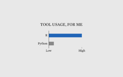
Why I Use R More than Python
Debates about which is best are useless. Go with what works for you, and never mind the rest.
-
Members Only
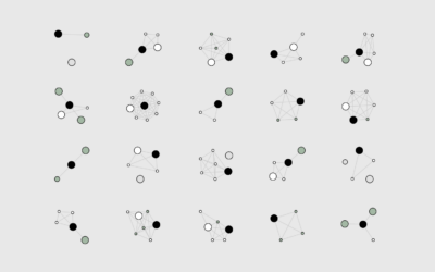
How I Made That: Network Diagrams of All the Household Types
Process the data into a usable format, which makes the visualization part more straightforward.
-
Barbie and Oppenheimer themes for charts in R
Matthew Jané made a small R package called Theme Park, which is meant…
-
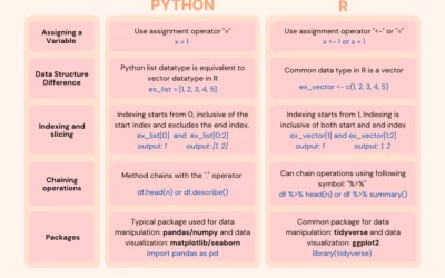
Switching from Python to R
If you’re looking to switch or just want to expand your skills, this…
-
Members Only
How to Make Unit-Based, Variable Width Bar Charts
In a cross between unit charts and variable width bar charts, we can show total counts and relative proportions at the same time.
Recently for Members
Second Edition
 Visualize This: The FlowingData Guide to Design, Visualization, and Statistics (2nd Edition)
 Visualize This: The FlowingData Guide to Design, Visualization, and Statistics (2nd Edition)
New tools, refined process.
Browse by Chart Type See All →


