Inception was a complex film, so there was understandably some confusion over the…
2010
-
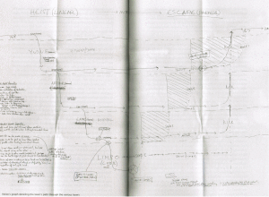
The real Inception flowchart by Nolan
-

The Joy of Stats available in its entirety
The Joy of Stats, hosted by Hans Rosling, is now viewable in its…
-
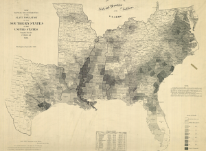
Old map shows slavery in the United States
In 1864, drawing on the most recent 1860 Census data, the United States…
-

Dynamic sculpture brings weather into airport
eCLOUD, conceived by Aaron Koblin, Nik Hafermaas, and Dan Goods, displays weather data…
-

Merry Christmas from FlowingData
Merry Christmas and happy new year! As usual, don’t forget to eat lots.…
-
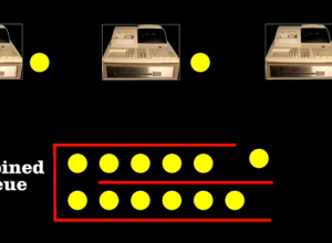
Why the other lines always seem to move faster than yours
Why does it almost always seem like you’re in the slow line at…
-
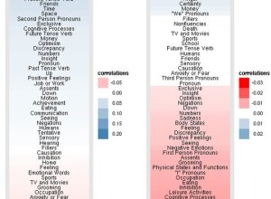
Facebook status updates: young people are self-centered and old ramble
The Facebook Data Team had a quantitative look at status updates by age…
-
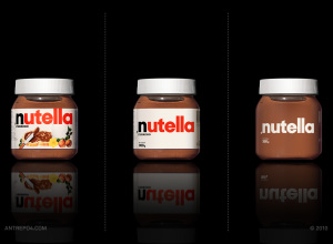
Minimalised consumer products
Antrepo wonders what it might be like if the labels on consumer products…
-
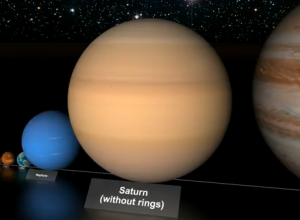
Comparison of the largest stars
You’ve most likely seen a couple of views of the universe to provide…
-
Epic animation in Google Docs
For the Google Demo Slam, three animators Tu+, Namroc, and Metcalf Anything put…
-
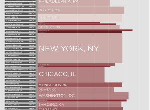
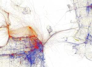
Worst and best commutes in America
I grew up in a relatively small city where it took no more…
-

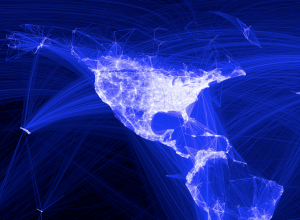
Choreography of the skies shows flight paths
We’ve all seen Aaron Koblin’s Flight Patterns, so we know that there’s a…
-

MacGyver guide on how to use a map
You might think that the only use for a map is to find…
-
Search how phrases have been used via Google Ngram Viewer
Language changes. Culture changes. And we can see some of these changes via…
-
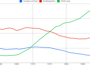
Right versus wrong bubble size
I was going to post this graphic from Good when it came out,…
-
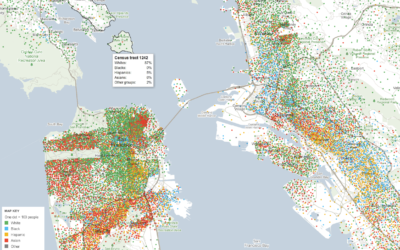
Mapping demographics of every block and city in America
Government data technology has felt behind the times the past few years with…
-
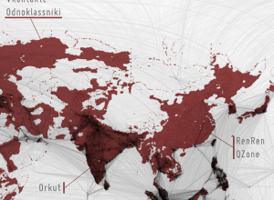
Filling in the black holes of the Facebook friendship map
While it was fun looking at the worldwide connections on Facebook, I thought…
-
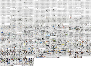
Growth in visual culture via science magazine pages
William Huber, Tara Zepel, and Lev Manovich compare magazine pages of Science and…
-
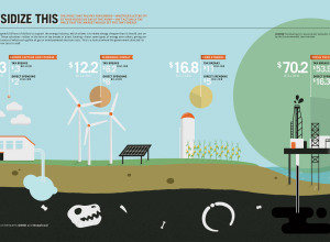
10 Best Data Visualization Projects of the Year – 2010
Data visualization and all things related continued its ascent this year with projects…
-
Facebook worldwide friendships mapped
As we all know, people all over the world use Facebook to stay…
Recently for Members
Second Edition
 Visualize This: The FlowingData Guide to Design, Visualization, and Statistics (2nd Edition)
 Visualize This: The FlowingData Guide to Design, Visualization, and Statistics (2nd Edition)
New tools, refined process.
Browse by Chart Type See All →


