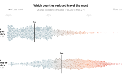
Based on cellphone data from Cuebiq, The New York Times looked at how…
New York Times
-
County stay-at-home orders and change in distance traveled
-
Coronavirus data at the state and county level, from The New York Times
Comprehensive national data on Covid-19 has been hard to come by through government…
-
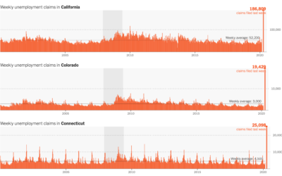
Unemployment spike
The Department of Labor released the numbers for last week’s unemployment filings. 3.28…
-
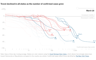
Mobile phone data shows decreased movement nationwide
Stuart A. Thompson and Yaryna Serkez for New York Times Opinion on decreasing…
-
Particle flows show how the coronavirus ramped up
Using a combination of estimates based on cell phone movements and outbreak size,…
-
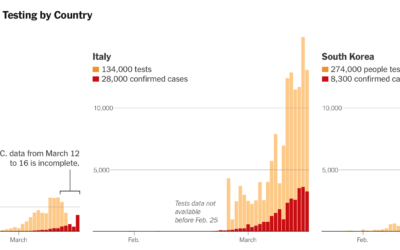
Lagging coronavirus testing in the US
Coronavirus testing in the United States has been a slow process to say…
-
Coronavirus life cycle
For The New York Times, Jonathan Corum and Carl Zimmer describe how the…
-
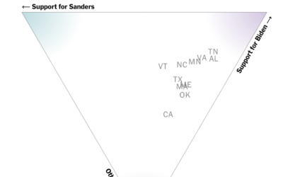
How different groups voted on Super Tuesday
The New York Times has a rundown of what happened on Super Tuesday,…
-
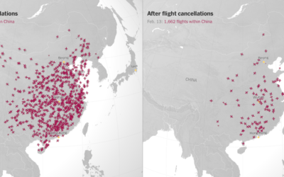
Canceled flights due to coronavirus
With an animated side-by-side map, The New York Times shows canceled flights in…
-
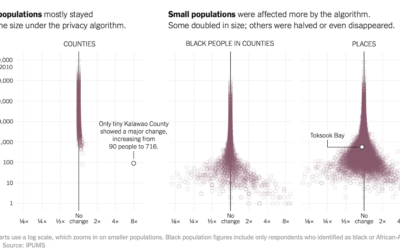
Privacy algorithm could lead to Census undercount of small towns
To increase anonymity in the Census records, the bureau is testing an algorithm…
-
Members Only
Misleading or Not? A Chart Showing Coronavirus Fatality Rate (The Process #75)
Welcome to another episode of Misleading or Not? where we look at a chart and decide if it’s misleading or not.
-
To get your personal data, provide more personal data
File another one under the sounds-good-on-paper-but-really-challenging-in-practice. Kashmir Hill, for The New York Times,…
-
How police use facial recogntion
For The New York Times, Jennifer Valentino-DeVries looked at the current state of…
-
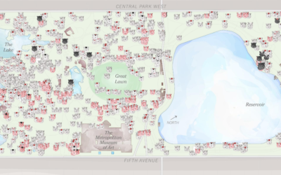
Squirrel census count in Central Park
In 2018, there was a squirrel census count at Central Park in New…
-
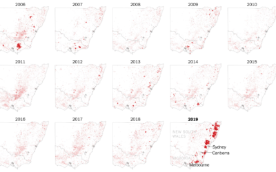
Where the Australia fires are burning
The New York Times zoomed in on southeastern Australia where the fires have…
-
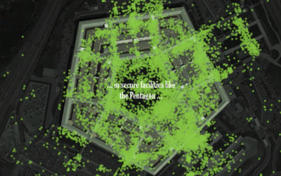
One leaked file, the location of 12 million smartphones
A file leaked to The New York Times contained location traces of 12…
-
Making invisible gas leaks visible
For The New York Times, Jonah M. Kessel and Hiroko Tabuchi went to…
-
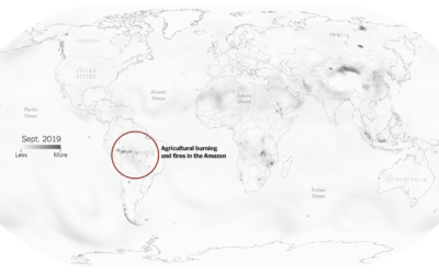
Compare your city’s air pollution to the rest of the world
High air pollution can lead to serious health risks, but you can’t usually…
-
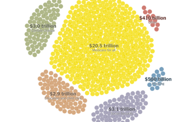
Paying for Elizabeth Warren’s proposed policies
Elizabeth Warren has big plans, and they would cost a lot with a…
-
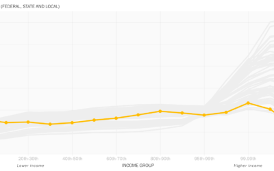
Animated line chart to show the rich paying less taxes
David Leonhardt, for The New York Times, discusses the relatively low tax rates…





 Visualize This: The FlowingData Guide to Design, Visualization, and Statistics (2nd Edition)


