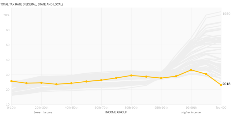
David Leonhardt, for The New York Times, discusses the relatively low tax rates for the country’s 400 wealthiest households. The accompanying animated line chart by Stuart A. Thompson shows how the rates have been dropping over the years, which are now “below the rates for almost everyone else.” Oh.
Animated line chart to show the rich paying less taxes
Second Edition
 Visualize This: The FlowingData Guide to Design, Visualization, and Statistics (2nd Edition)
 Visualize This: The FlowingData Guide to Design, Visualization, and Statistics (2nd Edition)
New tools, refined process.