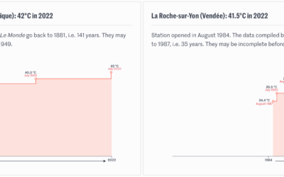
Speaking of the heat wave in Europe, Pierre Breteau for Le Monde charted…
climate
-
Timelines for record temperatures
-
Melting popsicles to visualize a heat wave
Many European countries are experience record high temperatures, so The Washington Post used…
-
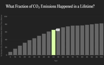
Pollution by the rich versus poor
Based on estimates from the World Inequality Lab, Bloomberg shows how wealthier individuals’…
-
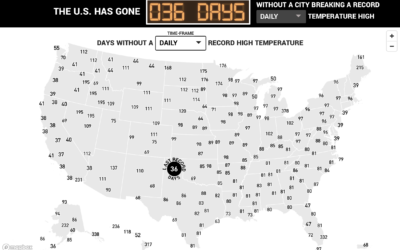
Days since record-high temperatures
Here’s a fun/alarming weather map from The Pudding. Using data from the Applied…
-
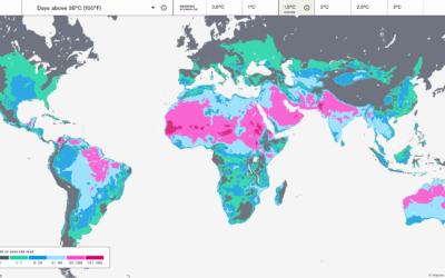
Mapping the probable heat around the world
Earth is getting warmer, and the previously abstract concept seems to grow more…
-
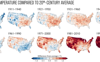
Climate normals mapped over time
Every decade the National Oceanic and Atmospheric Administration releases climate normals to provide…
-
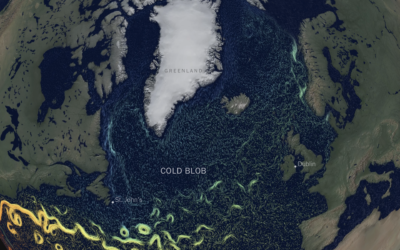
Cooling Gulf Stream
This is quite a dive by Moises Velasquez-Manoff and Jeremy White for The…
-
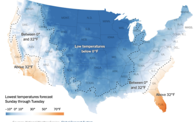
Low temperatures map of the United States
Based on data from the Global Forecast System, The New York Times mapped…
-
Interactive data essays on climate change
In their second issue, Parametric Press focuses on climate change with a set…
-
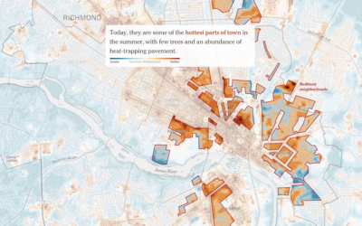
Racist housing policy from 1930s and present-day temperature highs
Brad Plumer and Nadja Popovich for The New York Times show how policies…
-
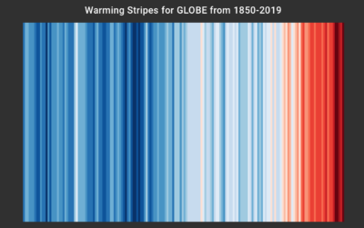
Global warming color stripes, as decorative conversation starter
Ed Hawkins, who you might recognize from charts such as spiraling global temperature…
-
Climate change displayed, with shower tiles
Based on a chart by Ed Hawkins, the shower wall of Gretchen Goldman…
-
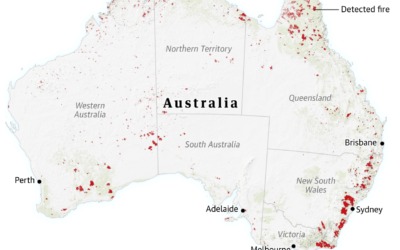
Visual guide for the fires in Australia
For The Guardian, Niko Kommenda and Josh Holder provide a visual guide to…
-
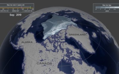
Arctic ice melting
One way to gauge the amount of ice in the Arctic is to…
-
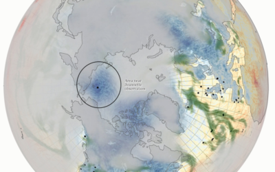
Using old ship logs as a window into the weather in the 1800s
For Reuters, Feilding Cage describes a weather time machine project by NOAA that…
-
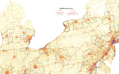
Making the most detailed map of auto emissions in America
Using estimates from the Database of Road Transportation Emissions, Nadja Popovich and Denise…
-
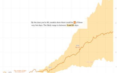
Hotter days where you were born
It’s getting hotter around the world. The New York Times zooms in on…
-
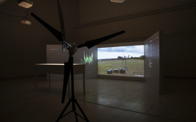
Computer uses wind to mine cryptocurrency and then fund climate research
HARVEST is an art piece by Julian Oliver that consists of a 4G-connected…
-
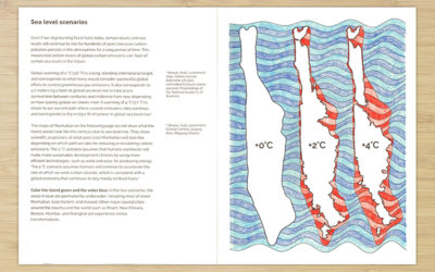
Climate Change Coloring Book
The Climate Change Coloring Book by Brian Foo makes data tactile and interactive.…




 Visualize This: The FlowingData Guide to Design, Visualization, and Statistics (2nd Edition)


