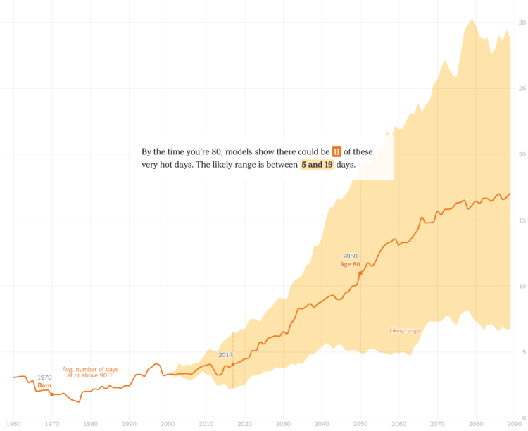
It’s getting hotter around the world. The New York Times zooms in on your hometown to show the average number of “very hot days” (at least 90 degrees) since you were born and then the projected count over the next decades. Then you zoom out to see how that relates to the rest of the world.
I’ve always found it interesting that visualization and analysis are typically “overview first, then details on demand”, whereas storytelling more often goes the opposite direction. Focus on an individual data point first and then zoom out after.
 Visualize This: The FlowingData Guide to Design, Visualization, and Statistics (2nd Edition)