How to Make Animated Visualization GIFs with ImageMagick
Using the library command-line gets you more flexibility to highlight the important parts of the data.
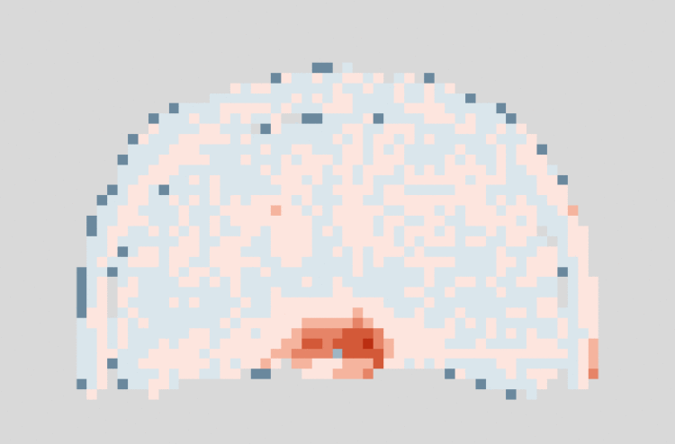
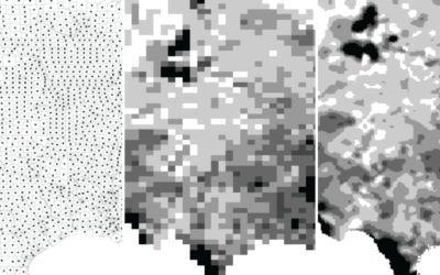
I already covered how to make animated heatmaps in R, but in this tutorial you learn more about customizing the animation itself. Notice that in the animated GIF above, there is a pause in the middle to indicate a changing point and a pause at the end to show the most recent difference.
If you used the animation package in R, you could string together the images to make an animation, but you wouldn’t be able to create those pauses in between.
So instead, I created the images in R and then used ImageMagick command-line to string the images together — with the pause in between. For animated GIFs, the animation package uses ImageMagick. So going direct isn’t that big of a jump, and it gets you more flexibility.
To access this full tutorial, you must be a member. (If you are already a member, log in here.)
Get instant access to this tutorial and hundreds more, plus courses, guides, and additional resources.
Membership
You will get unlimited access to step-by-step visualization courses and tutorials for insight and presentation — all while supporting an independent site. Files and data are included so that you can more easily apply what you learn in your own work.
Learn to make great charts that are beautiful and useful.
Members also receive a weekly newsletter, The Process. Keep up-to-date on visualization tools, the rules, and the guidelines and how they all work together in practice.
See samples of everything you gain access to:
About the Author
Nathan Yau is a statistician who works primarily with visualization. He earned his PhD in statistics from UCLA, is the author of two best-selling books — Data Points and Visualize This — and runs FlowingData. Introvert. Likes food. Likes beer.