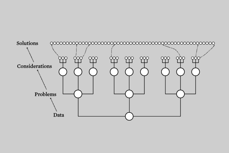
Visualization rules and best practices are generalized solutions to generalized problems. Better visualization requires a more specific view.
Visualization rules and best practices are generalized solutions to generalized problems. Better visualization requires a more specific view.
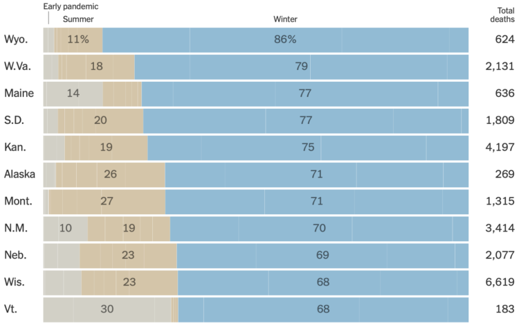
You probably knew that coronavirus deaths have been in the several thousands per day for a few months now. But Lazaro Gamio, for The New York Times, framed the cumulative rates in an even more striking way with a straightforward stacked bar chart. Half of U.S. coronavirus deaths were after November 1.
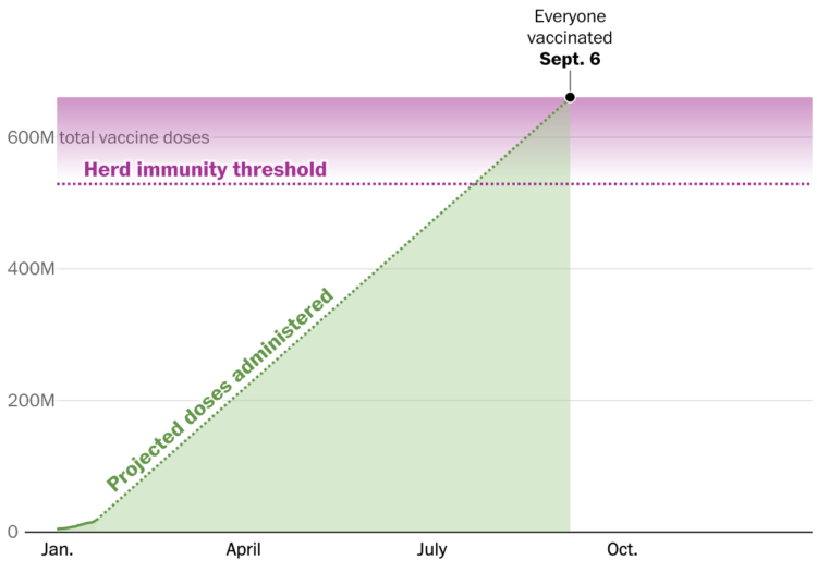
Vaccines provide light at the end of the tunnel, but when we finally get to the end depends on the speed at which we vaccinate. The Washington Post considers Joe Biden’s pledge for 100 million shots in his first 100 days in the context of herd immunity and calendar days.
I appreciate the time spent explaining the intersection of these two lines.
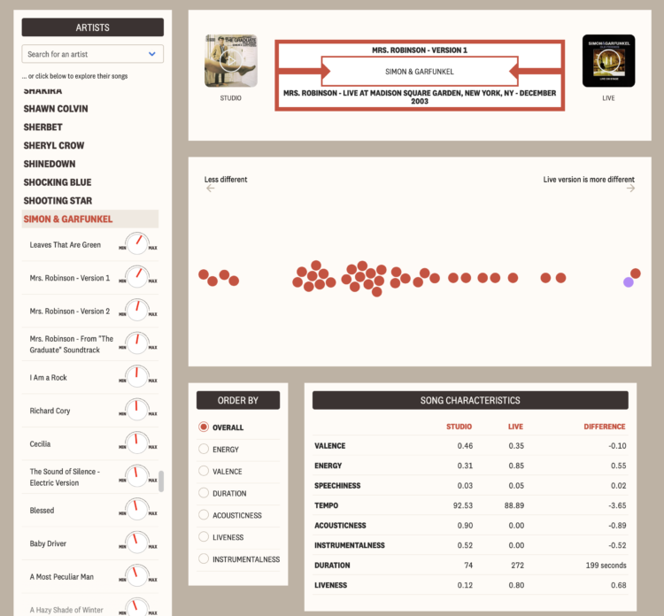
There’s something about hearing music live no matter how many times you’ve heard a song record in the studio. Maybe the acoustics are different. Maybe the musicians play a favorite song differently. Maybe the musicians feed off a big crowd’s energy.
For The Pudding, Kat Wilson and Kevin Litman-Navarro quantified these differences between studio and live versions. The result is the Live Music Jukebox, which lets you pick an artist and see which songs differed the most.
I was just lamenting over returned concert tickets from 2020. I guess this’ll have to do for now.
For NYT Opinion, Charlie Warzel and Stuart A. Thompson returned to the topic of location data logged by our mobile phones. This time though, they turned their attention to the United States Capitol on January 6, 2021:
The data we were given showed what some in the tech industry might call a God-view vantage of that dark day. It included about 100,000 location pings for thousands of smartphones, revealing around 130 devices inside the Capitol exactly when Trump supporters were storming the building. Times Opinion is only publishing the names of people who gave their permission to be quoted in this article.
As the animation plays out, you can clearly see the dots cluster around the rally area and then make their way to the Capitol building.
This surveillance stuff through consumer data (which companies can buy) seems way too easy.
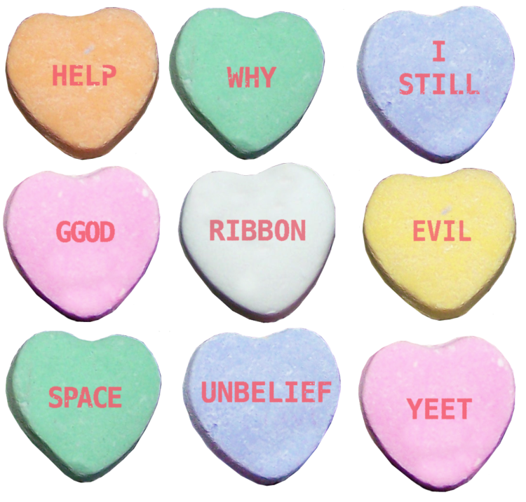
Continuing her annual tradition, Janelle Shane trained various AI models to generate two-word-all-caps love messages for those chalky Valentine’s Day candy hearts. So deep. So profound.
See also Shane’s experiment with generating hearts for somewhat creepy results, as AI often likes to do.
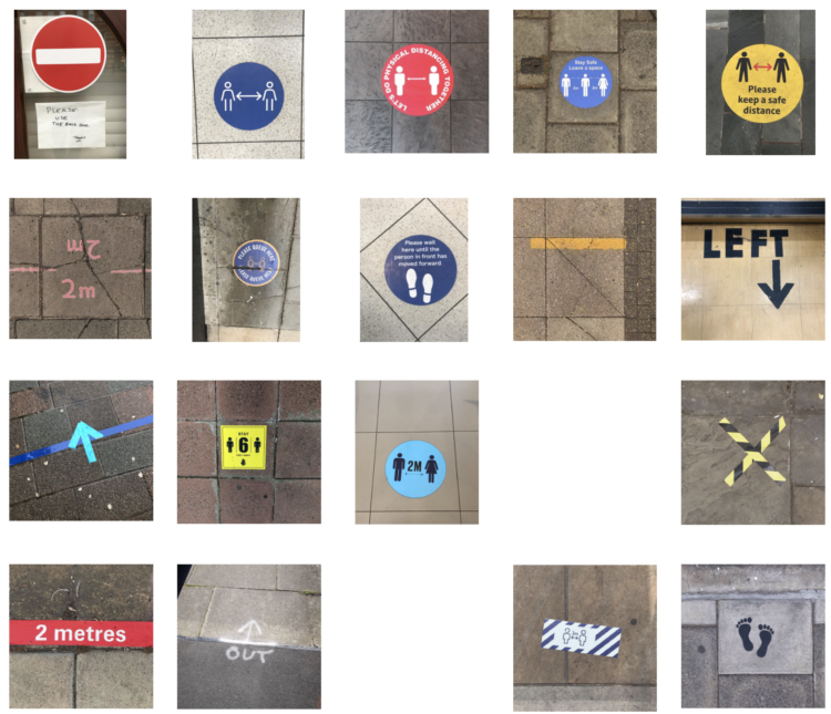
The Pandemic Graphics Archive is a work-in-progress collection of floor signs and posters from our current days of distance and mask-wearing. [via swissmiss]

People’s interpretation of a chart can change if you use differents words to describe it, even if the data stays the same.
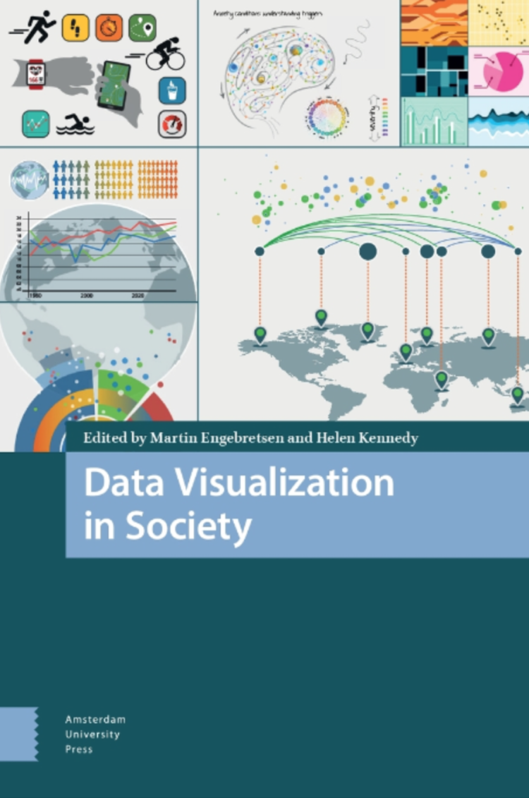 Data Visualization in Society, an open access book, is a collection of works that looks closer at the role data visualization plays beyond the technical aspects of the discipline:
The expansion of data visualization in society therefore requires a new kind of literacy if it is to enable citizens to act in informed and critical ways. It also requires the assessment of data visualization’s role in democracy, and the reassessment of democratic theory in light of developments in data visualization. This means asking a range of questions about the relationship between data visualization and democracy. It also means considering the factors in visualization consumption and production processes that affect engagement, which might include factors which extend beyond textual and technical matters, such as class, gender, race, age, location, political outlook, and education of audience members. Some of the contributions in this collection address these issues.
My reading list just got longer.
The Datavis Book Club run by Datawrapper is reading and discussing the first four chapters, in case you want get in on the fun.
This is interesting:
What does 425,000 Covid deaths sound like? I was inspired by this article by @LazaroGamio and @LaurenLeatherby for the NY Times, where they visualized how long to reach another 25k deaths. The piece had a rhythm that made me think of music, so I tried turning the data into sound pic.twitter.com/2YhmgqDZGQ
— carni_dc (@CarniDC) February 1, 2021
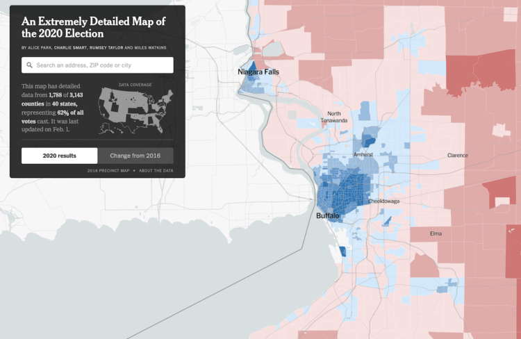
NYT’s The Upshot published their precinct-level map of 2020 election results. Zoom in to your geographic area and bask in or scratch your head over the detailed variation.
This seems be a recurring view now, with their “extremely detailed map” making an appearance after the 2016 and 2018 election. They also had their “most detailed maps” in 2014.
However, this year, The Upshot made their precinct-level data available on GitHub, so you can look closer if you like.
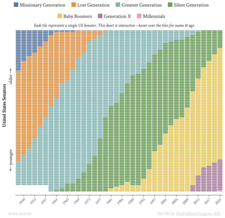
With this straightforward unit chart, wcd.fyi shows which generation each Senate member belonged to, from 1947 through 2021. Each rectangle represents a senator, and each column represents a cohort.
As time moves on, the generations inevitably shift. In 2021, we have the first Millennial senator in Jon Ossoff from Georgia.
I’m also looking forward to Jer Thorp’s Living in Data, which comes out later this year but is available for pre-order now:
In this provocative book, Thorp brings his work as a data artist to bear on an exploration of our current and future relationship with data, transcending facts and figures to find new, more visceral ways to engage with data. Threading a data story through hippo attacks, glaciers, and school gymnasiums; around colossal rice piles and over active mine fields, Living in Data keeps humanity front and center. Thorp reminds us that the future of data is still wide open; that there are stories to be told about how data can be used, and by whom. Accompanied by informative and poetic illustrations, Living in Data not only redefines what data is, but re-imagines how it might be truly public, who gets to speak its language, and how, using its power, new institutions and spaces might be created to serve individuals and communities. Timely and inspiring, this book gives us a path forward: one where it’s up to all of us to imagine a more just and participatory data democracy.
When I started FlowingData, Statistics and data almost always seemed highly technical and accessible to only a few. A few years later, understanding data was like a novelty that more people wanted to play with but still didn’t quite know the implications of what they were looking at. These days, spurred on by last year especially, interpreting data is an essential skill.
Over the next few years, Thorp’s perspective on how we live with these new streams, individually and as a society, will only grow more important.
While we’re on the topic of Statistics books for the general public, David Spieglhalter’s The Art of Statistics: How to Learn from Data is also on my reading list.
In The Art of Statistics, world-renowned statistician David Spiegelhalter shows readers how to derive knowledge from raw data by focusing on the concepts and connections behind the math. Drawing on real world examples to introduce complex issues, he shows us how statistics can help us determine the luckiest passenger on the Titanic, whether a notorious serial killer could have been caught earlier, and if screening for ovarian cancer is beneficial. The Art of Statistics not only shows us how mathematicians have used statistical science to solve these problems — it teaches us how we too can think like statisticians. We learn how to clarify our questions, assumptions, and expectations when approaching a problem, and — perhaps even more importantly — we learn how to responsibly interpret the answers we receive.
I was waiting for the book to come to North America, and apparently it did in 2019. I’m so behind in my reading, but I declare 2021 as the year I take my attention span back.
Tim Harford has a new book coming out tomorrow called The Data Detective: Ten Easy Rules to Make Sense of Statistics.
Today we think statistics are the enemy, numbers used to mislead and confuse us. That’s a mistake, Tim Harford says in The Data Detective. We shouldn’t be suspicious of statistics—we need to understand what they mean and how they can improve our lives: they are, at heart, human behavior seen through the prism of numbers and are often “the only way of grasping much of what is going on around us.” If we can toss aside our fears and learn to approach them clearly—understanding how our own preconceptions lead us astray—statistics can point to ways we can live better and work smarter.
Added to the list.
If you’re outside North America, look for How To Make The World Add Up. They’re the same book.
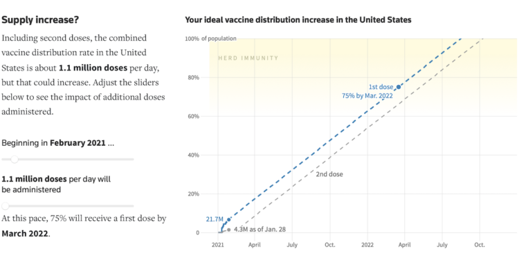
For Reuters, Feilding Cage, Chris Canipe and Prasanta Dutta made an interactive that lets you adjust dose rate and state in a simulation to get an estimate for when we might reach herd immunity.
As with any simulation, there are assumptions and simplifications. In this case, the dose rate stays uniform and total population is used, even though there are no vaccines available to children yet. But it’s something.
My main takeaway is that we’re gonna have to be patient (still).
Just speaking to the chart, I like the sketch-ish dashed lines and gradient to show herd immunity ranges. They communicate that things are still uncertain.

Vivian Wu made a snowflake generator. Adjust parameters such as growth, kaleidoscoping, and density, and you dear friend, can make yourself a unique snowflake of your very own.
I think I’ll just zone out and let the animation play out for a few minutes every day. Breathe in. Breathe out.
Here’s the good stuff for January.
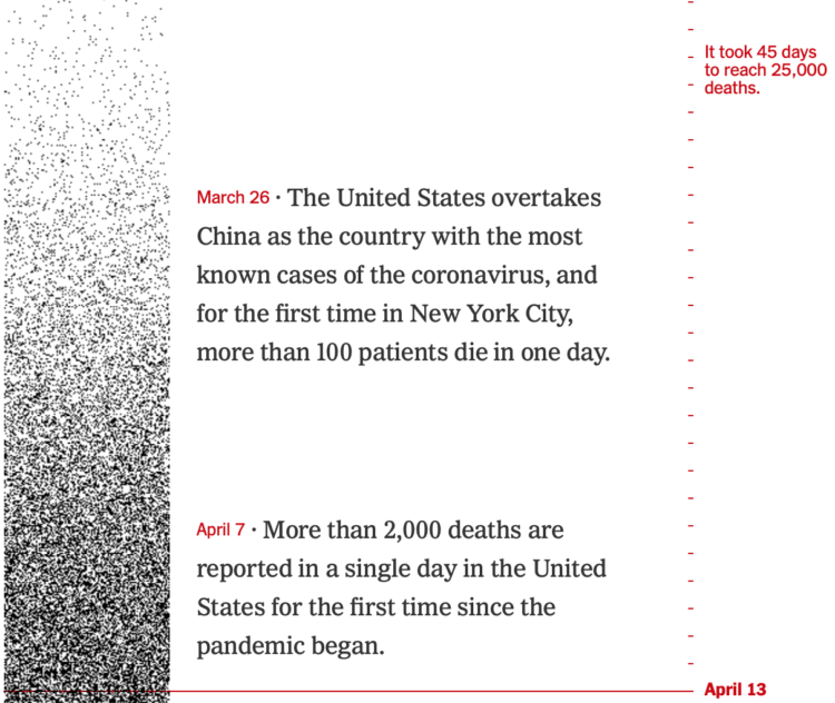
The United States passed 425,000 coronavirus deaths this week. For The New York Times, Lazaro Gamio and Lauren Leatherby used dot density over time to show how we got to this point.
Each dark pixel represents a death, and each tick mark represents a day. So the strip starts light with sparsely placed dots, and then it gets darker and darker. Get to present day, and there’s hardly any white space.
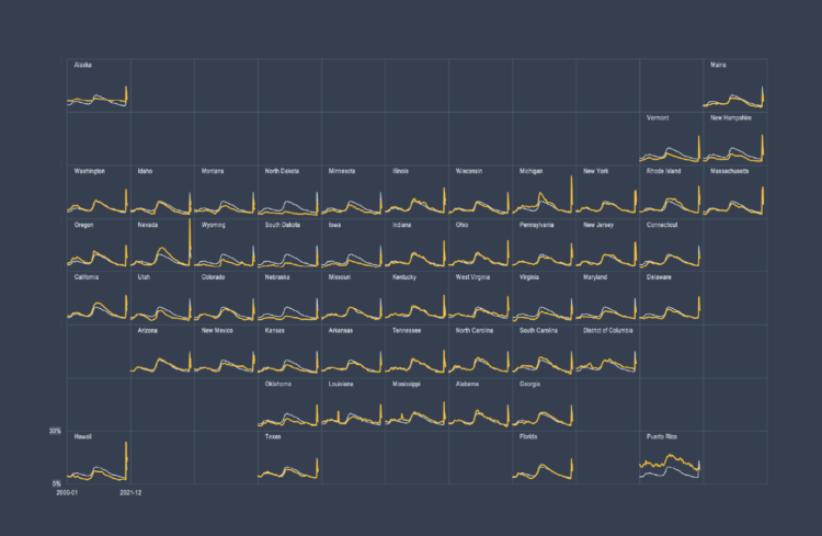
Also known as trellis charts, lattice chart, or whatever you want to call them, the technique lets you compare several categories in one view.
 Visualize This: The FlowingData Guide to Design, Visualization, and Statistics (2nd Edition)
New tools, refined process.


