Ed Hawkins, who you might recognize from charts such as spiraling global temperature and the aforementioned temperature grid, encourages you to show your stripes. Select your region, and see how average temperature increased. I saw this last year, but I just realized that people are using this chart to print, knit, and decorate.
Read More
-
-
Based on a chart by Ed Hawkins, the shower wall of Gretchen Goldman and Tom Di Liberto transformed into a canvas to show global warming.
Each row represents a country, and each cell — I mean tile — represents the temperature difference compared to the overall average for the time period.
-
For Bloomberg, Ellen Huet and Lizette Chapman reported on the jolt for Instacart to shift into an essential service. Around the middle of the article is this chart that shows the shifts in what people were shopping for post-coronavirus versus pre-coronavirus.
Bread making and cleaning. These percentage changes are for mid-April, but I’d say that’s about where this household is at.
-
Is bread-making still a thing, or is that so two weeks ago? If you’re late to the sourdough train or still working out the feeding schedule, the Bread Scheduler by Stuart Thompson makes the timing more obvious. Just enter when you want to start or finish, and the scheduler works out the details.
I haven’t found the patience yet for sourdough. For less time-sensitive breads, try out no-knead bread or this easy focaccia.
-
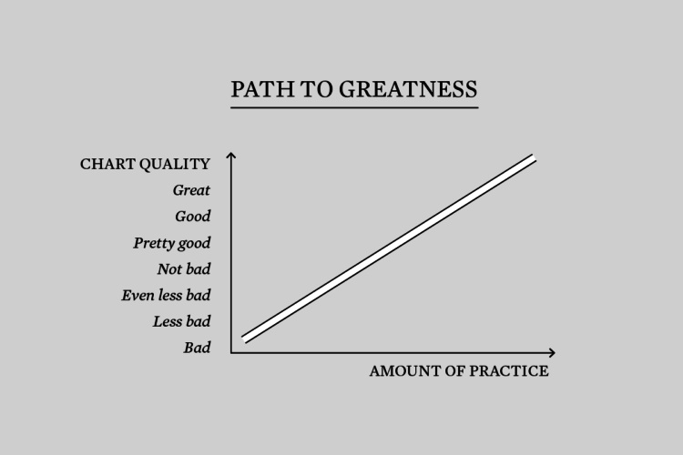
I’m just gonna put this right here, from @_daviant: “Another day another stupid Excel chart”.
-
To show events over time, you can use a timeline, which is often marks on a line that runs from less recent to more recent. But you can vary the shape. Sara Di Bartolomeo and her group researched the effectiveness of different layouts:
Considering the findings of our experiment, we formulated some design recommendations for timelines using one of the data set types we took into account. Here is a list of recommendations regarding timeline readability:
- Use linear vertical timelines for situations which require fast data lookup.
- Avoid spiral timelines when the task requires fast lookup.
- If you use a more creative, expressive shape, such as a spiral timeline, also include a tutorial or visual cues to assist the user in learning and understanding.
Also: it “heavily depends on the context.”
-
The USGS released a unified geologic map of the moon on a 1:5,000,000-scale — and the data to go with it:
This new work represents a seamless, globally consistent, 1:5,000,000-scale geologic map derived from the six digitally renovated geologic maps (see Source Online Linkage below). The goal of this project was to create a digital resource for science research and analysis, future geologic mapping efforts, be it local-, regional-, or global-scale products, and as a resource for the educators and the public interested in lunar geology. Here we present the completed mapping project as unit contacts, geologic unit polygons, linear features, and unit and feature nomenclature annotation.
That paintball aesthetic is quite becoming.
-
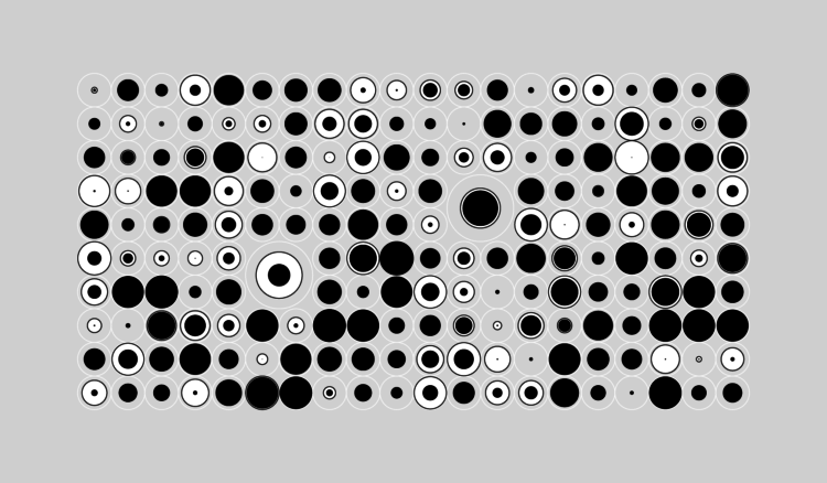
I thought we (i.e. me) could use a break, so I made these abstract charts to represent the most popular quotes about hope.
-
Members Only
-
At greater disparities between low resources and high volumes of sick people, doctors must decide who lives and who dies, which seems a moral burden with a single case, much less anything more. So systems are setup to relieve some of that pressure. For Reuters, Feilding Cage uses clear illustrations to describe possible policies to help healthcare workers decide who receives care first.
-
Brian Foo is the current Innovator-in-Residence at the Library of Congress. His latest project is Citizen DJ, which lets you explore and remix audio from the Library:
It invites the public to make hip hop music using the Library’s public audio and moving image collections. By embedding these materials in hip hop music, listeners can discover items in the Library’s vast collections that they likely would never have known existed. For technical documentation and code, please see the repo.
Give it a go. Even if you’re not into making music, you can still explore the sounds, listen to them in their full context, and end up reading about some song written in the early 1900s.
I’ll take all the rabbit holes I can get.
-
It’d be great if we could conjure a vaccine or a “cure” seemingly out of nowhere just like in the movies. Unfortunately, there’s a necessary process involved to make sure that something works and that it is safe to distribute to billions of people. For New York Times Opinion, Stuart A. Thompson shows typical vaccine timelines, which can take decades, against hopeful coronavirus vaccine timelines.
-
Medical tests do not always provide certain results. Quartz illustrated this with the accuracy of a simulated antibody test that identifies 90% of those infected and 95% of those not infected:
That means that if you took the test and got a positive result, there’s a 45.1% chance it’s correct. If you got a negative result, there’s a 99.6% chance your result is accurate.
Of course, this doesn’t mean don’t take the test. Detecting 90% of infections with false positives is a good thing. However, it does help to understand what the numbers mean before you do anything with them.
-
FiveThirtyEight compared six Covid-19 models for a sense of where we might be headed. With different assumptions and varying math, the trajectories vary, but they at least provide clues so that policymakers can make educated decisions.
If you’re interested in the data behind these models, check out the COVID-19 Forecast Hub maintained by the Reich Lab at the University of Massachusetts Amherst. They helped with the FiveThirtyEight comparisons and are also the source for the official CDC forecast page.
-
The timelines keep shifting and people are getting antsy for many valid (and not-so-valid) reasons. When will this end? Will we ever get “normal” again? At this point, simulations are probably the closest we can get to seeing what might happen next. Marcel Salathé and Nicky Case peer into what happens next with these playable simulations.
Where many simulations have felt like distant, abstract ideas, Salathé and Case’s explanations and interactives are rooted in optimism and practical things that we can do now.
-
Inspired by the genre of YouTube videos where younger people listen to older music, The Pudding is running a project to find the generational music gaps. Enter your age, songs play, and you say if you know the song or not.
The aggregate results are shown as more people listen. For example, the above shows the percentage of people in a given age group who did not recognize the listed songs.
I’m looking forward to what they do with the finished dataset.
-
Jukebox from OpenAI is a generative model that makes music in the same styles as many artists you’ll probably recognize:
To train this model, we crawled the web to curate a new dataset of 1.2 million songs (600,000 of which are in English), paired with the corresponding lyrics and metadata from LyricWiki. The metadata includes artist, album genre, and year of the songs, along with common moods or playlist keywords associated with each song. We train on 32-bit, 44.1 kHz raw audio, and perform data augmentation by randomly downmixing the right and left channels to produce mono audio.
A lot of the time, generative music sounds artificial and mechanical, but these results are pretty convincing. I mean you can still tell it’s not from the artist, but many of the examples are listenable.
OpenAI also published the code.
-
Members Only
-
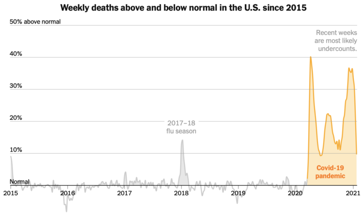
A couple of weeks ago — or maybe it was a couple of years ago, I’m not sure — the administration announced it would withdraw funding from the World Health Organization. Here’s what that does to the overall picture.
-
The Vocal Synthesis channel on YouTube trains text-to-speech models using publicly available celebrity voices. Then using this new computer-generated voice, the celebrities “recite” various scripts. For example, the above is Jay-Z rapping the “To be, or not to be” soliloquy from Hamlet, but it’s not him.
Find out more about the voice generation here, which was developed in 2017. Maybe more interesting, Jay-Z recently filed a copyright claim against the videos.