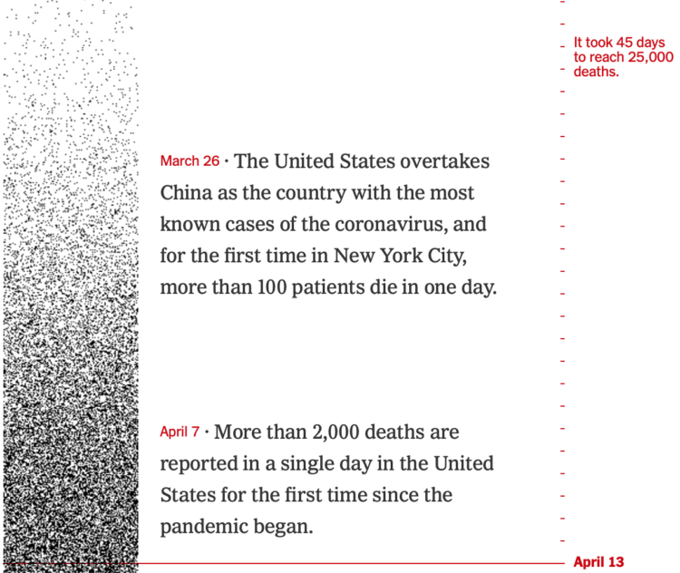
The United States passed 425,000 coronavirus deaths this week. For The New York Times, Lazaro Gamio and Lauren Leatherby used dot density over time to show how we got to this point.
Each dark pixel represents a death, and each tick mark represents a day. So the strip starts light with sparsely placed dots, and then it gets darker and darker. Get to present day, and there’s hardly any white space.

 Visualize This: The FlowingData Guide to Design, Visualization, and Statistics (2nd Edition)