For Axios, Will Chase, with illustrations by Brendan Lynch, provides the current status of known variants of the coronavirus. The tracker shows the estimated transmission rate, severity, vaccine efficacy, and prevalence.
-
Members Only
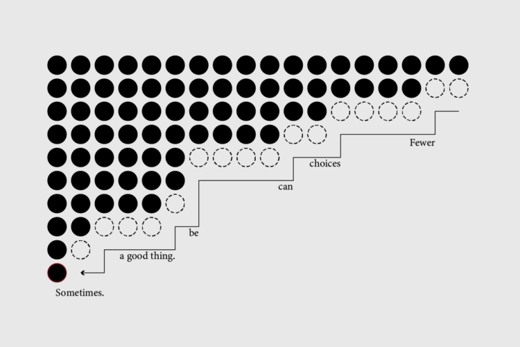
If you only consider data format to choose your chart type, then yeah, you’re probably approaching the problem too mechanically. But it’s still part of the process.
-
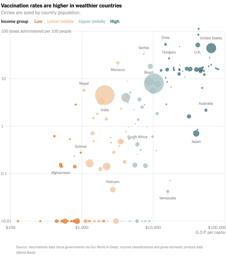
For The New York Times, Keith Collins and Josh Holder look at the relationship between country wealth and vaccination rates. Wealthier countries made deals with drug makers earlier, which means poorer countries are not able to secure as many vaccines.
-
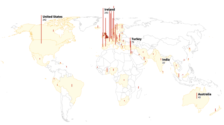
As you likely know, there are coronavirus variants around the world. Reuters mapped the spread of the Kent variant, which was detected in the English county of Kent.
-
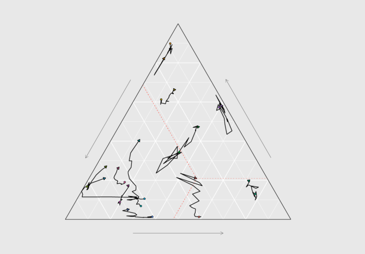
How to Make Ternary Plots in R, with ggplot2
When you want to compare between three parts of your data, ternary plots might be a good option. Here is how to make them.
-
Search history can say a lot of about a person, like where they’re going, where they want to be, what they want to learn about, or what they’re trying to make — at some point in their life. Search Record, by Jon Packles, is a way to parse through your history. Download your archive, import it into the locally-run tool, and explore.
I’m more of DuckDuckGo person, so I can speak to the specificity of the tool, but it looks insightful. At the least, I’d want to download my search archive and play around with it.
-
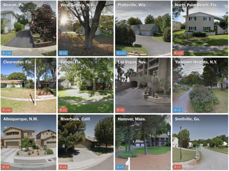
NYT’s The Upshot has a quiz that puts you in a neighborhood via Google Maps images. Who did the neighborhood vote for in the 2020 presidential election? The aggregate of reader results is the most interesting part, which shows a strong correlation between correct guesses and the magnitude of the win by a candidate.
I much prefer this quiz over the refrigerator one The Upshot put up last year.
-
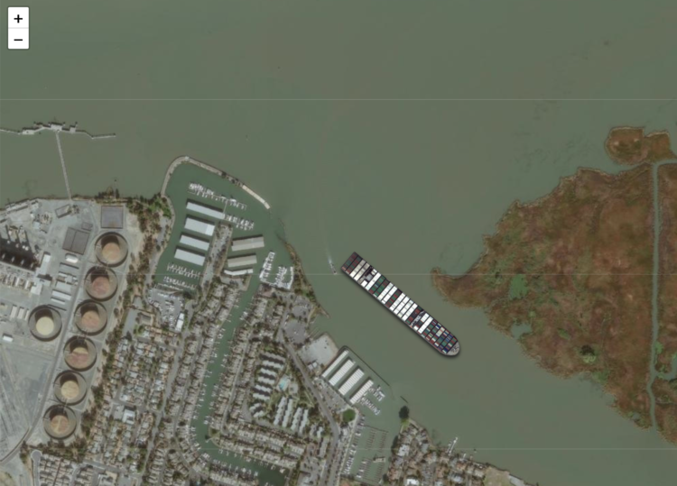
The Ever Given got stuck in the Suez Canal. It was refloated. So now you can use this “ridiculous thing” by Garrett Dash Nelson to get the Ever Given stuck anywhere in the world. Show the ship to scale and click-and-drag the satellite imagery, and you get a pretty good idea of how big the thing is.
-

To better understand the challenge of steering a giant container ship through the Suez Canal, CNN made an interactive that lets you do just that. Control the power and point a silhouette of the Ever Given in the right direction without crashing.
It is of course a simplification that doesn’t account for things like water depth and passing boats, but it does leave you wondering how giant ships don’t get stuck more often.
-
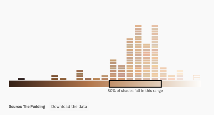
For The Pudding, Ofunne Amaka and Amber Thomas looked at shades, words, and numbers used to describe foundation makeup:
A 2020 study investigating the connotations of foundation shade names in 20 products found that dark shades were largely named after “the least valuable substances and objects” while lighter shades were labeled after “decorative, valuable, and precious objects.” Our analysis revealed similar results, and the more you study the data, the more patterns of microaggressions specifically targeting Black and Brown consumers begin to materialize.
-
yeti dynamics imagined if a giant banana were orbiting Earth from the same distance as the International Space Station:
[arve url=”https://www.youtube.com/watch?v=paMantiqs54″ loop=”no” muted=”no” /]
It’s so dumb, which is why it’s so good. And you’re in luck, because this video is from a few years ago, and yeti dynamics has many variants, such as: if the moon were replaced by planets and if all the planets were in between Earth and the moon. [via kottke]
-
 The Data Journalism Handbook: Towards a Critical Data Practice now has a second edition, updated from the original 2012 edition:
The Data Journalism Handbook: Towards a Critical Data Practice provides a rich and panoramic introduction to data journalism, combining both critical reflection and practical insight. It offers a diverse collection of perspectives on how data journalism is done around the world and the broader consequences of datafication in the news, serving as both a textbook and a sourcebook for this emerging field. With more than 50 chapters from leading researchers and practitioners of data journalism, it explores the work needed to render technologies and data productive for journalistic purposes.
Download the digital version for free or buy a physical copy.
-
Members Only

Here’s the good stuff for March 2021.
-
A dollar might not buy you as much in one state as it does in the other.
-
On a superficial level, color scale selection seems like a straightforward task. Pick a sequence of colors that looks like it goes from light to dark. Done. But right when you get into it, you might find the process isn’t so straightforward. Different color scales can represent different aspects of your data, and poor selection can lead to poor communication. So, Lisa Charlotte Rost for Datawrapper wrote a four-part practical guide to help you figure it out.
See also Rost’s equally useful guide on what colors to pick for your scales.
-
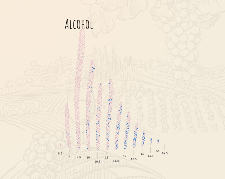
For The Pudding, Lars Verspohl provides an introduction to statistical models disguised as a lesson on finding good wine. Start with a definition of wine, which becomes a way to describe it with the numbers. Define what makes a wine good. Find the wines that look closer to that definition.
-
Reviewing Deborah Stone’s Counting and Tim Harford’s The Data Detective, Hannah Fry discusses the usefulness of data and its limitations for The New Yorker:
Numbers are a poor substitute for the richness and color of the real world. It might seem odd that a professional mathematician (like me) or economist (like Harford) would work to convince you of this fact. But to recognize the limitations of a data-driven view of reality is not to downplay its might. It’s possible for two things to be true: for numbers to come up short before the nuances of reality, while also being the most powerful instrument we have when it comes to understanding that reality.
This builds on Fry’s similarly themed article from a couple of years ago, as well as her book Hello World.
Data is limited, and the better we understand those limitations, the better use we can get out of what’s there.
-
For ProPublica, Ken Schwencke reports on a poor data system that relies on local law enforcement to voluntarily enter data:
Local law enforcement agencies reported a total of 6,121 hate crimes in 2016 to the FBI, but estimates from the National Crime Victimization Survey, conducted by the federal government, pin the number of potential hate crimes at almost 250,000 a year — one indication of the inadequacy of the FBI’s data.
“The current statistics are a complete and utter joke,” said Roy Austin, former deputy assistant attorney general in the Department of Justice’s civil rights division. Austin also worked at the White House on data and civil rights and helped develop an open data plan for police data.
Garbage in, garbage out.
-
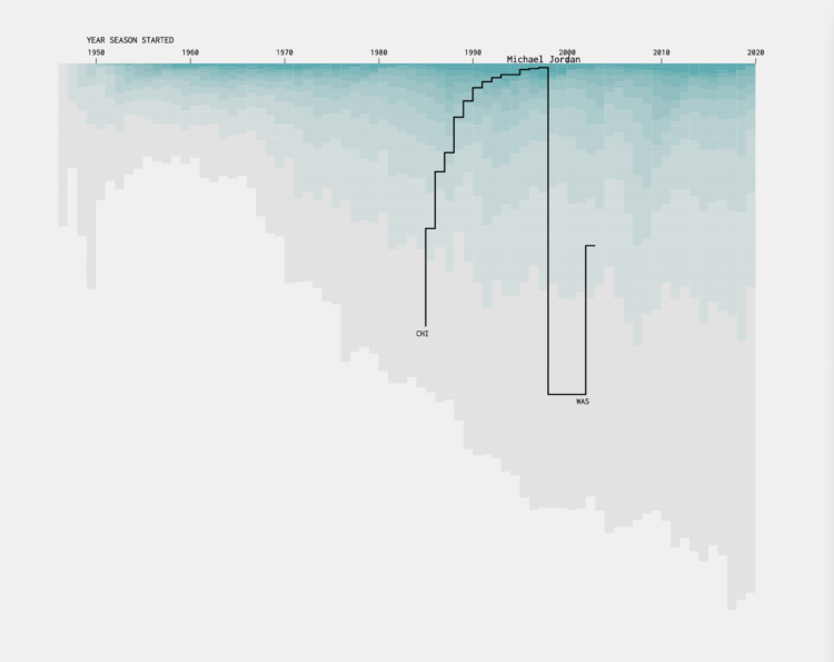
I was curious who played for a single team over their entire career, who skipped around, and how the patterns changed over the decades.
Recently for Members
Browse by Chart Type See All →


Browse By Topic
Get the Book
 Visualize This: The FlowingData Guide to Design, Visualization, and Statistics
 Visualize This: The FlowingData Guide to Design, Visualization, and Statistics
Available now.