• Membership
  • Newsletter
  • Projects
  • Learning
  • About
  • Member Login
  • Generate a color analysis by uploading an image

    April 16, 2021

    Topic

    Data Art  /  color, Emily Noyes Vanderpoel, Python, vintage

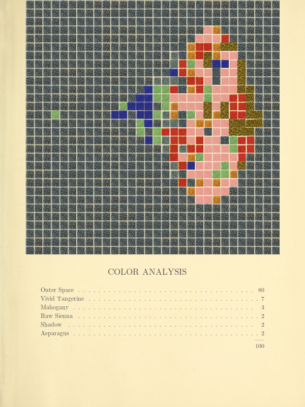
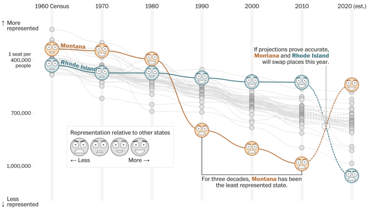
    Mel Dollison and Liza Daly made a fun interactive that lets you upload an image, and it spits out a vintage-looking color analysis a la Vanderpoel:

    This generator is based on the works of Emily Noyes Vanderpoel (1842-1939), who hoped her original color analyses would inspire others to study “whatever originals may be at hand in books, shops, private houses, or museums.” We hope you are similarly inspired by her abstract, modernist style employed in the context of everyday objects and photos.

    Originally conceived as a Twitter bot, you can find the Python code behind the project on GitHub.

  • Tracking airfare as a proxy for summer travel plans

    April 16, 2021

    Topic

    Statistical Visualization  /  airfare, coronavirus, travel, Upshot

    Quoctrung Bui and Sarah Kliff for NYT’s The Upshot used difference charts to show how current airfare prices are approaching 2019 prices, based on data from travel app Hopper. This seems to indicate that people are getting ready to travel again.

    Because airfare is typically purchased weeks or months in advance, it can be a barometer of how the public is feeling about the pace of recovery. The prices in the Hopper data, which includes fares displayed over three years of searches (representing billions of flight queries), now suggest a travel recovery that could be in full effect as early as this summer.

    The red shade between each line shows the difference between prices year-over-year. Usually the area color in difference charts reflects the metric that is greater, but in these, the area reflects the metric that is less. That confused me for a second. But I’m curious if you’re not familiar with difference charts, do you just see the pattern correctly right away?

  • Members Only

    Chart Remix: U.S. States Ranked – The Process 135

    April 15, 2021

    Topic

    The Process  /  remix, YouGov

    Welcome to another edition of me trying to make a graphic look better.

  • Stopping a pandemic before it starts

    April 15, 2021

    Topic

    Infographics  /  Beatrice Jin, illustration, pandemic, Politico

    For Politico, Beatrice Jin provides an illustrated guide on stopping a pandemic before it starts. Some scientists suggest going to the source, which often is from interacting with animals, and as you’d expect, cutting off the livelihood of millions around the world would be a complex process.

  • How your state might lose or gain representation with Census count

    April 14, 2021

    Topic

    Infographics  /  census, representation, Washington Post

    Harry Stevens, Tara Bahrampour and Ted Mellnik for The Washington Post look at how the upcoming Census count affects representation in the House. Montana and Rhode Island are projected to gain and lose a seat, respectively, which switches their positions in terms of seats per population.

    The explanation of how counts and representation work, with a progression from abstract concept to specific cases, is on point.

  • Visualizing risk of Johnson & Johnson vaccine side effect

    April 13, 2021

    Topic

    Infographics  /  coronavirus, Johnson & Johnson, risk, vaccine, Washington Post

    As the Johnson & Johnson vaccine pauses in the United States, Philip Bump for The Washington Post offers a quick visualization that shows 100 vaccinations per second. A red one appears if there’s a side effect. But because the side effect is rare, currently at 1 in 1.1 million, the red dot on the visualization likely never appears as you watch. The blue dots are potential lives saved if the J&J vaccine continues.

    I’m reminded of David Spiegelhalter’s video on understanding risk from over a decade ago. So many everyday activities carry risk. The only way we get through the day is not to avoid all risk, which is impossible, but to figure out what risk we’re willing to take.

  • Send postcards of plots made in R

    April 13, 2021

    Topic

    Software  /  ggirl, ggplot2, Jacqueline Nolis, postcards, R

    How many times have you made a plot in R and thought, “I wish I could send this as a postcard to my best friend.” Probably a million times, right? Wish no more. The ggirl package (that’s gg-in real life for short) by Jacqueline Nolis lets you send a plot over the internets to a postcard API, which sends a physical card to an address you specify.

  • Domestic terrorism incidents plotted over time

    April 13, 2021

    Topic

    Statistical Visualization  /  domestic, terrorism, Washington Post

    The Washington Post (paywall) shows the recent rise in domestic terrorism incidents in the United States, based on data compiled by the Center for Strategic and International Studies.

    In the initial view, each circle in the unit chart represents an incident, where yellow represents far-right violence, and dark gray represents far-left. As you scroll, the units are sorted into more specific categories.

  • Guide for React with D3.js

    April 12, 2021

    Topic

    Coding  /  Amelia Wattenberger, D3, JavaScript, React

    Amelia Wattenberger wrote a guide on how you can use the JavaScript library React with D3.js. I know next to nothing about the former, but probably should, so this was useful.

  • Code (data) as therapy

    April 12, 2021

    Topic

    Coding  /  Craig Mod, health, Wired

    For Wired, Craig Mod writes about how he uses code as a way to find order during less coherent times:

    Break the problem into pieces. Put them into a to-do app (I use and love Things). This is how a creative universe is made. Each day, I’d brush aside the general collapse of society that seemed to be happening outside of the frame of my life, and dive into search work, picking off a to-do. Covid was large; my to-do list was reasonable.

    The real joy of this project wasn’t just in getting the search working but the refinement, the polish, the edge bits. Getting lost for hours in a world of my own construction. Even though I couldn’t control the looming pandemic, I could control this tiny cluster of bits.

    A couple of years ago, I spoke about how FlowingData is a personal journal in disguise. I find myself turning to data and charts, because those things feel familiar and can be a source of comfort.

    So while reading Mod’s essay, it was easy to substitute in data and nod my head in agreement.

  • Vaccine efficacy rates explained

    April 9, 2021

    Topic

    Infographics  /  coronavirus, vaccine, Vox

    Vox explains efficacy rates and why the best vaccine is the one you get now:

    [arve url=”https://www.youtube.com/watch?v=K3odScka55A” loop=”no” muted=”no” /]

  • Members Only

    Look for the Good Charts – The Process 134

    April 8, 2021

    Topic

    The Process  /  good, possibilities

    Focus on the possibilities instead of all of things you shouldn’t do.

  • Data Underload  /  money, Tooth Fairy

    Tooth Fairy Exchange Rate

    Calculating how much money a kid gets after exchanging all twenty baby teeth.

    Read More
  • Collecting reports of anti-Asian hate crimes

    April 7, 2021

    Topic

    Statistical Visualization  /  Asian, hate crime, New York Times, race

    The New York Times collected, categorized, and linked to reports of anti-Asian hate crimes over the past year. The levels of ignorance, cowardice, and stupidity is off the charts.

  • Stores that closed on famous shopping streets

    April 7, 2021

    Topic

    Infographics  /  Amanda Shendruk, coronavirus, Quartz, shopping, streets

    Pre-pandemic, we walked around shopping areas casually browsing, but a lot of retail didn’t make it through. For Quartz, Amanda Shendruk looks at the closures on famous shopping streets, complete with a location-appropriate vehicle to drive in and a police car that appears if you scroll too fast.

  • When you don’t own your face

    April 6, 2021

    Topic

    Statistics  /  Clearview, facial recognition, New York Times, privacy

    For The New York Times, Kashmir Hill describes the implications of facial recognition becoming a thing that everyone just has:

    Retail chains that get their hands on technology like this could try to use it to more effectively blacklist shoplifters, a use Rite Aid has already piloted (but abandoned). In recent years, surveillance companies casually rolled out automated license-plate readers that track cars’ locations, which are frequently used to solve crimes; such companies could easily add face reading as a feature. The advertising industry that tracks your every movement online would be able to do so in the real world: That scene from “Minority Report” in which Tom Cruise’s character flees through a shopping mall of targeted pop-up ads — “John Anderton, you could use a Guinness right about now!” — could be our future.

    No thank you.

  • Public agencies using facial recognition software without oversight

    April 6, 2021

    Topic

    Statistics  /  Clearview, facial recognition, police, privacy

    An anonymous source supplied BuzzFeed News with usage data from Clearview AI, the facial recognition service that was banned by many police departments nationwide. Many agencies still used and/or tried it:

    The data, provided by a source who declined to be named for fear of retribution, has limitations. When asked about it in March of this year, Clearview AI did not confirm or dispute its authenticity. Some 335 public entities in the dataset confirmed to BuzzFeed News that their employees had tested or worked with the software, while 210 organizations denied any use. Most entities — 1,161 — did not respond to questions about whether they had used it.

    Still, the data indicates that Clearview has broadly distributed its facial recognition software to federal agencies and police departments nationwide, offering the app to thousands of police officers and government employees, who at times used it without training or oversight. Often, agencies that acknowledged their employees had used the software confirmed it happened without the knowledge of their superiors, let alone the public they serve.

    BuzzFeed News also made a searchable table so you can see if your local agencies are on the list.

  • Technopolitics of the U.S. census

    April 5, 2021

    Topic

    Statistics  /  census, counting

    Dan Bouk and Danah Boyd wrote an essay on the data infrastructure and politics behind the decennial census:

    Like all infrastructures, the U.S. decennial census typically lives in the obscurity afforded by technical complexity. It goes unnoticed outside of the small group of people who take pride in being called “census nerds.” It rumbles on, essentially invisible even to those who are counted. (Every 10 years, scores of people who answered the census forget they have done so and then insist that the count must have been plagued by errors since it had missed them, even though it had not.) Almost no one notices the processes that produce census data—unless something goes terribly wrong. Susan Leigh Star and Karen Ruhleder argue that this is a defining aspect of infrastructure: it “becomes visible upon breakdown.” In this paper, we unspool the stories of some technical disputes that have from time to time made visible the guts of the census infrastructure and consider some techniques that have been employed to maintain the illusion of a simple, certain count.

    This process, whether we know what’s going on or not, in turn affects voices and democracy across the country. So it’s kind of important.

  • How the Ever Given got unstuck

    April 2, 2021

    Topic

    Infographics  /  Ever Given, Suez Canal, Washington Post

    The Washington Post illustrated how the Ever Given got stuck and was freed from the Suez Canal. Pulling, digging, and a high tide.

    All I could think about was the children’s book Little Blue Truck, the story of a big construction truck that gets stuck in mud and is freed by a little blue truck and its animal friends.

  • Varying colors of state guidance maps

    April 2, 2021

    Topic

    Design  /  Caity Weaver, color, coronavirus, New York Times

    Many states use color to represent levels of Covid-19 and/or county restrictions. The color scales states use vary across the country. For The New York Times, Caity Weaver details the usage and the challenges of picking meaningful scales.

  • Page 83 of 392
  • <
  • 1
  • ...
  • 80
  • 81
  • 82
  • 83
  • 84
  • 85
  • ...
  • 392
  • >

Analyze, visualize, and communicate data usefully, beyond the defaults.

Become a member →

Recently for Members

May 8, 2025
When the data is not what it seems

May 1, 2025
Finding the Right Charts

April 24, 2025
Visualization Tools, Datasets, and Resources – April 2025 Roundup

April 17, 2025
Breaking Out of Chart Software Defaults

April 15, 2025
Line Chart with Decorative Neon Accents

Browse by Chart Type See All →

Pyramid Chart Glyph Chart Bubble Chart Sankey Diagram Box Plot Frequency Trails Packed Bubble Chart Step Chart Stacked Bar Chart

Browse By Topic

  • Visualization

    Seeing data

  • Maps

    Seeing geographic data

  • Infographics

    Explaining data

  • Networks

    Connecting data

  • Statistics

    Analyzing data

  • Software

    Working with data

  • Sources

    Getting data

  • Design

    Making data readable

Get the Book

Visualize This: The FlowingData Guide to Design, Visualization, and Statistics

Available now.

Order: Amazon / Bookshop

Made by FlowingData

  • The Process

  • Data Underload

  • Chart Everything

  • Guides

  • Books

  • Shop

  • About
  • Contact
  • Newsletter
  • LinkedIn
  • Instagram
  • Bluesky
  • RSS
Copyright © 2007-Present FlowingData. All rights reserved.