
Here’s the good stuff for June 2021.
Here’s the good stuff for June 2021.
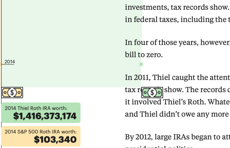
ProPublica continues their analysis of an anonymous IRS tax records dump. In their most recent, they look at how Peter Thiel uses a Roth IRA to avoid taxes on billions.
In the second half of the piece, a time series chart showing the growth of Thiel’s account versus a standard maxed out account. The data progresses as you scroll, which moves the article forward, until it fills the whole window. Nice.
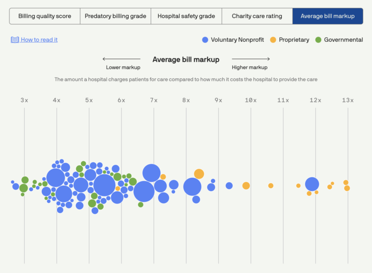
Using data collected by Johns Hopkins University, Michelle McGhee and Will Chase for Axios provide a visual reference for the billing practices of for-profit hospitals:
Rising deductibles and out-of-pocket costs are increasingly leaving patients responsible for bloated medical bills. A new analysis by Johns Hopkins University reveals that many of the top 100 hospitals by revenue in the U.S. use predatory tactics to pursue patients with unpaid bills.
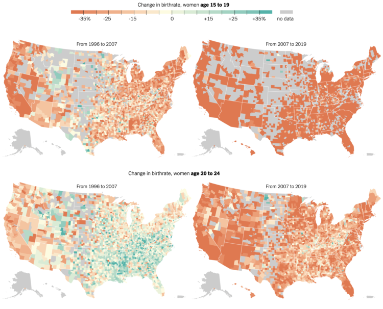
The New York Times mapped birth rates, which are down almost everywhere, especially among women in their 20s:
The result has been the slowest growth of the American population since the 1930s, and a profound change in American motherhood. Women under 30 have become much less likely to have children. Since 2007, the birthrate for women in their 20s has fallen by 28 percent, and the biggest recent declines have been among unmarried women. The only age groups in which birthrates rose over that period were women in their 30s and 40s — but even those began to decline over the past three years.
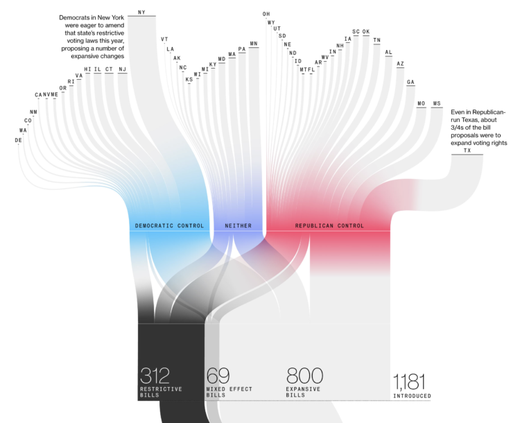
Bloomberg used a Sankey diagram to show the path of over a thousand voting bills, classifying them as restrictive, mixed effect, or expansive:
Across the country, Republican state lawmakers proposed more than 300 bills this year to restrict voting and dozens more that would restrict in some ways and expand in others. But the broadest measures either stalled or were scaled back.
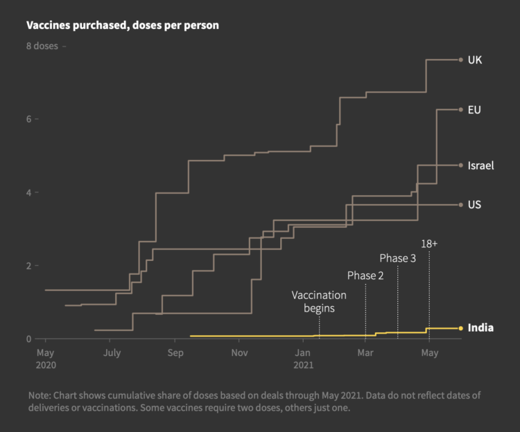
Prasanta Kumar Dutta and Manas Mishra reporting for Reuters on the slow rollout of Covid-19 vaccinations in India:
Compared to many Western countries, India was late in procuring vaccines. Modi’s government placed the first advance order for an unapproved vaccine only this month, after being criticised for being slow. Countries including the United States and Britain signed orders last year.
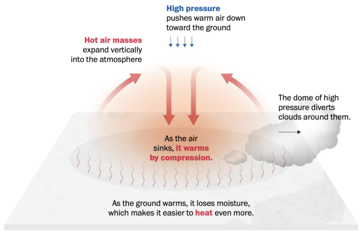
It’s hot here in the western United States, and it’s only mid-June. From The Washington Post, we’re stuck in a heat dome:
Hot air masses expand vertically into the atmosphere, creating a dome of high pressure that diverts weather systems around them. One way to gauge the magnitude of a heat wave is to measure the height of the typical halfway point of the atmosphere — at the 500 millibar pressure level. For this pressure level to stretch to heights of 600 dekameters, or 19,685 feet, is quite rare, but that marker was forecast for this week, and it was indeed reached in Flagstaff, Ariz., on Tuesday.
Splendid.
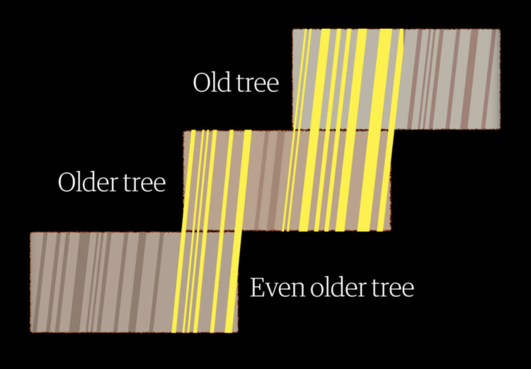
To measure drought in the present day, we use data from sensors that constantly record environmental conditions, such as soil moisture, precipitation, and snow water content. But to measure drought thousands of years ago, researchers can use tree rings. Alvin Chang for The Guardian shows how the researchers line up old rings to gather historical data and then do that across a region.

Michael Friendly and Howard Wainer have a new book out: A History of Data Visualization and Graphic Communication. They rewind back 400 years and discuss the beginnings of visualization, when nobody knew what a chart was. Putting this in my queue and hoping it’s back in stock soon.
Visualization still seems like a relatively new thing. It’s old.
This week I broke down one of my projects and explained as many of the design choices as I could.
While it is often easy, and tempting, to write a scraper as a dirty one-off script, spatula makes an attempt to provide an easy framework that most scrapers fit within without additional overhead.
This reflects the reality that many scraper projects start small but grow quickly, so reaching for a heavyweight tool from the start often does not seem practical.
The initial overhead imposed by the framework should be as light as possible, providing benefits even for authors that do not wish to use every feature available to them.
Although, without my dirty one-off scripts, what will I put in my tmp data folder?
Here’s how to do it in R from start to finish, plus editing in illustration software. Make design choices and trade-offs for more readable charts.

The New York Times investigated the collapse of the Metro, which killed 26 people. They explain their findings with a 3-D model of the train and the tracks:
The Times took thousands of photographs of the crash site and shared the evidence with several leading engineers who reached the same conclusion: The steel studs that were vital to the strength of the overpass — linchpins of the entire structure — appear to have failed because of bad welds, critical mistakes that likely caused the crash.
Impressive use of visuals and scrollytelling to take you through the seemingly small mistakes that added to a terrible outcome.
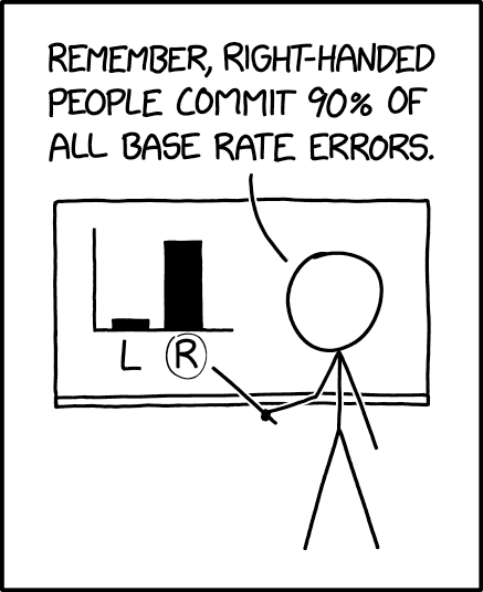
xkcd points out the importance of considering the baseline when making comparisons:
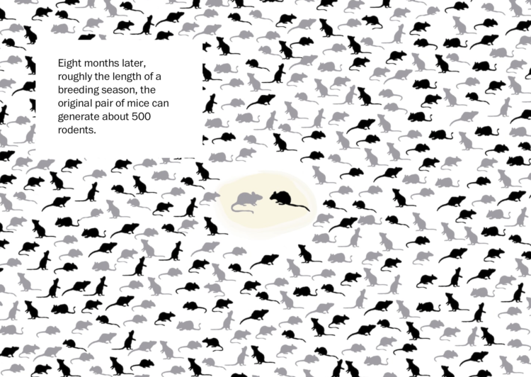
There’s a mouse plague in Australia right now. The words alone don’t express the scale and seriousness of this problem, but this Washington Post piece sure does. The combination of video, photos, and graphics clearly demonstrates the scale. It starts with a pair of mice and escalates quickly from there — and might give you the willies along the way.
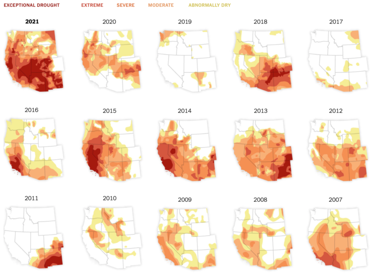
In what’s become a recurring theme almost every year, the western United States is experiencing drought, much of it exceptional or extreme. Nadja Popovich for The New York Times has the small multiple maps to show June conditions each year since 2000.

As a way to reflect on 2020, Catherine Madden wove tapestry to visualize six time series. So nice. [via Visualising Data]

If you’ve got it, take the time to understand and explore your data in the places others rushed through.
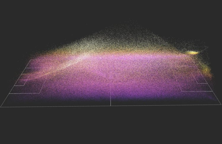
This is a fun soccer graphic by Karim Douïeb. It shows 882,536 passes from 890 matches across various leagues and seasons. It looks cool as a static point cloud, but be sure to check out the animated, interactive version which lets you isolate the view to specific parts of the field.
It reminds me of the Windows 3.1 fireworks screensaver. Those were the days.
You can find the data via StatsBomb, in case you want to play around.
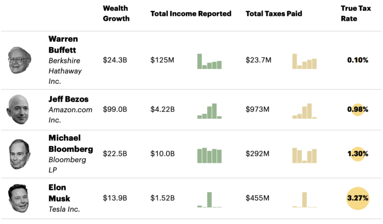
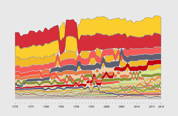
ProPublica anonymously obtained billionaires’ tax returns. Combining the data with Forbes’ billionaire wealth estimates, ProPublica calculated a “true tax rate” for America’s 25 richest people:
The results are stark. According to Forbes, those 25 people saw their worth rise a collective $401 billion from 2014 to 2018. They paid a total of $13.6 billion in federal income taxes in those five years, the IRS data shows. That’s a staggering sum, but it amounts to a true tax rate of only 3.4%.
It’s a completely different picture for middle-class Americans, for example, wage earners in their early 40s who have amassed a typical amount of wealth for people their age. From 2014 to 2018, such households saw their net worth expand by about $65,000 after taxes on average, mostly due to the rise in value of their homes. But because the vast bulk of their earnings were salaries, their tax bills were almost as much, nearly $62,000, over that five-year period.
As you might guess, a lot of the disparity has to do with wealth held in unrealized capital gains. The other part is how the ultrawealthy still pay for everything when most of their money is in investments and how that factors into deductions.


 Visualize This: The FlowingData Guide to Design, Visualization, and Statistics
Available now.