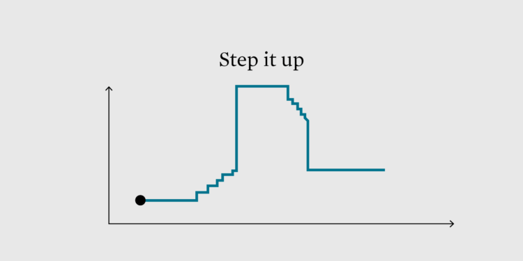
This week we look at the step chart and how to highlight specific patterns in the steps.
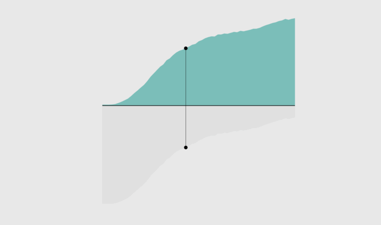
There is no exact time when everyone gets married. You have your own timeline. I have mine. However, we can see when it tends to happen by the percentage of people who married at least once, given their age.
This week we look at the step chart and how to highlight specific patterns in the steps.
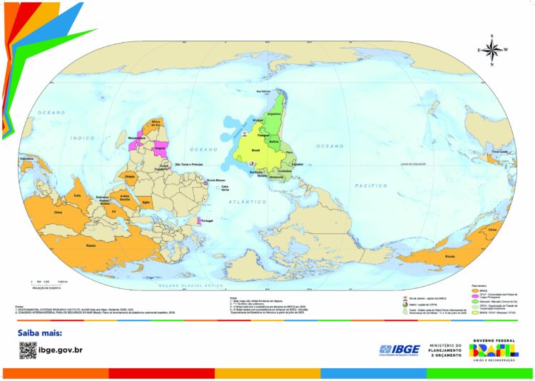
The Brazilian Institute of Geography and Statistics (IBGE), Brazil’s agency for statistics and maps, released a world map that shows south on top and Brazil in the center.
This probably looks upside down and off center to most Americans, but more countries should do this.
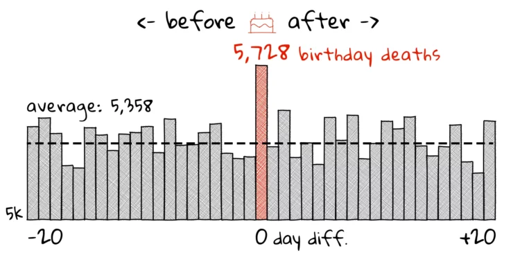
The birthday effect is a statistical anomaly that shows higher likelihood of death on or near your birthday. For the Pudding, Russell Samora analyzes mortality data to see if this effect is for real.
The differing results across studies highlight how methodological choices—from sample selection to statistical analysis—can dramatically shape our findings. When studying something as basic as birthdays and death, how we approach the problem shapes what answers we find.
Warning: this is a statistics lesson in disguise so you might learn something.
There are plans to reduce staffing at the Social Security Administration by 7,000 and perhaps to rebuild the entire codebase, which means check delays could be a real thing. For the Urban Institute, Richard W. Johnson and Jonathan Schwabish ran the numbers for how many people could be affected if checks are just one, two, or three months late.
We find 11 percent of current Social Security beneficiaries, or 7.4 million people, do not have enough savings to replace their benefits if their Social Security checks were delayed for one month. The share with inadequate savings to replace their Social Security increases to 13 percent (8.3 million people) if checks were delayed for two months and to 14 percent (9.2 million people) if checks were delayed for three months.
For reference, SSA has never missed a benefit payment since its inception eight decades ago.
The NOAA database, dubbed Billion-Dollar Weather and Climate Disasters, tracked events that exceeded one billion dollars of damage. It’s kaput. For CNN, Andrew Freedman reports:
The disasters database, which will be archived but no longer updated beyond 2024, has allowed taxpayers, media and researchers to track the cost of natural disasters — spanning extreme events from hurricanes to hailstorms — since 1980. Its discontinuation is another Trump-administration blow to the public’s view into how fossil fuel pollution is changing the world around them and making extreme weather more costly.
Add this to the growing list of discontinued NOAA products, because they are related to climate, even just a tiny bit.
RJ Andrews held an exhibition of data graphics at 41 Cooper in New York. On physical data that exists off the screen:
After my presentation, I was asked about tools and gave my stock answer extolling paper and pencil as the most important creative weapon. This quip surprised me with the biggest applause of the night.
Beautiful information graphics off-screen, in the real world, are a real treat. In some sense the show did not feel special to me as much as it felt natural. The best way to consume data might not be alone on a pocket screen—but together, in conversation, with human-sized artifacts.
Andrews speaks of the satisfaction of such things but also of the challenges of handling physical data.
I’ve felt this with my own physical projects. It’s nice to hold the data. It’s real. It’s tangible.
It takes exponentially more time and effort.
But if we want visualization to extend beyond analytical tools and dashboards, then that’s what we will need to do.
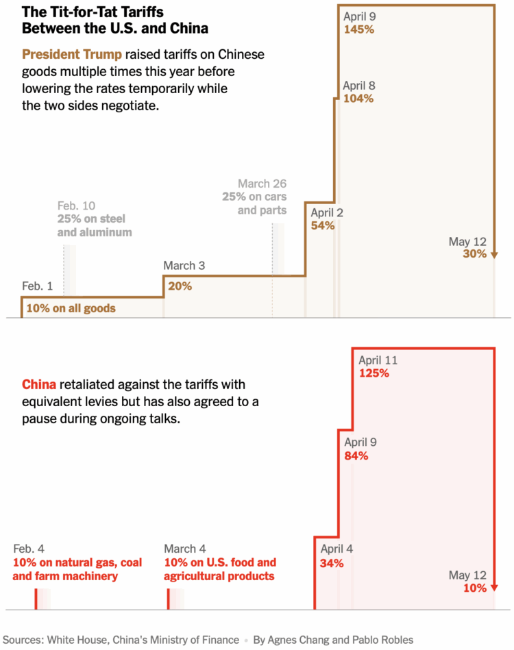
The U.S. and China put a semi-hold on tariffs for the next 90 days. The New York Times provides the timeline so far.
Tariffs on Chinese goods are down to 30% from 145% and tariffs on U.S. goods are down to 10% from the retaliatory 125%. Has anyone explained how countries choose these numbers? They seem arbitrary.
In any case, I’m guessing these step charts will need to update a few times over the next few months. Step charts, which show constant values and then sudden changes over time, might be the chart type of the next few years.
It’s a temporary suspension, for now. For the Washington Post, Maxine Joselow reports:
The program collects data on levels of harmful air pollutants, including ozone and particulate matter, at the 63 national parks in the United States. Federal officials consult this data when deciding whether to grant permits to nearby industrial facilities, such as power plants or oil refineries.
Breathing in these pollutants is linked to a range of adverse health effects. For instance, long- and short-term exposure to particulate matter is associated with heart attacks, strokes, asthma attacks and premature death, according to the Environmental Protection Agency.

For CNN, Andrew Freedman reports:
Of the hundreds of vacancies, the 30 open meteorologist-in-charge roles are particularly worrying, current and former NWS meteorologists told CNN.
Meteorologists-in-charge serve as the captain of a team of forecasters and other specialized staff members. Their decades of experience often comes into play during high-impact weather situations, an active-duty NWS meteorologist told CNN. They also requested anonymity for fear of reprisal.
In addition to headless offices, fewer weather balloons are launching, less data is collected, and the forecasts become less accurate. Not ideal.
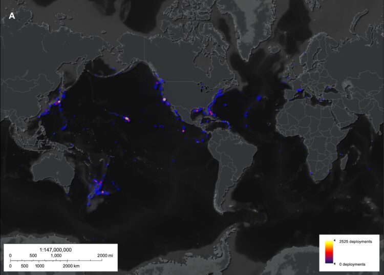
Researchers from the Ocean Discovery League estimated how little we know about the deep seafloor:
We then used two independent methods to estimate the amount of deep seafloor observed globally over the past seven decades (see Methods). Using the dive-based method, we estimate a maximum visual seabed coverage of 2130 km2. Using the time-based method, we estimate visual seabed coverage of 3823 km2.
Of Earth’s total surface area (510 million km2), the seafloor makes up 360 million km2 (approximately 71%). Of this ocean area, approximately 93% is deep seafloor (≥200 m), yielding 66% of the Earth’s total surface area (~335.7 million km2). In the framework of this global context, our exploration coverage estimates show that deep-sea visual tools have only observed 0.0006 to 0.001% of the deep seafloor since 1958.
We’re never going to find Atlantis at this rate.
Seth Godin on the importance of judgment:
AI is a tool, and judgment, for the foreseeable future, remains our job. It doesn’t matter how cool your hammer is, it’s still on you to decide which nails need hammering. And to be responsible for what happens when you use it.
There’s been a shift in wording brought on by the AI wave. People “ask” the AI to do things versus “use” our tools to solve problems, as if we should pass responsibility of thought to statistical models. This seems not good.
When talking about AI, I mentally substitute “computer” or “tool” in its place. I don’t ask my computer to analyze data. I use my computer like someone might use a hammer while building a planter box.
Benj Edwards reporting for Ars Techinca:
In “Large Language Models, Small Labor Market Effects,” economists Anders Humlum and Emilie Vestergaard focused specifically on the impact of AI chatbots across 11 occupations often considered vulnerable to automation, including accountants, software developers, and customer support specialists. Their analysis covered data from 25,000 workers and 7,000 workplaces in Denmark.
Despite finding widespread and often employer-encouraged adoption of these tools, the study concluded that “AI chatbots have had no significant impact on earnings or recorded hours in any occupation” during the period studied. The confidence intervals in their statistical analysis ruled out average effects larger than 1 percent.
See the full study by Anders Humlum and Emilie Vestergaard here.
This seems to make sense. Even if our time is freed up in one area, wouldn’t employers expect that time to be spent elsewhere?
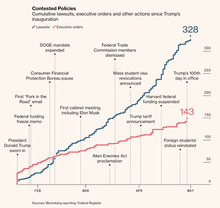
For Bloomberg, Zoe Tillman and Christopher Cannon break down the lawsuits against the administration in response to executive orders. Sometimes it seems like orders are going unchecked, but there is plenty of pushback. Fighting in court is just a less visible and lengthier process.
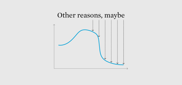
Look for outside reasons, or confounding factors, for why things show up in the data.
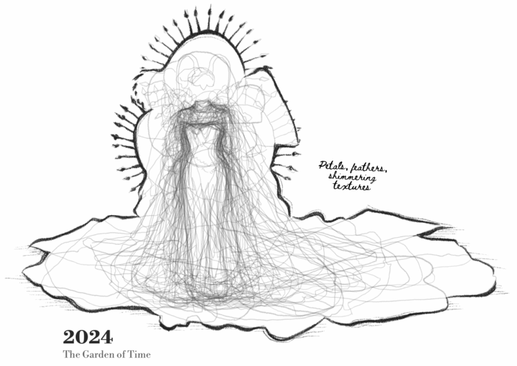
This is outside my wheelhouse, but it seems like Met Gala dresses grow more outlandish each year. Reuters went into the photo archive to confirm.
Using the Reuters photo archive, the Reuters Graphics desk traced 310 celebrity outfits on the red carpet for years 2004, 2009, 2014, 2019 and 2024. Of the thousands of photos in the archive for those years, Reuters selected photos that captured entire outfits in which the subject was facing the camera or slightly turned. Reuters further narrowed the outfits to exclude suits and kilts, then traced the silhouettes of the remaining 310 unique outfits. The traced silhouettes were then laid on top of one another by aligning the shoulder, bust and waist of each garment.
I saw a handful of photos from this year’s 2025 Met Gala, and it seems like attendees dialed dress sizes all the way back (because they were instructed to?). Maybe 2024 was the peak for puffing silhouettes.
In any case, I like the sketch-overlay method to show the variation in patterns. It’s like a combination of this dress size classic and jean pocket comparison, with a touch of hurricane forecast.
For Rolling Stone, Miles Klee reports on a growing trend where ChatGPT disrupts people’s thought processes and coping mechanisms. One example:
Speaking to Rolling Stone, the teacher, who requested anonymity, said her partner of seven years fell under the spell of ChatGPT in just four or five weeks, first using it to organize his daily schedule but soon regarding it as a trusted companion. “He would listen to the bot over me,” she says. “He became emotional about the messages and would cry to me as he read them out loud. The messages were insane and just saying a bunch of spiritual jargon,” she says, noting that they described her partner in terms such as “spiral starchild” and “river walker.”
“It would tell him everything he said was beautiful, cosmic, groundbreaking,” she says. “Then he started telling me he made his AI self-aware, and that it was teaching him how to talk to God, or sometimes that the bot was God — and then that he himself was God.” In fact, he thought he was being so radically transformed that he would soon have to break off their partnership. “He was saying that he would need to leave me if I didn’t use [ChatGPT], because it [was] causing him to grow at such a rapid pace he wouldn’t be compatible with me any longer,” she says.
These stories are edge cases, but we’re also just in the beginning.
As the models spit out text, images, and video that are more realistic, how will people deal with real things that don’t always converge to their preferences and chat history?
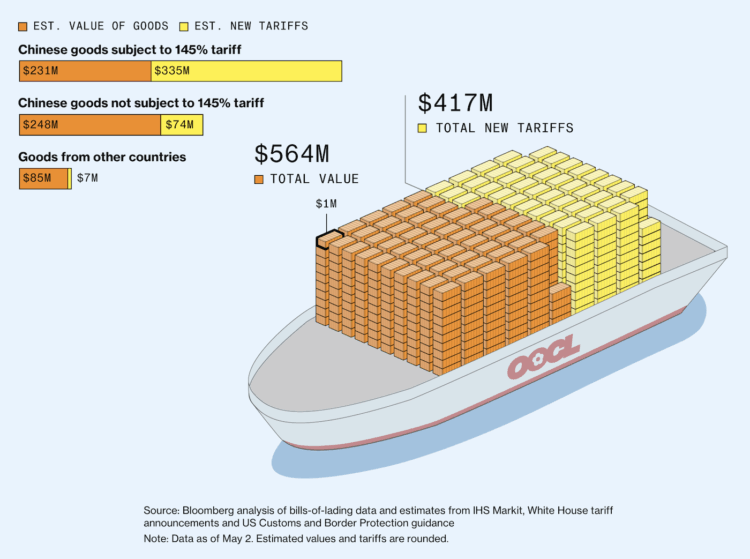
Bloomberg, leaning in to a shipping container metaphor, shows the value of goods (in orange) against declared tariffs (in yellow). Each “container” represents one million dollars, through the lens of $564 million of cargo aboard the OOCL Violet that was en route from China.
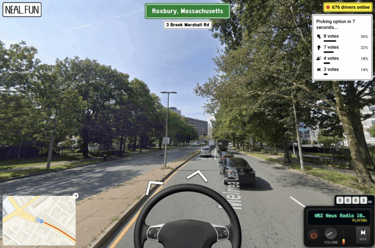
What if you were on a roadtrip and every ten seconds a large group of people decided which way to turn? Internet Roadtrip by Neal Agarwal will show the way.
A street view shows where you are, and a map at the bottom shows where you’ve been. The steering wheel is used to vote on going straight or turning. You can also vote to change the radio station.
I always enjoy Agarwal’s combo of imagination, fun, and technical know-how. The trip appears to be headed out of Boston as of this writing.
A promise behind AI is that it will do all the hard work so that you’ll never have to. The trouble with that is that a big part of living is the process. For the Guardian, Joseph Earp focuses on the process of making:
And I certainly do not want AI to write my books for me, or paint my pictures. Not only would the work be terrible: it wouldn’t even be work. As all creatives know, there is limited joy in having written a book – as soon as it is done, most of us are on to the next thing. The thrill, the joy, the beauty, is in the writing of a book. If you outsource your creative work to a computer, you are not a creative. Someone who merely churns out product is not an artist – they are a salesperson. The artist is the person who makes, not who has made.
 Visualize This: The FlowingData Guide to Design, Visualization, and Statistics (2nd Edition)
New tools, refined process.


