With the holidays just about here, I’m sure there’s nothing you’d rather do more than listen to hours of visualization research talks from VIS 2022. Lucky for you: all the talks are online.
Just sit back, relax, and let the knowledge wash over you.
With the holidays just about here, I’m sure there’s nothing you’d rather do more than listen to hours of visualization research talks from VIS 2022. Lucky for you: all the talks are online.
Just sit back, relax, and let the knowledge wash over you.
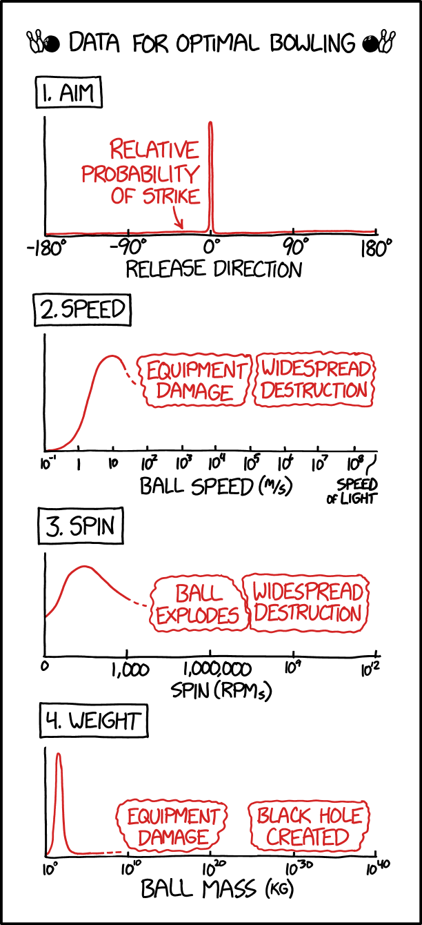
xkcd charted optimal bowling in terms of aim, speed, spin, and weight. This is very important.

Stable Diffusion is an AI model that lets you enter text to generate images. Spectrograms visually represent sound. Seth Forsgren and Hayk Martiros combined the two for Riffusion, which lets you enter text and the model generates a spectrogram that is converted to audio.
Read more about the process here.
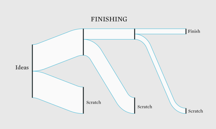
That can’t be for real, right? Right? A basic chart is not quite what it seems.
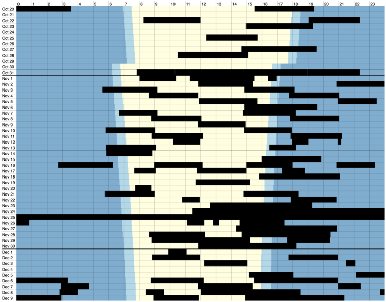
Volodymyr Agafonkin and his family live in Kyiv, Ukraine. He visualized when the power went out over the past two months:
As you can see, we spend 4–8 hours in blackout during a typical day. You can notice some stepping patterns in the data — this is our energy workers trying to stabilize the blackouts into some kind of schedule, although it’s often overridden due to emergency shutdowns. More blackouts happen in the evening time because of the increased load on the grid, with everyone getting home after work and cooking dinner. There’s usually no need for blackouts at night because people go to sleep, and the load falls sharply — that’s usually the time for us to charge devices, turn on the washing machine & dishwasher, and occasionally bake something nice in the oven.

Conway’s Game of Life is a zero-person game where cells in a grid live or die based on a simple set of rules. You set the initial state and the cells change accordingly. Life Universe by saharan is an infinite game of life where you can zoom in and out recursively. Trippy.
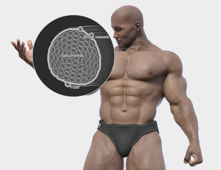
The human body has its limits, so many bodybuilders take steroids to increase those limits to build bigger muscles. Bonnie Berkowitz and William Neff, for The Washington Post, used a combination of illustration and 3-D animations to show what happens and the risks of introducing more of everything to the body.
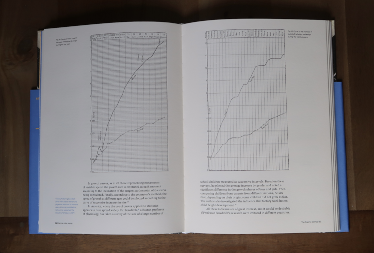
Visualization still seems like a relatively new thing, but it has a history that goes back a few centuries. The Information Graphic Visionaries book series celebrates this history with a profile of three makers — Florence Nightingale, Emma Willard, and Étienne-Jules Marey — and their work.
The series started as a Kickstarter campaign and the books have been making their way out. I just got my copy on Marey and the graphic method. I’m looking forward to digging in.
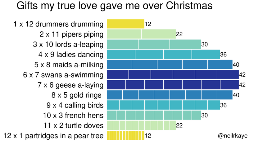
From Reddit user neilrkaye. This is very important.
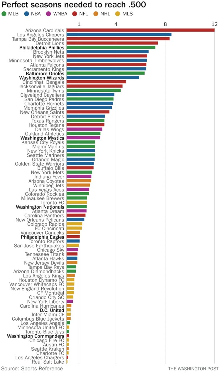
Here’s a fun one from Philip Bump for The Washington Post. Bump simply asks how many wins it would take for sports franchises to reach a .500 record over the life of the franchise. The historically bad teams bubble to the top.
From Maastricht University:
What happens if a SARS-CoV-2 coronavirus enters your lung? This molecular animation visualises how the virus particle can take over the host cell and turns it into a virus factory. Eventually, the host cell produces so many viral particles that it dies and releases numerous new virus particles.
Aw, such a cute little, life-altering virus. [via kottke]

Every ten years since 1952, Sight and Sound, a British film magazine, has asked critics to list the greatest movies of all time. The magazine announced the results from the 2022 poll. There was a clear shift in the rankings. The New York Times highlights the shift with a look through past polls and this year’s newcomers.
The pointers and film callouts bring meaning to an otherwise straightforward ranked list.
Disney Research demonstrates their use of neural networks to seamlessly age and de-age someone’s face across a continuous range. Sure what is real anymore anyway.

Knowing the impact of an asteroid falling in your city might not seem immediately relevant, but if there’s one headed toward Earth and NASA is unable to knock it off course with one of their rockets, you will definitely want to know what will happen and prepare accordingly.
Good thing Neal Agarwal, based on research from Gareth Collins and Clemens Rumpf, made an asteroid simulator. Set the material, size, speed, impact angle, and location, and see the effects from the resulting crater, fireball, shock wave, wind, and earthquake.
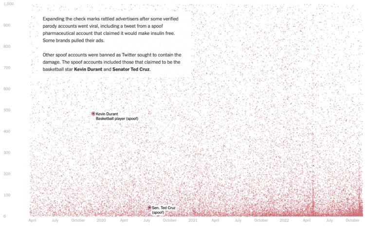
Twitter Blue is a subscription service from Twitter that primarily provided premium features like link aggregation and tweet editing. However, after the acquisition, the service primarily let people acquire a fancy blue checkmark. Stuart A. Thompson, for The New York Times, used data collected by Travis Brown to show who paid for their checkmarks.
It’s a big scatterplot. Each dot represents a Twitter user, plotted by registration date on the x-axis and follower count on the y-axis. The scrolly piece guides you through the dots.
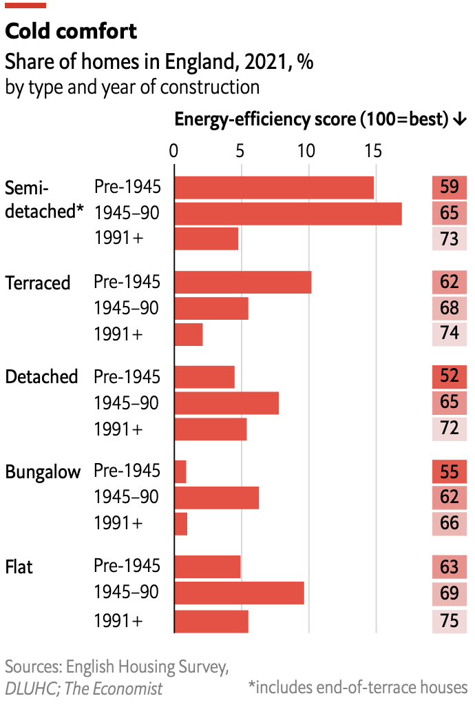 Speaking of old homes and energy efficiency in the UK, The Economist describes renovations that can help reduce energy usage, which is of heightened interest to the British government because it’s footing £40bn of citizens’ energy bills.
They include this small chart on energy efficiency by type of home and when it was built. It took me a second to separate the numbers on the right from the bars on the left, but I eventually got there. The Economist’s self-imposed space constraints for their charts must be fun to think about.
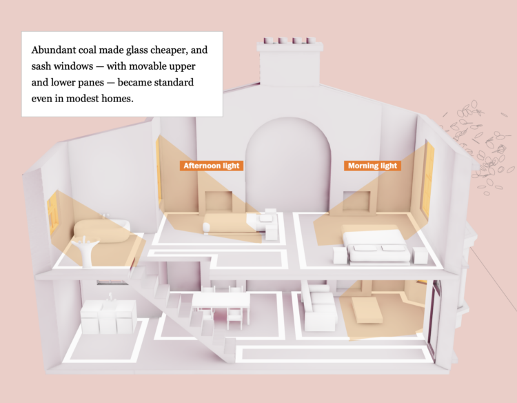
Philip Kennicott, Simon Ducroquet, Frank Hulley-Jones and Aaron Steckelberg, for The Washington Post, tour the evolution of UK architecture and temperature control:
Last summer, staff members at Hardwick Hall, a historic Elizabethan landmark in Derbyshire, were keenly aware of the excessive heat. The house, built during a period of exceptional cold known as the Little Ice Age, is a masterpiece of British architecture. With its glittering array of tall windows, it was vulnerable to the cold, but key design elements made it surprisingly efficient at managing the climate of its day.
As you’d expect, money plays a big role in the changing efficiencies.

Here’s the good stuff for November.
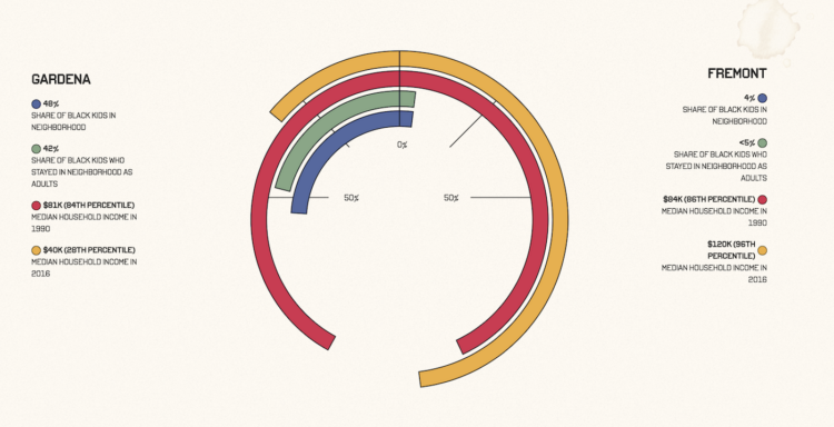
Aaron Williams, for The Pudding, shows upward mobility through his own experiences, moving as a child from a low-income city to a higher-income city.
It’s unclear what my mom meant by “better opportunities.” Still, I got the gist that it was about the socioeconomic measures think tanks, policymakers and researchers use to measure progress: education, housing and income.
I thought, “can I actually measure if moving made a difference?” Indeed, your environment impacts your future outcomes, but to what extent?
I like the nod to W.E.B. Du Bois through style and geometry.
 Visualize This: The FlowingData Guide to Design, Visualization, and Statistics (2nd Edition)
New tools, refined process.