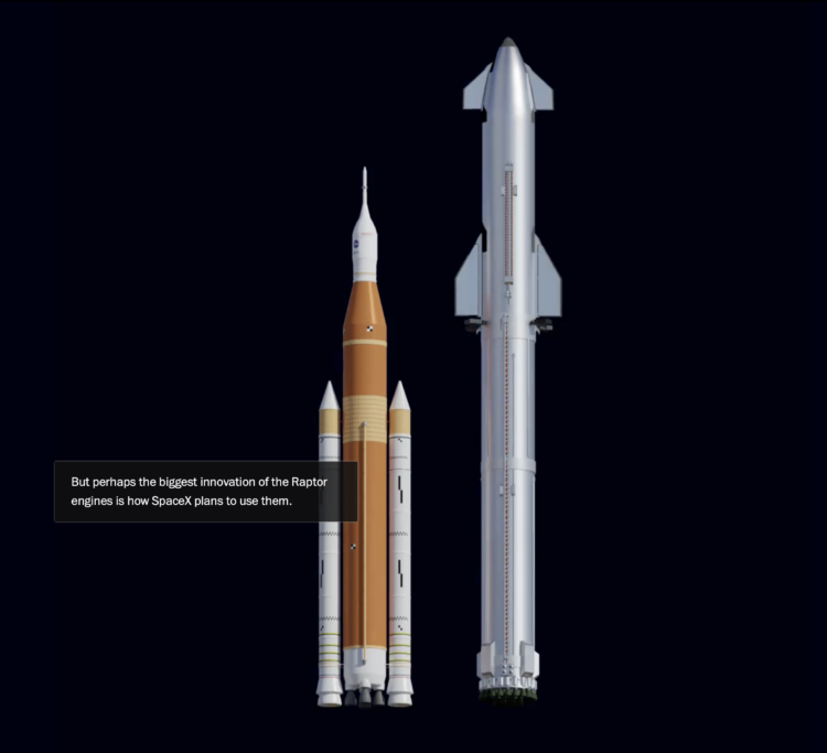
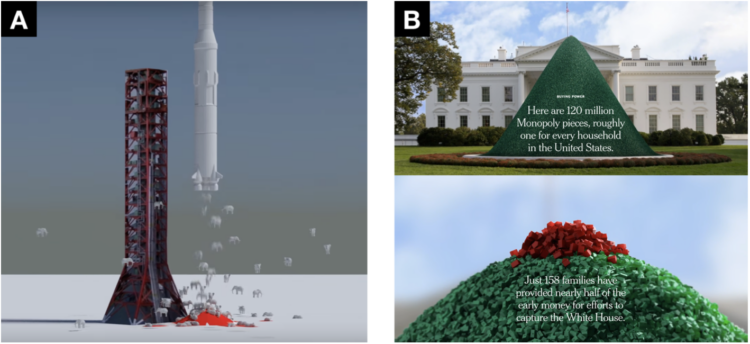
• Membership
  • Newsletter
  • Projects
  • Learning
  • About
  • Member Login
  • Members Only

    Play With Your Data

    September 1, 2022

    Topic

    The Process  /  fun, play

    Time for less work and more play.

  • Data Underload  /  meaning, time use, well-being

    Where We Find Meaning in the Everyday

    The American Time Use Survey asks people to log their activities for a day, and in the most recent release, people also rated the meaningfulness of the activities. Here’s how activity categories rated, sorted by most meaningful to least meaningful.

    Read More
  • Splitting the US population evenly, with arbitrary shapes

    August 31, 2022

    Topic

    Maps  /  Engaging Data, population

    By Engaging Data, this interactive map shows various splits of the United States with the condition that each division has the same population:

    This visualization lets you divide the US into 1,2,3,4,5,8 and 10 different segments with equal population and across different dimensions. The divisions are made using counties as the building blocks (of which there are 3143 in the US). There are numerous different ways to make the divisions. This lets you make the divisions by different types of geographic directions and divisions by population density.

  • China’s possible blockade around Taiwan

    August 30, 2022

    Topic

    Maps  /  blockade, China, New York Times, Taiwan

    It appears China wants to impose a blockade around Taiwan with ships, submarines, and airplanes. The New York Times mapped the possibility and how it could disrupt life in and around the island.

  • Losses and comebacks of Serena Williams

    August 29, 2022

    Topic

    Infographics  /  Serena Williams, tennis, Washington Post

    We tend to celebrate the wins in sports and often forget about or don’t see the climb that athletes take to get to the top. Artur Galocha and Adrian Blanco, for The Washington Post, look back at Serena Williams’ winning career, focusing on who or what she had to compete against from age 15 to 40.

    They start with a wideout view that shows Williams’ full career. Then they zoom in to notable career milestones where past competitors fade in and out of the picture. Years and age run along the same axis, and annotation points to key wins.

    The timeline view is simple and static, but it is well-made.

  • Big diagram of metabolic pathways

    August 29, 2022

    Topic

    Network Visualization  /  biochemistry, metabolism

    The contents of this diagram is not in my scope, but it is a very big, detailed diagram of metabolic pathways. Many steps, many arrows.

  • Where restaurant chains dominate

    August 26, 2022

    Topic

    Maps  /  chains, Clio Andris, restaurant, Xioafan Liang

    Researchers Xiaofan Liang and Clio Andris estimated the percentage of restaurants that are chains and independent to identify “McCities”:

    These high chainness McCities are prevalent in the Midwestern and the Southeastern United States. Independent restaurants were associated with dense pedestrian-friendly environments, highly educated populations, wealthy populations, racially diverse neighborhoods, and tourist areas. Low chainness was also associated with East and West Coast cities.

    Check out the interactive map here.

    My only criticism is that they used a rainbow color scale instead of using a single hue or a diverging color scale that breaks at half.

  • Introduction to Probability for Data Science, a free book

    August 26, 2022

    Topic

    Statistics  /  book, probability, Stanley Chan

    Introduction to Probability for Data Science is a free-to-download book by Purdue statistics professor Stanley H. Chan:

    We need a book that balances the theory and practice. We need a book that provides insights and not just theorems and proofs. We need a book that motivates the students, telling them why probability is so essential to their work. We need a book that highlights the impacts of the subject. From over than half a decade of teaching the course, I have distilled what I believe to be the core of probabilistic methods. I put the book in the context of data science, to emphasize the inseparability between data (computing) and probability (theory) in our time.

    Download a free PDF copy or buy a physical copy.

  • Members Only

    Visualization Tools and Learning Resources, August 2022 Roundup

    August 25, 2022

    Topic

    The Process  /  roundup

    Here’s the good stuff for August.

  • Meteorologist delighted by surprise map interaction

    August 25, 2022

    Topic

    Maps  /  interaction, weather

    Meteorologist Greg Dutra was delivering the daily weather news for ABC Chicago and accidentally discovered that his map was interactive when he touched the screen:

    This wasn’t in the training manual! @TBrownABC7 @valwarnertv and I go OFF THE RAILS when I discovered the TV is a touch screen while on-air on @ABC7Chicago 😂 pic.twitter.com/almrdxqz3d

    — Greg Dutra (@DutraWeather) August 4, 2022

    It’s good, wholesome joy from a data display, in case you forgot what that looks like.

  • Network for Marvel Cinematic Universe

    August 24, 2022

    Topic

    Network Visualization  /  Marvel, Tristan Guillevin

    With a fun view of the Marvel Cinematic Universe, Tristan Guillevin walks through a network of characters and movies from 2008 through 2012. Each white-filled circle represents a movie, and each black-filled circle represents a character, connected to the movie he or she appeared in.

    See also the 3-D network by The Straits Times from a few years back that goes into more depth with interactions between characters.

  • Incomplete crime data

    August 24, 2022

    Topic

    Data Sharing  /  FBI, Marshall Project, report

    When the FBI switched to a new data collection system, which relies on local police departments to report their numbers, about 40% of agencies didn’t switch over. The Marshall Project made an interactive to see who’s reporting data in your state:

    Many criminologists fear the missing data means the nation would not get reliable crime data for years to come. If a local police department did not report crime data to the FBI, it would also mean scholars, policy makers and the public cannot compare what’s happening with crime in their community with other places.

  • Welcome to Meltsville

    August 23, 2022

    Topic

    Infographics  /  climate, heat, Washington Post

    It’s getting hot in cities around the world, each city with its own set of problems. The Washington Post combined all the problems into one fictional city called Meltsville. There are travel delays because the road is melting, bridges are cracking from heat expansion, and it’s generally a hard place to live.

  • Megaflood scenario

    August 22, 2022

    Topic

    Infographics  /  California, climate, New York Times, rain, storm

    Highlighting research by Xingying Huang and Daniel L. Swain, who studied “plausible worst case scenario” extreme storm sequences, The New York Times provides a glimpse of what that might look like in California. There are maps, there are charts, and there is an augmented reality view to put rain in your living room.

  • Breaking down the higher price on a restaurant receipt

    August 19, 2022

    Topic

    Infographics  /  inflation, New York Times, receipt, restaurant

    If you’ve eaten at a restaurant lately, you might have noticed a substantially higher bill than you’re used to. You’d be right to assume that it’s because of things like inflation and pandemic-induced prices, but you might not realize how much the cost of ingredients, labor, and a new takeout business model has gone up for restaurants. Priya Krishna and Umi Syam, for The New York Times, redesigned a single receipt to show a more detailed breakdown.

    The receipt presentation and color-coded scrolling are tops. It’s a well-made table that works with the copy to highlight items.

  • Members Only

    Visualization for One

    August 18, 2022

    Topic

    The Process  /  audience, generic, specificity

    Communicate to fewer people to reach more.

  • Worst drought in Europe, in 500 years

    August 18, 2022

    Topic

    Maps  /  climate, Dominic Royé, drought, Europe

    Dominic Royé mapped river discharge in Europe over the past few months:

    A single map for the worst #drought in 500 years in Europe. The river discharge anomaly based on reanalysis data from June to August 12 2022, shows an average negative anomaly of -29%, even reaching less than -62% at some points. #rstats #dataviz pic.twitter.com/LSGMfS52Lm

    — Dr. Dominic Royé (@dr_xeo) August 14, 2022

    This climate change thing seems real.

  • How much gas European sites have stored for the winter

    August 17, 2022

    Topic

    Statistical Visualization  /  Europe, gas

    Reuters goes with the radar chart to show gas supplies, as European countries prepare for the winter and possibly no gas from Russia. The circular shape shows the annual cycle, the gray shows the previous five-year average, and the blue shows the current year’s supply.

  • Tracked while reading about being tracked at work

    August 16, 2022

    Topic

    Infographics  /  New York Times, privacy, productivity, tracking, work

    While reading this NYT article, by Jodi Kantor and Arya Sundaram, on the drawbacks of activity and time tracking for work, the article itself tracks your reading behavior. You see counters for the time you spend reading and scrolling, clicks, keystrokes, idle time, and active time. It comes complete with snippy comments and a final grade — and a bitter taste for productivity tracking.

  • Google Maps incorrectly pointing people to crisis pregnancy centers

    August 16, 2022

    Topic

    Mistaken Data  /  abortion, Bloomberg, Google, search

    Davey Alba and Jack Gillum, for Bloomberg, found that Google Maps commonly points people to crisis pregnancy centers, non-medical locations that encourage women to follow through with pregnancy, when they search for “abortion clinic”.

  • Page 55 of 392
  • <
  • 1
  • ...
  • 52
  • 53
  • 54
  • 55
  • 56
  • 57
  • ...
  • 392
  • >

Analyze, visualize, and communicate data usefully, beyond the defaults.

Become a member →

Recently for Members

May 8, 2025
When the data is not what it seems

May 1, 2025
Finding the Right Charts

April 24, 2025
Visualization Tools, Datasets, and Resources – April 2025 Roundup

April 17, 2025
Breaking Out of Chart Software Defaults

April 15, 2025
Line Chart with Decorative Neon Accents

Browse by Chart Type See All →

Small Multiples Organogram Calendar Treemap Pyramid Chart Pictogram Slope Chart Connected Scatter Plot Parallel Sets Horizon Graph

Browse By Topic

  • Visualization

    Seeing data

  • Maps

    Seeing geographic data

  • Infographics

    Explaining data

  • Networks

    Connecting data

  • Statistics

    Analyzing data

  • Software

    Working with data

  • Sources

    Getting data

  • Design

    Making data readable

Get the Book

Visualize This: The FlowingData Guide to Design, Visualization, and Statistics

Available now.

Order: Amazon / Bookshop

Made by FlowingData

  • The Process

  • Data Underload

  • Chart Everything

  • Guides

  • Books

  • Shop

  • About
  • Contact
  • Newsletter
  • LinkedIn
  • Instagram
  • Bluesky
  • RSS
Copyright © 2007-Present FlowingData. All rights reserved.