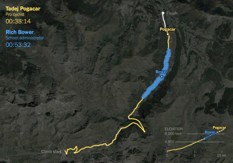
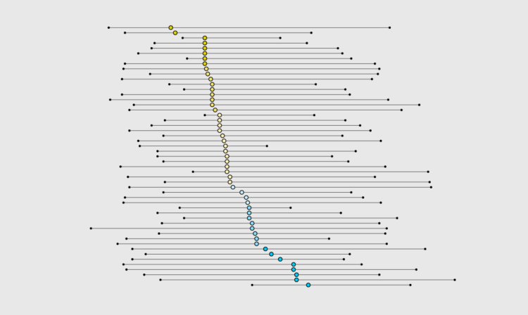
• Membership
  • Newsletter
  • Projects
  • Learning
  • About
  • Member Login
  • Mona Chalabi wins Pulitzer for data illustrations

    May 9, 2023

    Topic

    News  /  illustration, Mona Chalabi, New York Times, Pulitzer

    Mona Chalabi, known around these parts for her illustrative approach to data journalism, was awarded a Pulitzer Prize for her New York Times piece on Jeff Bezos’ extreme wealth. She compared the scale of Jeff Bezos wealth against median wealth, and the absurdity of the scale leant itself to ridiculous comparisons.

    Amazing. Congratulations to Mona.

  • Arguing in favor of dual axes to show correlation

    May 9, 2023

    Topic

    Design  /  correlation, dual axis, Toph Tucker

    Charts that use two different scales on the same vertical often get the automatic “misleading” label, because if you stretch and shrink two data series enough, you’ll eventually find a way to make them look related. Toph Tucker argues that the automatic dismissal is misguided:

    So yes, dual axes transform the series, and that transformation can lie. But it is the same kind of transformation that is already built into the Pearson correlation coefficient. Insofar as dual axes are bad, so is the Pearson correlation coefficient. Their merits and their badness go together. Dual axes are good at showing spurious correlation because they are good at showing correlation.

    The challenge is that when you see a line chart with time on the horizontal axis and multiple data lines, it’s hard to separate coordinate systems and we’ve learned to read the lines as patterns over time. On the other hand, a scatterplot (or a connected one for time) highlights the relationship.

    So while you don’t need to avoid dual axes completely, you should be careful when you do.

  • Mapping where trees will grow

    May 8, 2023

    Topic

    Maps  /  climate change, trees, Washington Post

    As the climate changes, the places that different types of trees will grow also shifts. Harry Stevens, for The Washington Post, provides the searchable maps to show the changes, based on data from the Davey Tree Expert Company.

    Maybe the most interesting part is that there’s a “check my work” section at the end, which points you to the code to make the maps.

  • Demonstrating how large language models work

    May 5, 2023

    Topic

    Statistics  /  AI, language, model, Upshot

    You might’ve heard about large language models lately. They’re the “brains” behind recent chatbots that seem to know an awful lot. Aatish Bhatia, for NYT’s The Upshot, walks you through how such a model “learns” to write based on a relatively small body of text.

    There’s a little bit of Choose Your Own Adventure mixed in, so you can select the type of text. Bhatia used nanoGPT, an open source library, to model Jane Austen, Shakespeare, and Star Trek: The Next Generation.

  • Members Only

    Chart Practice

    May 4, 2023

    Topic

    The Process  /  practice

    Split it up into small pieces and then aim for depth.

  • Quantum computing visual explainer

    May 4, 2023

    Topic

    Infographics  /  Financial Times, quantum computing, security

    Quantum computing promises a higher level of processing power over current computers, but it comes with its own challenges with implementation. When it comes to fruition, it’ll also break current privacy measures like your banking password. Financial Times explains how this works with a fine set of animations and illustrations.

  • When you cross hydropower and a battery

    May 3, 2023

    Topic

    Maps  /  energy, New York Times, renewable

    Mira Rojanasakul and Max Bearak for The New York Times highlight the rise of pumped storage around the world. Instead of a big dam to store water, two reservoirs are used. One is high. The other is low. When there is excess power available, water is pumped to the higher one, and when more is needed, water is released down to the lower one.

  • Sketchbook  /  30DayChartChallenge, practice

    Chart Challenge for a Day

    The 30-Day Chart Challenge tasks you with a visualization prompt each day in April. I’ve wanted to do it the past couple of years, but my schedule doesn’t really fit with the daily-thing-for-thirty-days genre of challenges. So my genius idea was to compress the challenge into one day.

    Read More
  • Non-abstract Curry shot chart

    May 1, 2023

    Topic

    Infographics  /  basketball, shot chart, Stephen Curry, Todd Whitehead

    Stephen Curry of the Golden State Warriors scored 50 points in game 7 against the Sacramento Kings. He made 20 shots. Instead of the standard shot chart with dots on a simplified court, Todd Whitehead overlaid video frames of every made shot for a single image.

    I assume all shot charts will take this format from now on. Thanks, ESPN.

  • Bed and Bath’s Beyond

    May 1, 2023

    Topic

    Statistical Visualization  /  bankruptcy, Bed Bath & Beyond, CNN

    Bed Bath & Beyond filed for bankruptcy, so Alex Leeds Matthews and Amy O’Kruk for CNN took the chance to look at the product offerings for the store. It is mostly beyond at this point.

    I enjoyed the goofy premise.

  • Melting ice, global effects

    April 28, 2023

    Topic

    Maps  /  climate change, glaciers, NPR

    Ice is melting at the poles, which makes it seem like a localized problem. However, as NPR shows and describes in a visual series, the large amounts of fresh water melting into the ocean mixes in with currents and changes temperatures, chemistry, and water levels globally.

  • Members Only

    Visualization Tools and Learning Resources – April 2023 Roundup

    April 27, 2023

    Topic

    The Process  /  roundup

    Here’s the good stuff for April.

  • Switching to electric school buses

    April 27, 2023

    Topic

    Infographics  /  Bloomberg, electric vehicle, LEGO, school bus

    For Bloomberg, Zahra Hirji and Denise Lu on the electrification of the national school bus fleet:

    Most school buses today run on diesel. The climate footprint of a diesel school bus is about 3.3 pounds of carbon dioxide equivalent (CO2e) per mile, more than double the per-mile footprint (roughly 1.5 pounds of CO2e) for a bus powered on the average US electric grid, according to Argonne National Laboratory. If a large share of the American school bus fleet — the largest mass transportation system in the country — electrifies, that would translate to a significant emissions cut.

    They used a LEGO school bus to show how a diesel school bus is retrofitted as an electric one, which is a plus in my book.

  • How little we save for retirement

    April 26, 2023

    Topic

    Statistical Visualization  /  income, retirement, USAFacts

    Saving for retirement is a slow process with an end goal that can seem far away, especially if you’re young. So we put it off until later. Then time sneaks up on us, for many it seems, and we’re stuck having to work longer and rely heavily on Social Security. Over at USAFacts, we looked at how much Americans save and show how your savings compare.

  • FiveThirtyEight layoffs

    April 26, 2023

    Topic

    News  /  data journalism, FiveThirtyEight, layoffs, Nate Silver

    Disney began more layoffs, and data-centric FiveThirtyEight, which is owned by Disney, was part of the round. Nate Silver, founder and editor-in-chief of the site, also announced he is likely to be leaving soon:

    Disney layoffs have substantially impacted FiveThirtyEight. I am sad and disappointed to a degree that’s kind of hard to express right now. We’ve been at Disney almost 10 years. My contract is up soon and I expect that I’ll be leaving at the end of it.

    I had been worried about an outcome like this and so have had some great initial conversations about opportunities elsewhere. Don’t hesitate to get in touch. I am so proud of the work of FiveThirtyEight staff. It has never been easy. I’m so sorry to the people impacted by this.

    Feels like a shift in data and stories.

  • Words used in cannabis business names

    April 25, 2023

    Topic

    Statistical Visualization  /  business, cannabis, Washington Post, words

    Daniel Wolfe for The Washington Post looked at the similar word choices across cannabis business names:

    To check if companies are distinguishing themselves, we analyzed every dispensary listing from WeedMaps, a map directory for local cannabis distributors. Here’s what patterns emerged when we examine the company’s name through a language model.

    The premise is that businesses should aim for brand differentiation, and if all the dispensaries have similar names, it’s tough for any one to stand out.

    I guess that’s true, but all I could think about was all the Chinese restaurants that I’ve been to, which also have similar names, even in the same city. People definitely are still able to pick out the good places.

  • India estimated to pass China in population

    April 24, 2023

    Topic

    Statistical Visualization  /  China, India, New York Times, population

    Based on the United Nations’ world population report, it is estimated that India’s population will increase past China’s some time this year. For The New York Times, Alex Travelli and Weiyi Cai have charts to show how and why.

  • Data Underload  /  income, work

    Income Sources

    Most people have a job and receive wages in return, but that starts to change when you get into the higher income groups.

    Read More
  • Members Only

    Explaining More, Assuming Less

    April 20, 2023

    Topic

    The Process, Visualization  /  assumptions, audience, teaching

    You know what they say about assumptions.

  • An illustrated tour of the skies in an elevator

    April 20, 2023

    Topic

    Infographics  /  Neal Agarwal, scale, scrollytelling, space

    Neal Agarwal is up to his wonderful ridiculousness again. Imagining an elevator that goes up to space, a long scroll through the skies gives you a sense of elevation up until you leave Earth. See how high birds fly, where the wild yak resides, and who was the first person to break the sound barrier in a free fall.

  • Page 43 of 392
  • <
  • 1
  • ...
  • 40
  • 41
  • 42
  • 43
  • 44
  • 45
  • ...
  • 392
  • >

Analyze, visualize, and communicate data usefully, beyond the defaults.

Become a member →

Recently for Members

May 15, 2025
Step Chart, Enhanced

May 8, 2025
When the data is not what it seems

May 1, 2025
Finding the Right Charts

April 24, 2025
Visualization Tools, Datasets, and Resources – April 2025 Roundup

April 17, 2025
Breaking Out of Chart Software Defaults

Browse by Chart Type See All →

Bump Chart Bubble Chart Square Pie Chart Frequency Trails Radar Chart Line Map Unit Chart Grid Map Slope Chart Scatter Plot

Browse By Topic

  • Visualization

    Seeing data

  • Maps

    Seeing geographic data

  • Infographics

    Explaining data

  • Networks

    Connecting data

  • Statistics

    Analyzing data

  • Software

    Working with data

  • Sources

    Getting data

  • Design

    Making data readable

Get the Book

Visualize This: The FlowingData Guide to Design, Visualization, and Statistics

Available now.

Order: Amazon / Bookshop

Made by FlowingData

  • The Process

  • Data Underload

  • Chart Everything

  • Guides

  • Books

  • Shop

  • About
  • Contact
  • Newsletter
  • LinkedIn
  • Instagram
  • Bluesky
  • RSS
Copyright © 2007-Present FlowingData. All rights reserved.