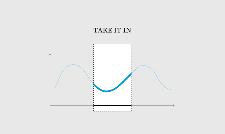
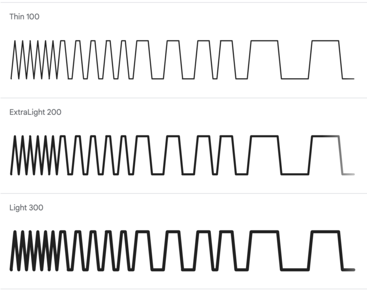
As more charts shift to smaller screens, we have to find ways to save space but keep the data readable. There are options.
As more charts shift to smaller screens, we have to find ways to save space but keep the data readable. There are options.
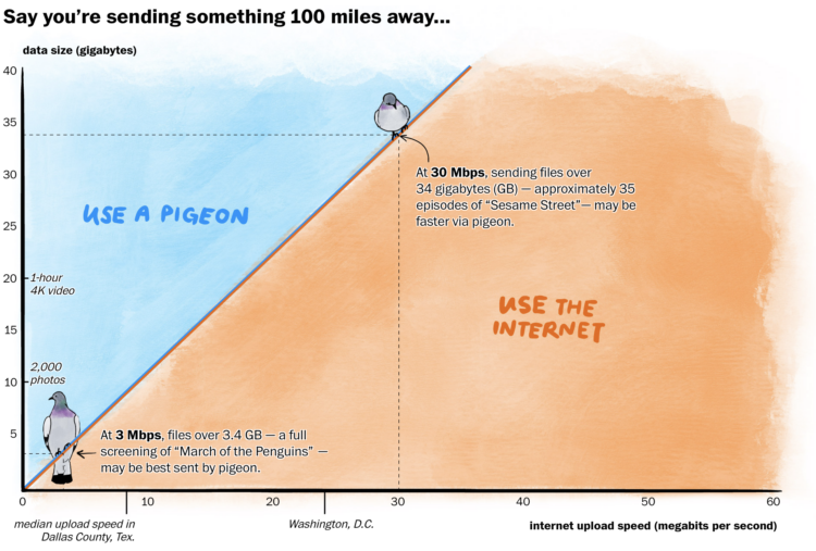
In some rural areas, upload speeds are crawlingly slow, which can make it difficult to send things on the internet. In some cases, a carrier pigeon might even be faster. For The Washington Post, Janice Kai Chen did the math so you know which one to use:
Racing pigeons clock an average of 40 miles per hour and typically race up to 400 miles, roughly from D.C. to Boston, according to the American Racing Pigeon Union. With the boost of a tailwind, pigeons have been recorded going as fast as 110 mph and as far as 1,000 miles.
At certain data volumes and distances, the pigeon is a quicker option for large swaths of rural America, where internet speeds can lag far behind the national average.
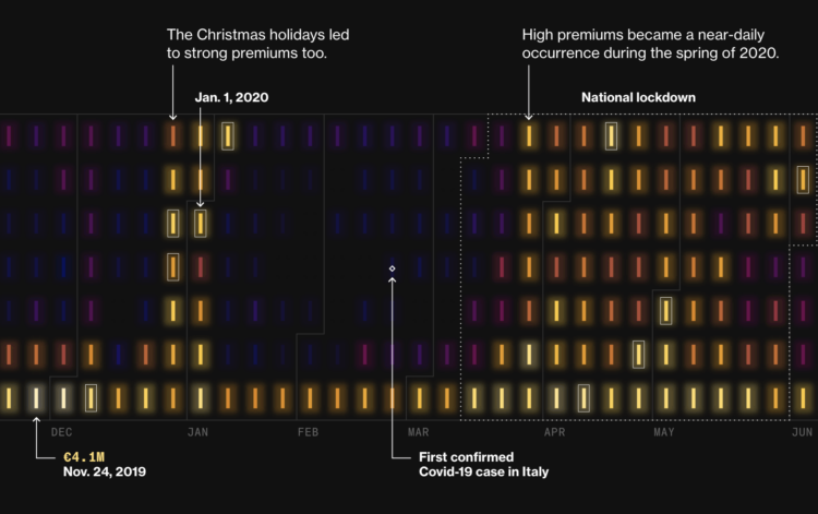
During Covid lockdowns, power companies in Italy charged premiums to cover increased prices for electricity, but it appears that isn’t the full story. For Bloomberg, Vernon Silver, Eric Fan, and Sam Dodge analyzed costs and premiums over time:
Even so, it’s clear – from executives’ celebratory comments during earnings calls as well as simple mathematics – that the dispatch market’s higher prices helped companies do far better than merely avoiding losses. In 2020 alone, dispatch premiums totaled €1.2 billion – or 238% more than companies would have received at the day-ahead price.
It looks like the power costs might partially be an excuse to charge more premiums. Maybe. Either way, I’m into the glowing aesthetic on the calendar heatmaps.

Health insurers reject claims often, and if this happens, you can file an appeal. However, before you file the appeal, it can help to see the records insurers used. ProPublica made a letter generator to make it easier to get these records.
A claim file is a collection of the information your insurer used to decide whether it would pay for your medical treatment or services. Most people in the U.S. facing a denial have the right to request their claim file from their insurer. It can include internal correspondence, recordings of phone calls, case notes, medical records and other relevant information.
Information in your claim file can be critical when appealing denials. Some patients told us they received case notes showing that their insurer’s decision was the outcome of cost-cutting programs. Others have gotten denials overturned by obtaining recordings of phone calls where company staff introduced errors into their cases.

When you look up directions with a mapping application, there are algorithms that run to find the shortest route. Jan Pánek made an interactive map that animates the search with various algorithms. Click the map for an origin and destination, and then watch it play out.
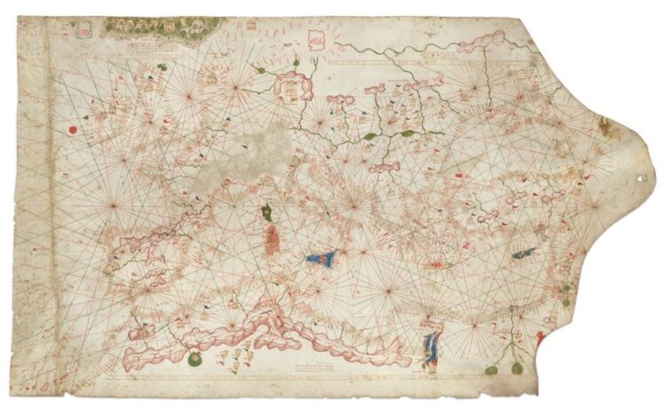
The map sold for $239,000 at a Christie’s auction, but it was misdated and is a couple of centuries older than previously thought:
It’s the fourth oldest surviving portolan chart of Europe, the oldest being the Carta Pisana from the late 13th century, which is held by the national library of France. The asking price now is $7.5 million, another category of collecting altogether and one that will likely remain framed on Clausen’s office wall until a university or museum decides to take ownership of it.
Excuse me while I pivot this site to historical chart collection.

In the land of what-if and what-about, it’s surprisingly easy to get stuck staring at your work, thinking about how your audience will hate it. You have to let it go.

muted.io is a set of visual tools to help you learn music theory. Learn about notes, chords, and scales through a playful and colorful interface.
Google Fonts now provides two open source fonts by Dmitry Ivanov that let you make simplified, small to medium line and bar charts based on data: Linefont and Wavefont. These might come in handy when you want to embed small charts in body text.
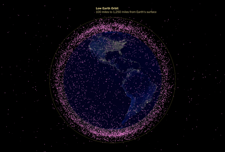
The Washington Post looked at the many satellites orbiting our planet. A globe shows a dot for each satellite, which are mostly there to show that there are a lot. I always appreciate dot transitions.
What jobs typically pay over $200,000 in annual salary? What about jobs that pay at least six-figure incomes? These are income ranges for the ten most common jobs at different income levels.

Using a combination of weather reports, videos, and 911 calls, The New York Times uses mixed media to show the events leading up to the wildfire in Lahaina, Maui.
Firefighters had rescued dozens of people from the seawall by 2 a.m. The fire continued spreading into the next morning. To the north, more residents, unsure of the risk to them, were roused from their homes when flames suddenly reached their streets. The fire also spread to the town’s southern edge, where the police worked to evacuate residents.
The inferno ultimately consumed thousands of buildings, stretching across more than three miles of Lahaina’s waterfront.
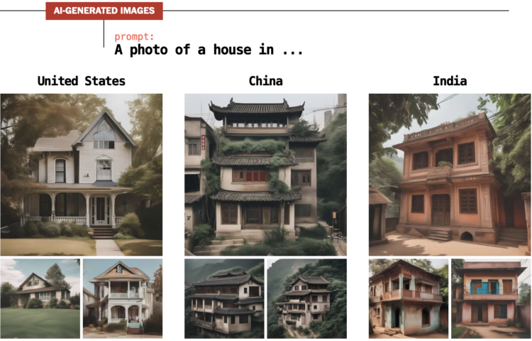
For The Washington Post, Nitasha Tiku, Kevin Schaul and Szu Yu Chen demonstrate how AI generators lead to biased images. The systems use data slurped up from the internet to guess what pixels to show based on the text (i.e. a prompt) that you provide. So the images are often the result of calculations that look for the most common pixels in the source data rather than a real-world representation.
To most people, the bias probably seems harmless with an assumption that the systems will improve. And that might be the case. But just you wait until an AI chart generator, based on the inputs of visualization critiques scraped from the internets, only produces bar charts with obscene amounts of white space no matter what you try. Then you’ll be sorry you didn’t care sooner.

Maybe you’ve run into the rare situation/blessing of too much space, and you’re not sure how to fill it. There are options.
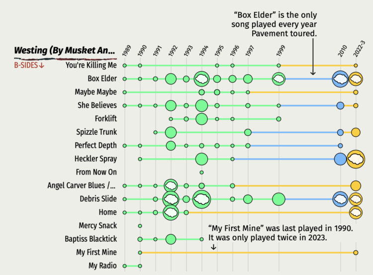
Denise Lu, a superfan of Pavement, an indie rock band, examined the set lists from years past. I didn’t know anything about the band going in but came out with an appreciation of their art and some curiosity.
Mostly, I enjoy these pieces where someone loves something and takes you down the data rabbit hole with them.
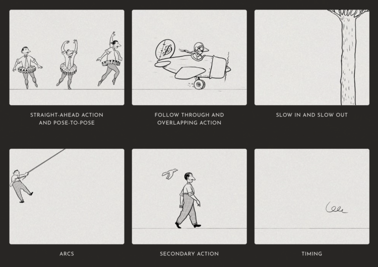
As Disney and its stock price struggles with streaming, Reuters looks at how Disney overcame previous challenges in its 100-year history. One of the first challenges was making animation that was believable:
He obsessed over quality and poured money into producing cartoons that would resonate with his audience. He wrote that observing the real world was key and animation must have, “a foundation of fact, in order that it may more richly possess sincerity.”
The studio formalized 12 principles of animation which transformed static sketches into lively characters on a screen. Veteran animators taught the principles to each of the new artists who joined the studio to ensure consistency.
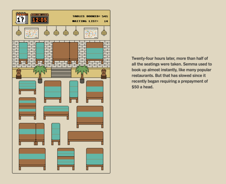
When you score a reservation at a busy restaurant, it can feel like you just won a modest lottery. However, getting a reservation is not just randomness. You’re up against others vying for the same seats, and you have to work within the seating arrangements of the restaurant. You need a strategy.
For The New York Times, Priya Krishna, Umi Syam and Aliza Aufrichtig frame strategies in the context of getting a reservation at Semma, a restaurant in New York City. They documented their reservation quest through the service Resy.
I enjoyed the pixel view and game metaphor. All it needed was some 8-bit music.
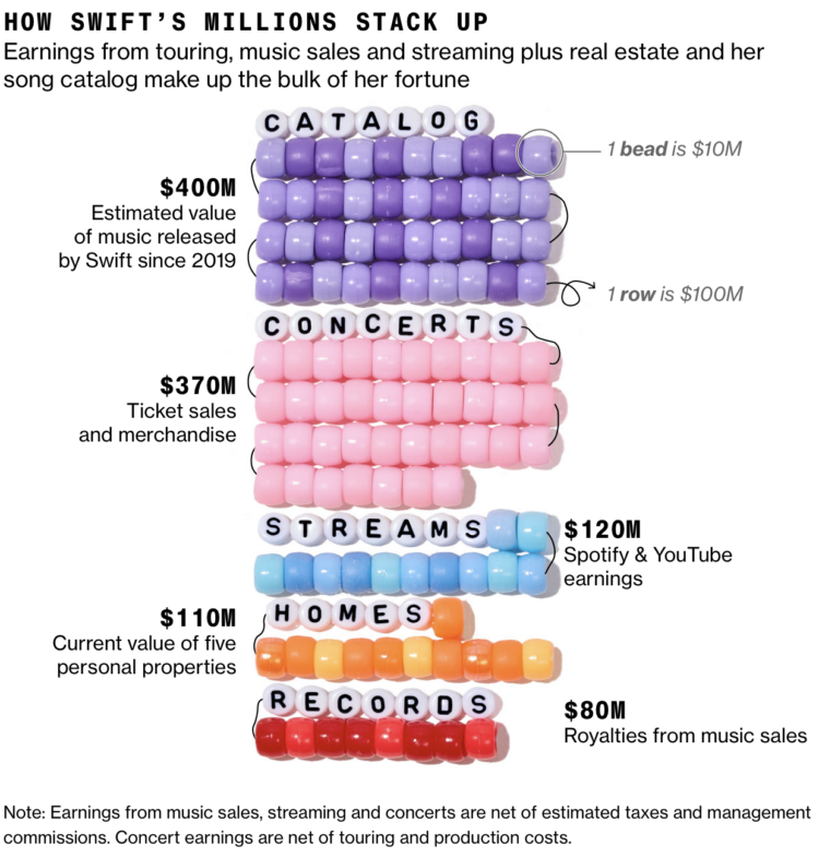
Bloomberg estimates that Taylor Swift reached billionaire status with her recent touring and music releases. Swift achieved the milestone mostly with music. Bloomberg provides the visual splits with bracelet beads.
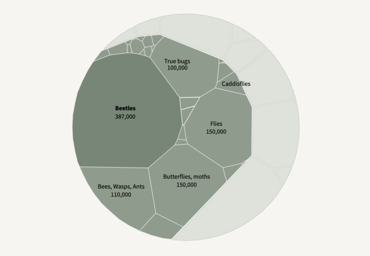
Insects are dying at a high rate every year, but it is difficult to estimate an accurate number, because it is a challenge to gather data for millions of species around the world. In a new-to-me series, Reuters broke it down:
The world has lost 5% to 10% of all insect species in the last 150 years — or between 250,000 and 500,000 species, according to a February 2020 study in the journal Biological Conservation. Those losses are continuing, though estimates vary due to patchy data as well as uncertainty over how many insects exist.

Here is the good stuff for October 2023.
 Visualize This: The FlowingData Guide to Design, Visualization, and Statistics (2nd Edition)
New tools, refined process.


