Google recently released a visualization API that allows you to share embeddable visualization on your website, create Google Gadgets that can be shared and reused, and create extensions for existing Google products. Andrew asks, “Will this shape the future of data visualization online?”
On one side, this is exciting for the visualization field, because when Google talks, everyone listens. On the opposing side, could this be another Google Maps type of thing? Google Maps was cool at first, but now, mashup after mashup has left me bored and disillusioned. Ultimately though, I like to think that this API is going to benefit all of us.
What the API Offers
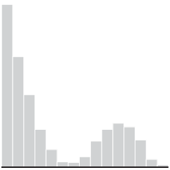
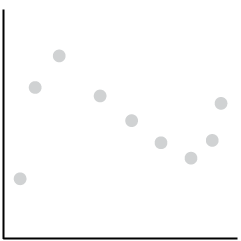
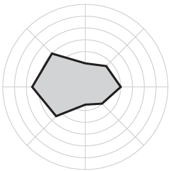
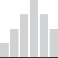
There’s a slew of charts, graphs, gidgets, and gadgets available that you’ll see in the gallery.
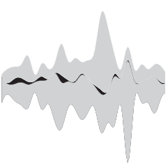
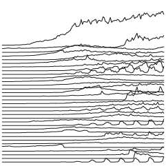
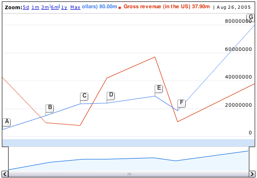
Time Series
I’m sure this Google Finance-looking graph will make a lot of people happy.
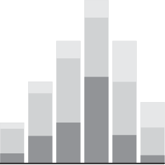
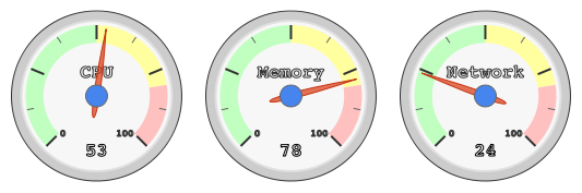
Gauges
These are, um, interesting.
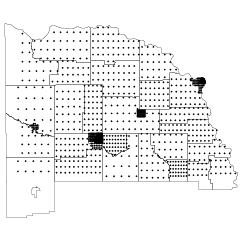
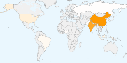
Maps
We’ve seen this before, but the difference here is that it’s now in widget form, which means a hook into Google Docs and other apps.
How We Will Benefit
If Google visualization becomes popular, visualization, in general, grows in popularity. People who weren’t exposed will now know more, and if all goes according to plan, data awareness has a chance to develop.
As an example, Google Maps made online mapping what it is now – commonplace. Remember when online mapping was only limited to the big boys? Now everyone can mashup to their heart’s content. People know how to use it and similar mapping applications and because of that, more “idea people” ask for mapping. As a result there is more opportunity.
Similarly, with the data viz API, we’ll see data mashups outside of the map. Data visualization will no longer just be for the big boys, but at the same time, we’ll still be able to make our own designs with a wider audience ready to experiment and play.
Good or Bad?
What do you think? Is the Google visualization API going to limit our imagination where we get stuck in a Google-ish funk; or is data and visualization awareness ready to rise to a point where we all benefit?

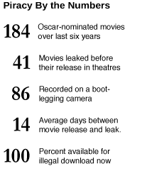 Despite the Academy’s efforts to crack down on bootlegging, its attempts haven’t done a whole lot. Focus on stopping one area, like downloading, another area just grows more prolific, like Region 5 DVDs from overseas. A quick search in the right places will show you that piracy isn’t going away any time soon.
 Since I enabled the plugins and started to-do lists, my browsing time has gone down a whopping 3.5% – from 10.11 hours per day to 9.76 hours per day. Ok, it doesn’t sound like much, but there’s a bit more to the story.

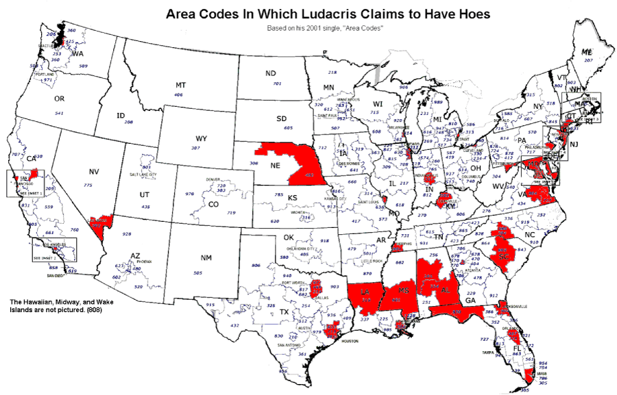
 I thought this map was amusing. As you can see, Mr. Bridges prefers those in the southeast and northeast according to his 2001 hit single, Area Codes in which he raps about all the female friends he has made.


 I
I  For our
  These highlights from

 Visualize This: The FlowingData Guide to Design, Visualization, and Statistics (2nd Edition)