Google recently released a visualization API that allows you to share embeddable visualization on your website, create Google Gadgets that can be shared and reused, and create extensions for existing Google products. Andrew asks, “Will this shape the future of data visualization online?”
On one side, this is exciting for the visualization field, because when Google talks, everyone listens. On the opposing side, could this be another Google Maps type of thing? Google Maps was cool at first, but now, mashup after mashup has left me bored and disillusioned. Ultimately though, I like to think that this API is going to benefit all of us.
What the API Offers
There’s a slew of charts, graphs, gidgets, and gadgets available that you’ll see in the gallery.
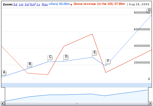
Time Series
I’m sure this Google Finance-looking graph will make a lot of people happy.
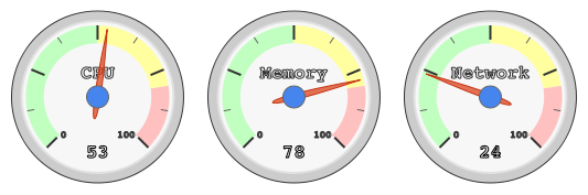
Gauges
These are, um, interesting.
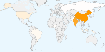
Maps
We’ve seen this before, but the difference here is that it’s now in widget form, which means a hook into Google Docs and other apps.
How We Will Benefit
If Google visualization becomes popular, visualization, in general, grows in popularity. People who weren’t exposed will now know more, and if all goes according to plan, data awareness has a chance to develop.
As an example, Google Maps made online mapping what it is now – commonplace. Remember when online mapping was only limited to the big boys? Now everyone can mashup to their heart’s content. People know how to use it and similar mapping applications and because of that, more “idea people” ask for mapping. As a result there is more opportunity.
Similarly, with the data viz API, we’ll see data mashups outside of the map. Data visualization will no longer just be for the big boys, but at the same time, we’ll still be able to make our own designs with a wider audience ready to experiment and play.
Good or Bad?
What do you think? Is the Google visualization API going to limit our imagination where we get stuck in a Google-ish funk; or is data and visualization awareness ready to rise to a point where we all benefit?
 Visualize This: The FlowingData Guide to Design, Visualization, and Statistics (2nd Edition)
It’s not going to limit our imagination any more than Excel does. Everyone has access to the standard bar, pie and scatter plots in Excel, and they’re by far the most common plots you see. And yet, you still see creative and informative visualizations.
Google is just offering a few more standard plots. Nice to have, but by no means limiting.
Google Maps is still cool. Many of the mashups add to this coolness. I was forced to rely on my neglected gmail account this week because of a problem with my hosting service. A client emailed me, and the address in his sig was picked up by gmail, and I was offered the chance to map it. I idly clicked the link, found where he was located, and realized that I’d driven by the place several times during business travel in an earlier career.
The ability to plan a route, then drag the path around and have the route recalculated, is something that right now amazes me. Sure, it’s what the GPS does when you make an unplanned route change, but I saw it first on Google Maps.
When I get a free moment, I plan to look into the API. How could it be anything but cool?
I agree with escargot’s comment. I haven’t looked closely at what the API offers, but it doesn’t appear to go much beyond the charting functionality of common programs like Excel.
In my opinion, more “creative” infovis isn’t even in competition with this kind of stuff yet, since most infovis designers haven’t figured out how to present more modern designs to a general audience in a way that makes sense to them. The functionality offered by Google or Excel is simpler and more “serializable” than proper infovis, making it easier to understand. More complex forms of infovis, for which we don’t have a generalized literacy, remain as marginalized novelties to non-experts.
So no, I don’t think Google is showing anyone anything they don’t already know, and I don’t think their design aesthetic is so compelling that everyone will think they have “solved” infovis. But I do think infovis design could take some cues from Google in the way they bring these sorts of technologies to “the masses.”
I really don’t think that this is going to take off and be another Google Maps. Essentially, all this API will do is provide a few “different” charts that are out of the bag prettier than excel. This may become a great value add to Google with ultimately only a cult-like following in the analytics community.
Overall, this release from google shouldn’t be a bad thing, assuming it has traction. Like past web services, let’s assume widespread adoption among web developers.
On the negative side, this could lead to large groups of websites or pages that have a similar look and feel. This happened with Ruby on Rails. Additionally, we would probably see a lot of examples where visualization is used but not really a value add. Did those three numbers really need a graph? Does every section of my new web2.0 site really need that map mashup?
On the positive side, more people will be exposed to visualization basics. More exposure should help educate the audience and widen the community base. This could help drive the community to produce better product. Also, the google service allows for anyone to develop plugins for visualization, so its less limiting than we might imagine from the initial release.
Finally, the data side is just as interesting as the visual side. If you read the developer guide you’ll see that they encourage data to be delivered via a uri and in certain formats. Will this lead to more data on the net being accessible in a common way? Will google’s ‘compliant data source’ become an unspoken standard? Will everyone skip that work and just start storing data in google spreadsheets since they’re already compliant?
I think there’s a good chance we’ll see some of these abused/overused, but I suppose that’s going to happen when any new visualization method is intro to the general public. I’m glad we’re seeing more than the standard (and boring) bar and line charts in Google Docs.
Also, I’m very excited to see that the Google Chart API now does Sparklines: http://code.google.com/apis/chart/#sparkline
I guess there will always be a danger of monoculture with something like this, but I think it will have a Schumpeter-esque effect, bringing it to the masses.
I think it is great. I doubt I would keep using it once I got familiar with it, my feeling is it would be a toy to try things out with, and use it as a springboard for more powerful tools afterwards.
It looks the like the consensus is the google api will have little to none negative effect on the viz field.
I thought about this a little bit yesterday, and I think I made an assumption about this api that might not be true – will this API even be popular? Who knows…
By the way, I love this. Great comments, everyone!
I agree with Jason. However, I would go farther and say that same phenomenon occurs with any advance in any field. There is a lull of creativity while the public digests the newest “thing”, but then it gets incorporated by the public and is built upon.
In other words, I think this is great.
Pingback: Winner of the Edward Tufte Book is… | FlowingData
Speaking of Rails, here is a plugin to build your own Google Motion Chart super fast:
http://github.com/mwarnock/rails-google-visualization-plugin/tree/master
Enjoy.
Pingback: Using data to learn more about yourself everyday « Will Scully-Power’s Blog
Air travel has become a major part of our society, with industries and individuals depending on air transport for their livelihood. But have you ever wondered what happens to the artifacts of our airborne culture when they’re no longer needed? More..
xrtst303a
Air travel has become a major part of our society, with industries and individuals depending on air transport for their livelihood. But have you ever wondered what happens to the artifacts of our airborne culture when they’re no longer needed? More..
xrtst303a