• Membership
  • Newsletter
  • Projects
  • Learning
  • About
  • Member Login
  • Clock plays a song with the current time in its title

    September 1, 2023

    Topic

    Infographics  /  clock, Pudding, Russell Samora, song

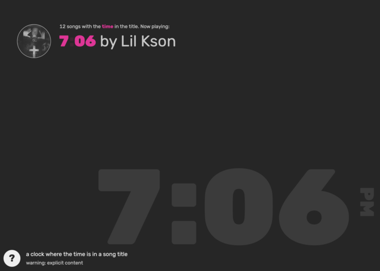
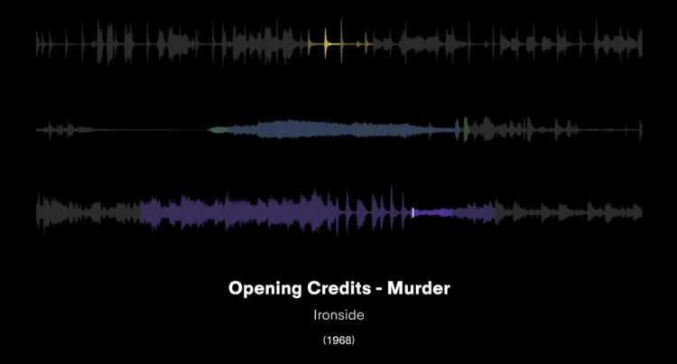
    For The Pudding, Russell Samora pulled songs via the Spotify API and made a unique kind of clock:

    Every minute, random songs are played that contain the time in the title (e.g., 6:47 or 6:47 from Central Station). If there are at least two songs with the correct am/pm (or it is absent), then the incorrect ones will be excluded.

    This is the first clock in a working series of four. The second one uses time mentioned in YouTube videos.

  • Members Only

    Visualization Tools and Learning Resources, August 2023 Roundup

    August 31, 2023

    Topic

    The Process  /  roundup

    Here’s the good stuff for August.

  • Data Underload  /  mortgage, spending

    When the Cost of a Mortgage is a Multiple of the Original Loan

    In early 2021, the average rate for a 30-year fixed rate mortgage was under three percent. According to Freddie Mac, the average rate for the past week was 7.23%. That’s a big enough increase to feel the difference in your monthly payment, but it stings even more when you compound the cost over the length of a mortgage.

    Use this chart to see how many times over you’ll pay over the original loan amount, given the annual rate and the number of years of paying.

    Read More
  • Turn a static SVG into an interactive one, with Flourish

    August 30, 2023

    Topic

    Apps  /  Flourish, illustration, SVG

    It’s straightforward to share a static SVG online, but maybe you want tooltips or for elements to highlight when you hover over them. Flourish has a new template to provide the interactions easier. Seems promising.

  • How I Made That: Network Diagrams of All the Household Types

    Process the data into a usable format, which makes the visualization part more straightforward.

  • Apple’s global suppliers

    August 29, 2023

    Topic

    Maps  /  Apple, Bloomberg, China, suppy

    Most of Apple’s suppliers and manufacturing happen outside the United States and in China. But because of tensions between the U.S. and China, Apple has tried to shift to other countries. Bloomberg provides the breakdowns over time, showing the biggest increases in India and Vietnam.

  • Infinity abstractions

    August 28, 2023

    Topic

    Infographics  /  Dea Bankova, infinite, math

    Infinity is an abstraction of endlessness, which seems to suggest that it cannot be measured with finite units or occur in the real world. With a fun visual project, Dea Bankova wonders otherwise.

  • Data Underload  /  households, rent

    Renting vs. Owning a Home, by State

    Among households in the United States, 68% are owned and 32% are rented, based on estimates from the American Community Survey in 2021. That breakdown isn’t uniform across the country though. In Maine, almost 80% of households are owned, whereas in California, less than 60% is owned. In Washington, D.C., it’s less than half. Here are the splits for each state.

    Read More
  • Members Only

    Visualization Integration

    August 24, 2023

    Topic

    The Process  /  tools

    If you want to maximize fun, a mixed toolbox is still best.

  • Explorable explanation for matrix transformations

    August 24, 2023

    Topic

    Infographics  /  math, matrix, Yi Zhe Ang

    Instead of using a bunch of equations to memorize, Yi Zhe Ang visually explains matrix transformations to provide some intuition behind the math. Make it to the end so that you can transform a 3-D image of a cat.

  • Python is coming to Excel

    August 23, 2023

    Topic

    Software  /  Excel, Python

    Excel is getting a bump in capabilities with Python integration. From Microsoft:

    Excel users now have access to powerful analytics via Python for visualizations, cleaning data, machine learning, predictive analytics, and more. Users can now create end to end solutions that seamlessly combine Excel and Python – all within Excel. Using Excel’s built-in connectors and Power Query, users can easily bring external data into Python in Excel workflows. Python in Excel is compatible with the tools users already know and love, such as formulas, PivotTables, and Excel charts.

    Sounds fun for both Excel users and Python developers.

    It’s headed to the Beta Channel in Excel for Windows and then Excel for Windows proper. They didn’t announce a timeline for Mac.

  • Using cold lake water to cool buildings

    August 23, 2023

    Topic

    Infographics  /  cooling, Washington Post

    There are buildings in Toronto, Canada that make use of a deep lake water cooling (DLWC) system, including Scotiabank Arena, home of the Toronto Raptors. Cold water pumps from nearby Lake Ontario and then flows through pipes in buildings to absorb heat. For The Washington Post, Tik Root, with graphics by Daisy Chung and photos by Ian Willms, describes the system.

    It sounds a lot like the system I use to cool my beer, well, wort at that point, when I’m brewing.

  • Passenger planes flying too close

    August 22, 2023

    Topic

    Infographics  /  flights, New York Times

    Sometimes passenger planes get a little too close to each other on takeoff and landing due to miscommunication and understaffing from air traffic control. From The New York Times, near collisions might happen more often than the steady flight captain’s overhead voice would have you believe.

    A series of animated flight paths, albeit sped up, show the close calls.

  • xkcd: Pairwise matrix of what to do in an emergency

    August 21, 2023

    Topic

    Infographics  /  humor, xkcd

    xkcd has an informative reference for what do in case of mountain lion encounter, lightning, fire alarm, and bleeding. Very informative.

  • Visual breakdowns of iconic hip-hop samples

    August 18, 2023

    Topic

    Statistical Visualization  /  hip-hop, music, sampling, Tracklib

    Hip-hop music producers often sample from previous works. They remake, restructure, and repurpose the samples to create a new sound. Tracklib broke down iconic hip-hop sampling over the past fifty years, using musical frequency charts to show where the bits of popular songs came from.

    [arve url=”https://www.youtube.com/watch?v=hIGNaDk9eIA” /]

  • Members Only

    Chart Options for When Time Data Has Uneven Gaps

    August 17, 2023

    Topic

    The Process  /  gaps, options, time series

    Visualizing time series data often assumes that your data points are evenly spaced over time, which is not always the case.

  • Hip-hop’s influence on the English language

    August 17, 2023

    Topic

    Infographics  /  hip-hop, language, music, New York Times, vernacular

    For The New York Times, Miles Marshall Lewis highlights the etymology of five words in the English language heavily influenced by hip-hop: dope, woke, cake, wildin’, and ghost. A fun design using GIFs, images, and rotating discs you can click for music take you through the history.

  • Shifting towards more hot days, fewer cold days

    August 16, 2023

    Topic

    Statistical Visualization  /  Bloomberg, global warming

    It keeps getting hotter around the world. Not every single day. But over time, there are increasingly more hot days and fewer cold days.
    For Bloomberg, Zahra Hirji, Rachael Dottle and Denise Lu lean into layered density plots to show the shift and the path towards extreme climates.

    They show distributions, which can be a challenge for non-data people to understand. So they take their time in the beginning to explain what the chart type shows, with a combination of color, animation, and labeling that stays consistent through the article.

  • Supermarket provides AI-driven meal planner and is disappointed by the internet using it to output weird recipes

    August 15, 2023

    Topic

    Mistaken Data  /  AI, grocery, Guardian, recipes

    A supermarket chain in New Zealand offered an AI-based recipe generator, and of course people started throwing in random household items to see what it would make. For The Guardian, Tess McClure reports:

    The app, created by supermarket chain Pak ‘n’ Save, was advertised as a way for customers to creatively use up leftovers during the cost of living crisis. It asks users to enter in various ingredients in their homes, and auto-generates a meal plan or recipe, along with cheery commentary. It initially drew attention on social media for some unappealing recipes, including an “oreo vegetable stir-fry”.

    When customers began experimenting with entering a wider range of household shopping list items into the app, however, it began to make even less appealing recommendations. One recipe it dubbed “aromatic water mix” would create chlorine gas. The bot recommends the recipe as “the perfect nonalcoholic beverage to quench your thirst and refresh your senses”.

  • Cultural Midwest, not technically

    August 14, 2023

    Topic

    Maps  /  geography, humor, Luke Capasso, Midwest

    The U.S. Census Bureau defines the Midwest as the region of twelve states cornered by North Dakota, Kansas, Ohio, and Michigan. Comedian Luke Capasso convincingly argues that while that is technically correct, regions should be defined by culture and your dad’s spirit vehicle.

    @lukecapasso

    Replying to @xerofox_given2 #midwest #Midwestern #pittsburgh #pittsburghpa #ope #unitedstates #Louisville #eastcoast #ohio #ohiocheck #dayton #columbus #buffalo #foryou #foryourpage #foryoupage

    ♬ original sound – Luke Capasso

    [via kottke]

  • Page 37 of 391
  • <
  • 1
  • ...
  • 34
  • 35
  • 36
  • 37
  • 38
  • 39
  • ...
  • 391
  • >

Analyze, visualize, and communicate data usefully, beyond the defaults.

Become a member →

Recently for Members

May 8, 2025
When the data is not what it seems

May 1, 2025
Finding the Right Charts

April 24, 2025
Visualization Tools, Datasets, and Resources – April 2025 Roundup

April 17, 2025
Breaking Out of Chart Software Defaults

April 15, 2025
Line Chart with Decorative Neon Accents

Browse by Chart Type See All →

Glyph Chart Cartogram Line Map Stacked Area Chart Mosaic Plot Sankey Diagram Step Chart Spiral Chart Square Pie Chart

Browse By Topic

  • Visualization

    Seeing data

  • Maps

    Seeing geographic data

  • Infographics

    Explaining data

  • Networks

    Connecting data

  • Statistics

    Analyzing data

  • Software

    Working with data

  • Sources

    Getting data

  • Design

    Making data readable

Get the Book

Visualize This: The FlowingData Guide to Design, Visualization, and Statistics

Available now.

Order: Amazon / Bookshop

Made by FlowingData

  • The Process

  • Data Underload

  • Chart Everything

  • Guides

  • Books

  • Shop

  • About
  • Contact
  • Newsletter
  • LinkedIn
  • Instagram
  • Bluesky
  • RSS
Copyright © 2007-Present FlowingData. All rights reserved.